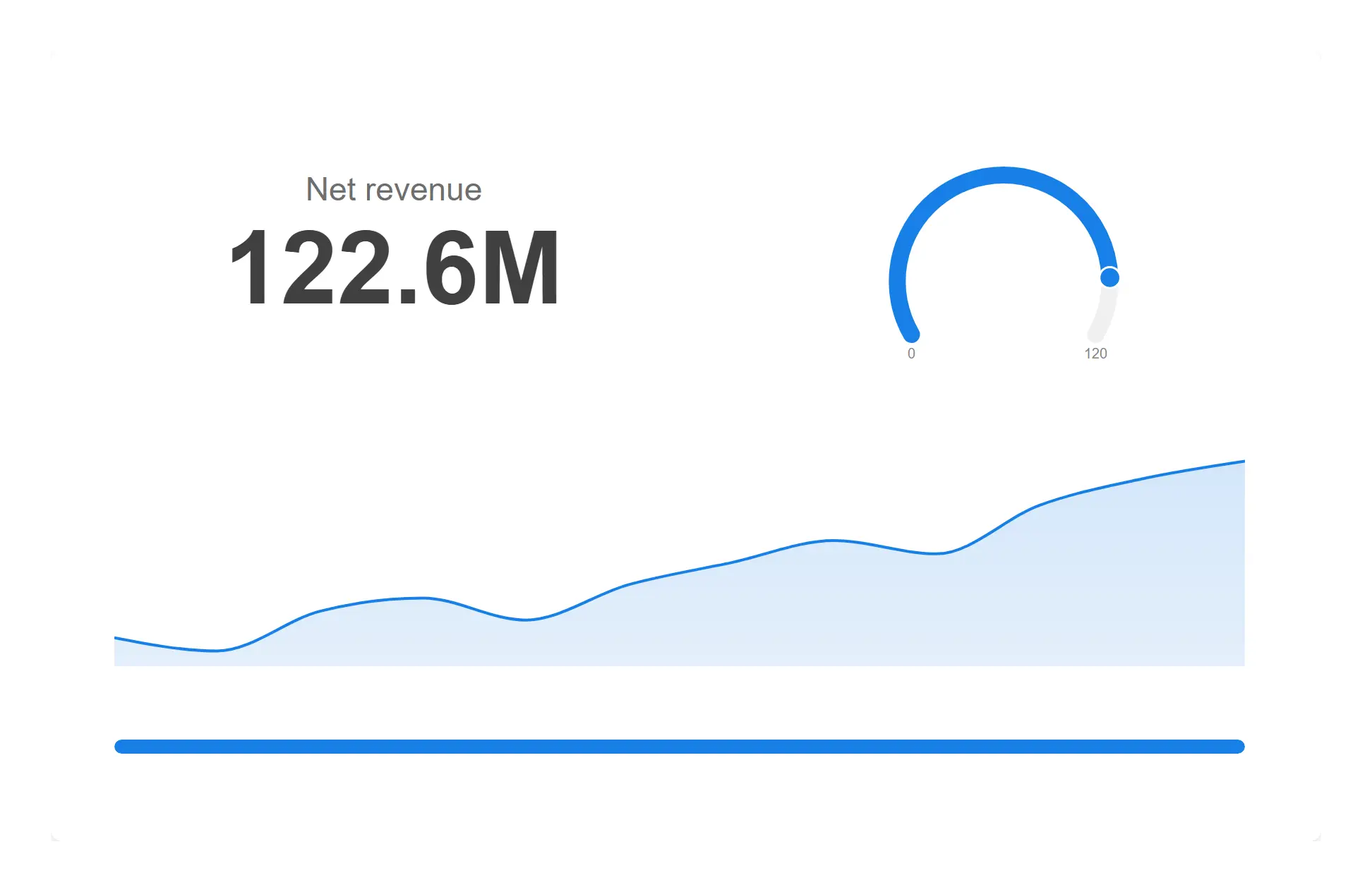
Compose the KPI card
Value, gauge, sparkline and callout are layers — drag them where you want them, resize them, add another. Drop one dimension on and the finished card becomes a grid of finished cards.
See the KPI card →Client-managed Qlik Sense and Qlik Cloud
KPI cards that answer the question at a glance. An AI copilot that builds the chart you describe, from your own data model. Forty chart types, advanced tables, self-service reporting and serverless writeback — eighteen objects on one shared foundation.
One object on a sheet: open it, compose it from layers, and it goes back exactly as you left it.
Composing a KPI card from layers in the Settings Studio. Illustrative
Start here
Value, gauge, sparkline and callout are layers — drag them where you want them, resize them, add another. Drop one dimension on and the finished card becomes a grid of finished cards.
See the KPI card →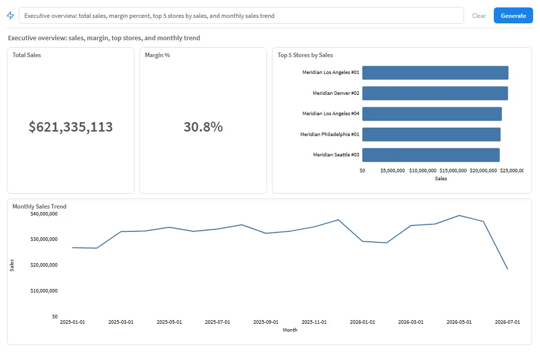
Describe what you want in a sentence. It reads your own data model, has the Qlik engine check every expression, and hands back real objects you can keep editing.
See the Copilot →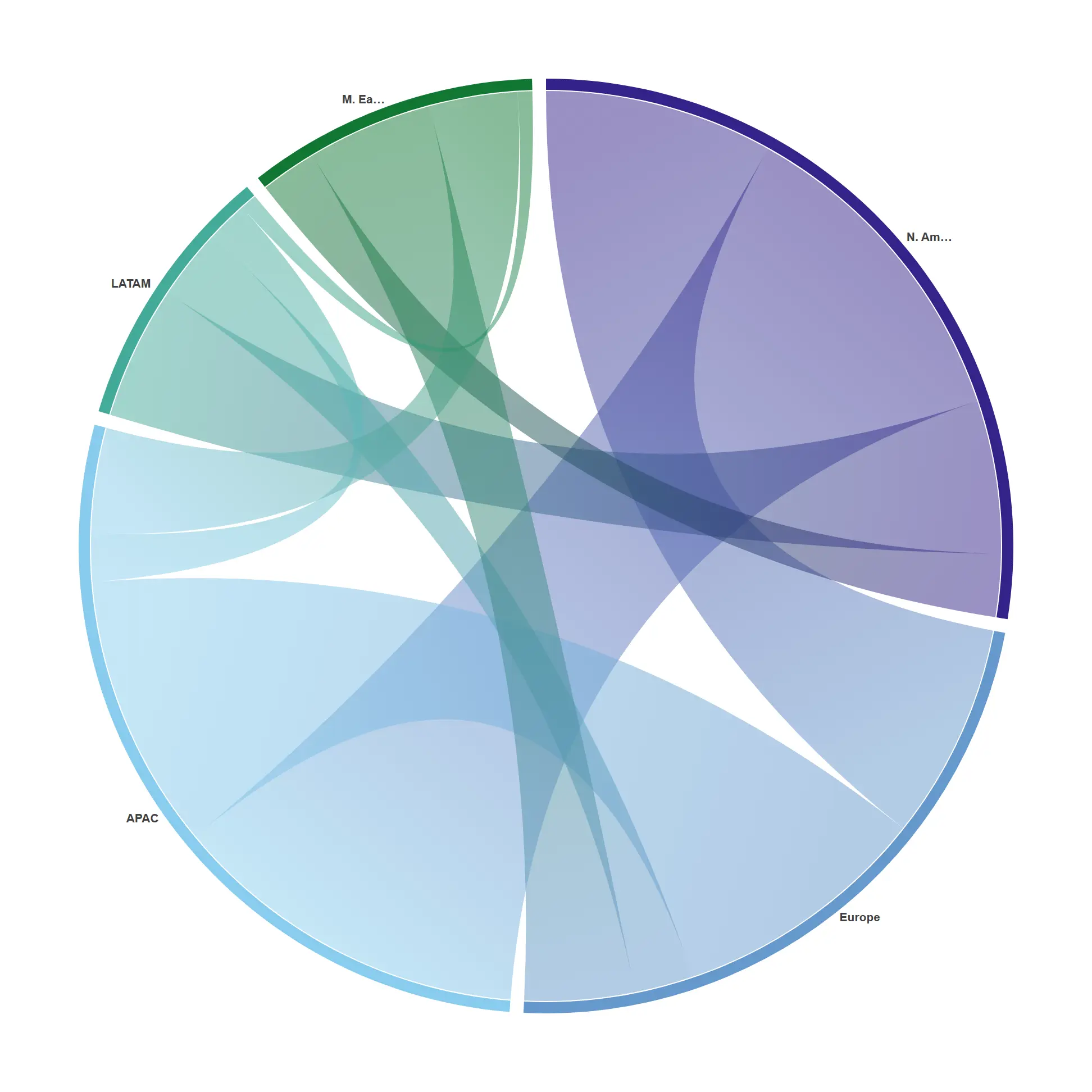
Sankeys, chords, violins, horizon bands and thirty-six more — all on one runtime, so they share your theme, your number formats and Qlik's own selection behaviour.
See the charts →That is the short version. Everything below is the evidence: how each part works, what the ecosystem actually looks like, and an honest comparison with the vendors you may already run.
KPI Card
One measure and default settings already give you a clean, engine-formatted card. Add a second measure and the comparison row appears; add a time dimension and the trend appears. The card only ever shows what the data can actually support, so it is never half-rendered while you configure it.
When you do want to compose it, every element is a layer on one canvas — value, label, comparison, gauge, sparkline, progress bar, text and image — each with its own expression, dragged and resized where you want it, as at the top of this page. Position is stored as a percentage, so a card composed once holds its layout at any size on any sheet.
Qlik's own KPI object stops at two measures, fixed icons, no embedded trend and no animation. This one card covers the ground that five separate community and commercial KPI extensions cover between them.
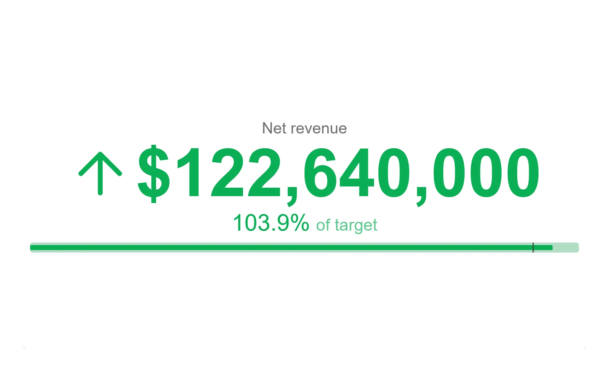
KPI card with bullet and bands — Attainment against plan, colour-banded, so the card answers "is this good?" not just "what is it?".
Progress bar, radial gauge arc or bullet chart — a single "Display as" setting, all three coloured by the same banding rules, so switching presentation never changes what the card is saying. Bands come from your own thresholds or from a target with a tolerance, and can drive the value colour, the icon and the card background independently.
An embedded sparkline as a line, area or bars, with the target overlaid as a dashed series and markers on the last, highest and lowest points. Long series are downsampled to what fits legibly at the card's width rather than being crammed in or truncated.
Drop one optional dimension on and the finished card repeats itself — one per region, per store, per product — as a responsive grid, each cell with its own banding, comparison and gauge, and an optional shared scale. Add a region to your data and the grid grows. Clicking a cell selects its value.
Every figure is formatted by the Qlik engine through the measure's own format, so the card matches the same number in a native table. The count-up animation formats each frame the same way — currency, percentages and abbreviations hold all the way up — and it stops for reduced-motion, for the app's animation setting, and in snapshots.
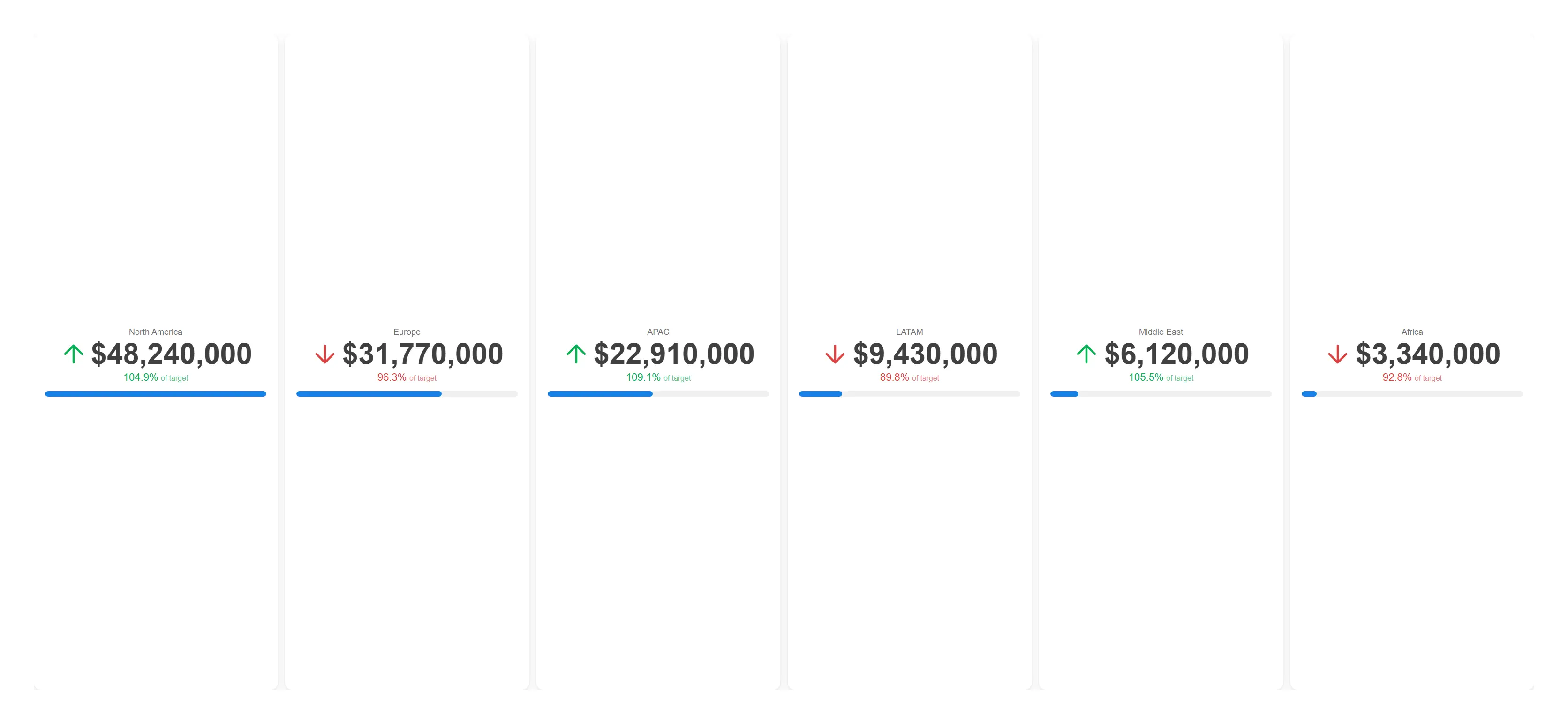
One card per region from a single object — add a region and the grid grows itself.
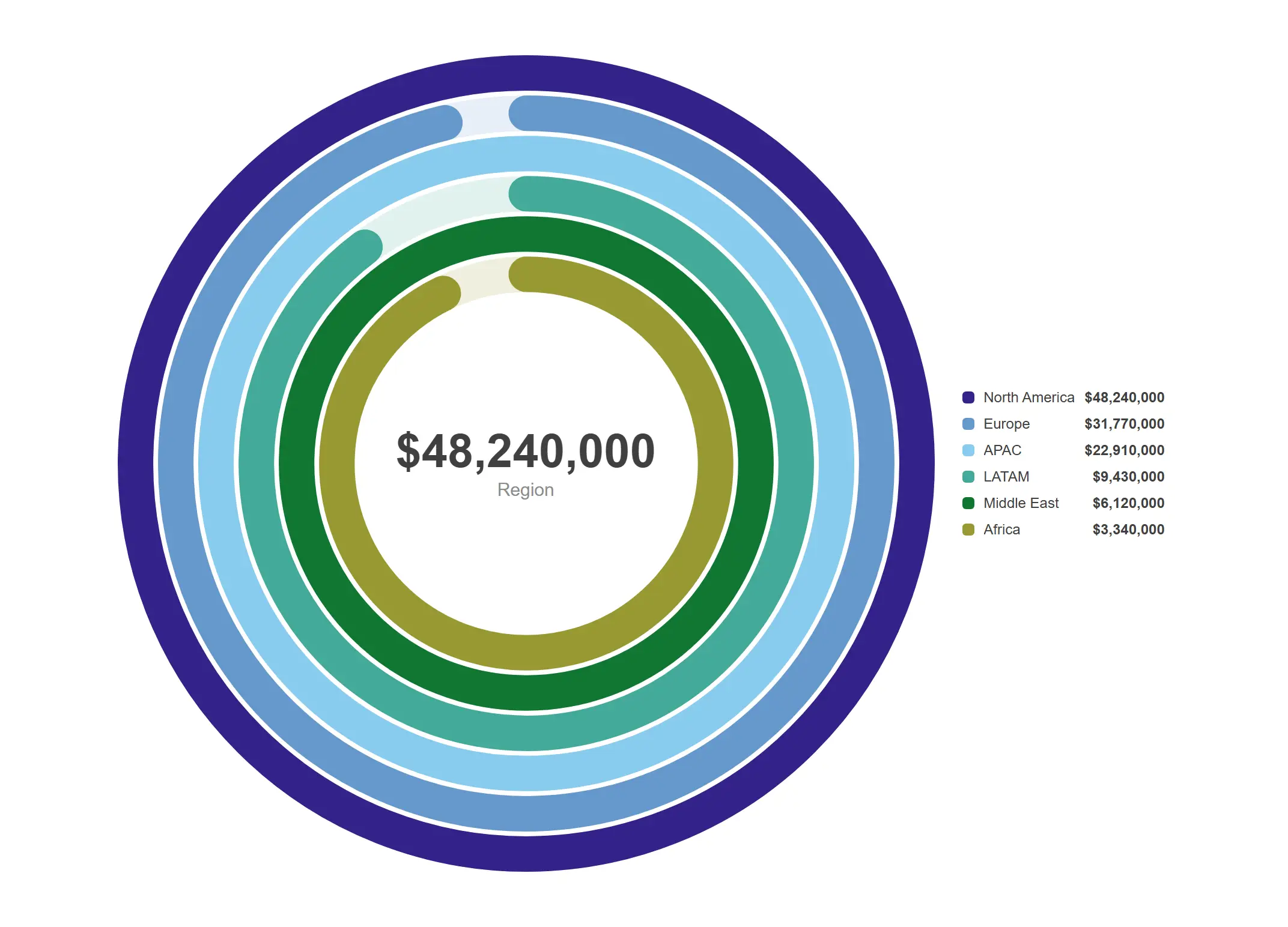
One ring per region, each measured against its own plan, all selectable.
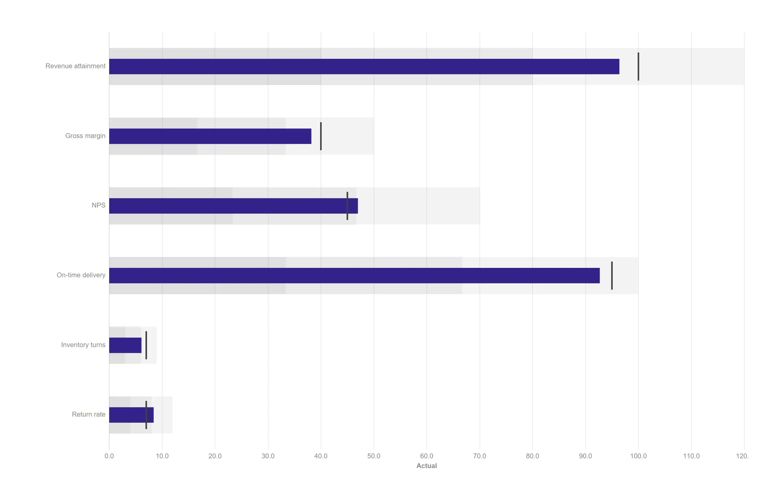
Six KPIs against target with qualitative bands, in less space than a single gauge.
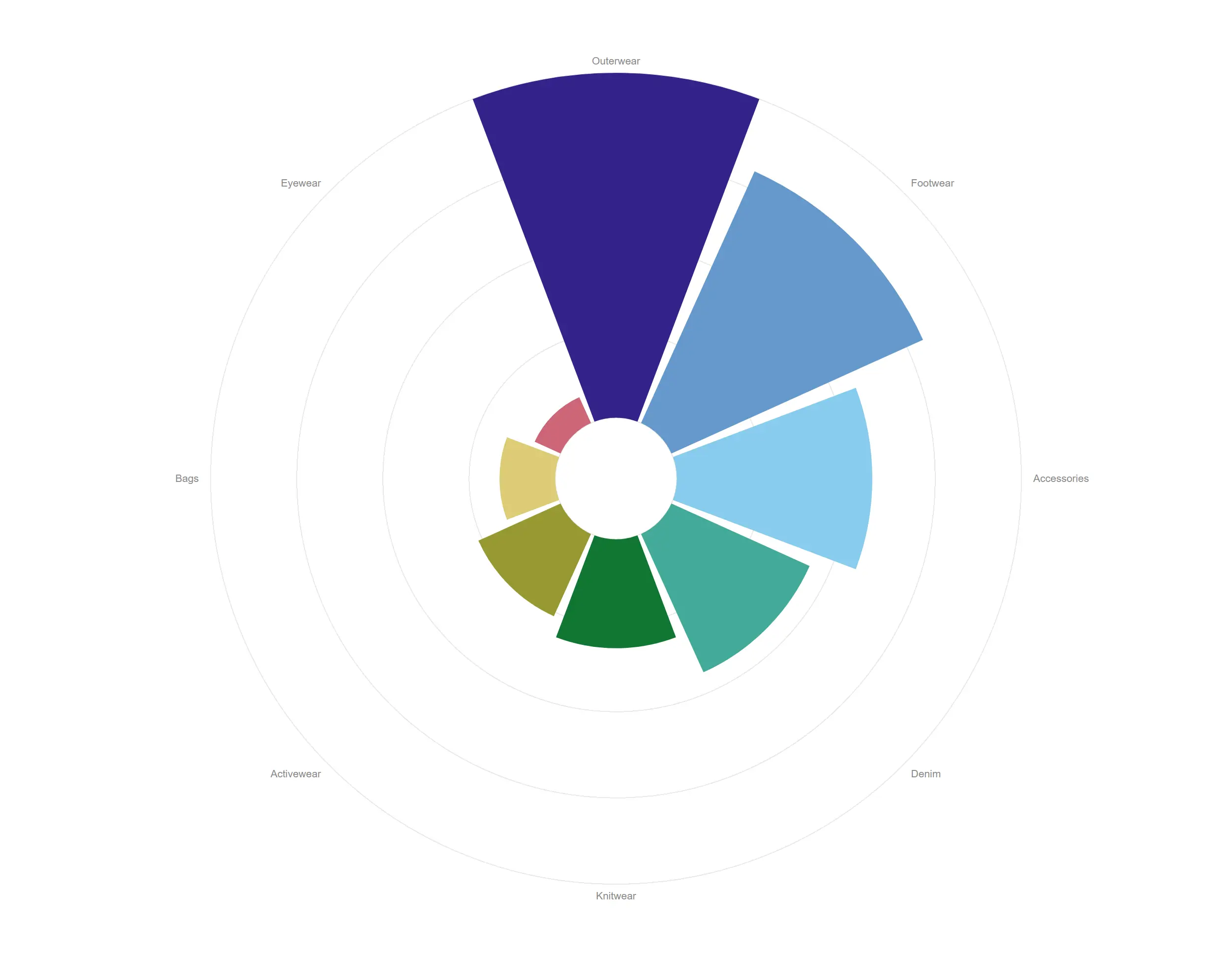
A bar chart wrapped into a ring, so a repeating cycle reads at a glance instead of scrolling off the edge.
AI Copilot
The Copilot reads the app it is sitting in — the field list, the master items, the current selections and the other objects on the sheet — designs a specification, and then puts every expression in it through Qlik's own expression check before anything is drawn. Anything that fails goes back for repair.
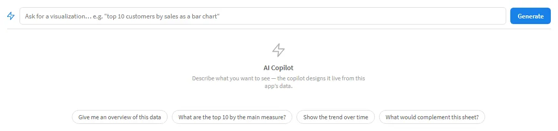
1 Ask for it in a sentence
2 Get a working answer, not a suggestion
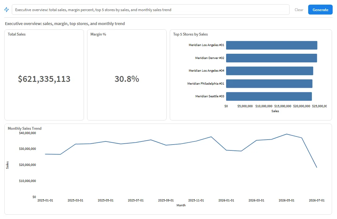
One prompt — "Executive overview: total sales, margin percent, top 5 stores by sales, and monthly sales trend" — against a synthetic demonstration app. The tiles stay live: a selection made anywhere else on the sheet updates them.
It reads your actual fields, tags, cardinality and master items rather than inventing names, and it sees what is already on the sheet — so it complements the sheet instead of duplicating it.
Every generated expression is checked by the Qlik engine, and impossible chart-and-data combinations are downgraded rather than attempted. A chart that cannot be computed never reaches the screen as a broken object.
What comes back are Chart+ charts, not pictures. "Add to sheet" turns the answer into genuine sheet objects you can edit by hand afterwards, and a follow-up prompt refines the previous answer — "make the second chart a line".
The Copilot calls a large language model with your own API key. There is no ExtraSense backend in the path, and no per-seat AI quota to buy from us.
Chart+
Every chart below is the same extension with a different type selected. They share hypercube mapping, selection behaviour, theme palettes, tooltips and number formatting, because those are written once in the core rather than forty times. Fix the selection behaviour and all forty inherit the fix.
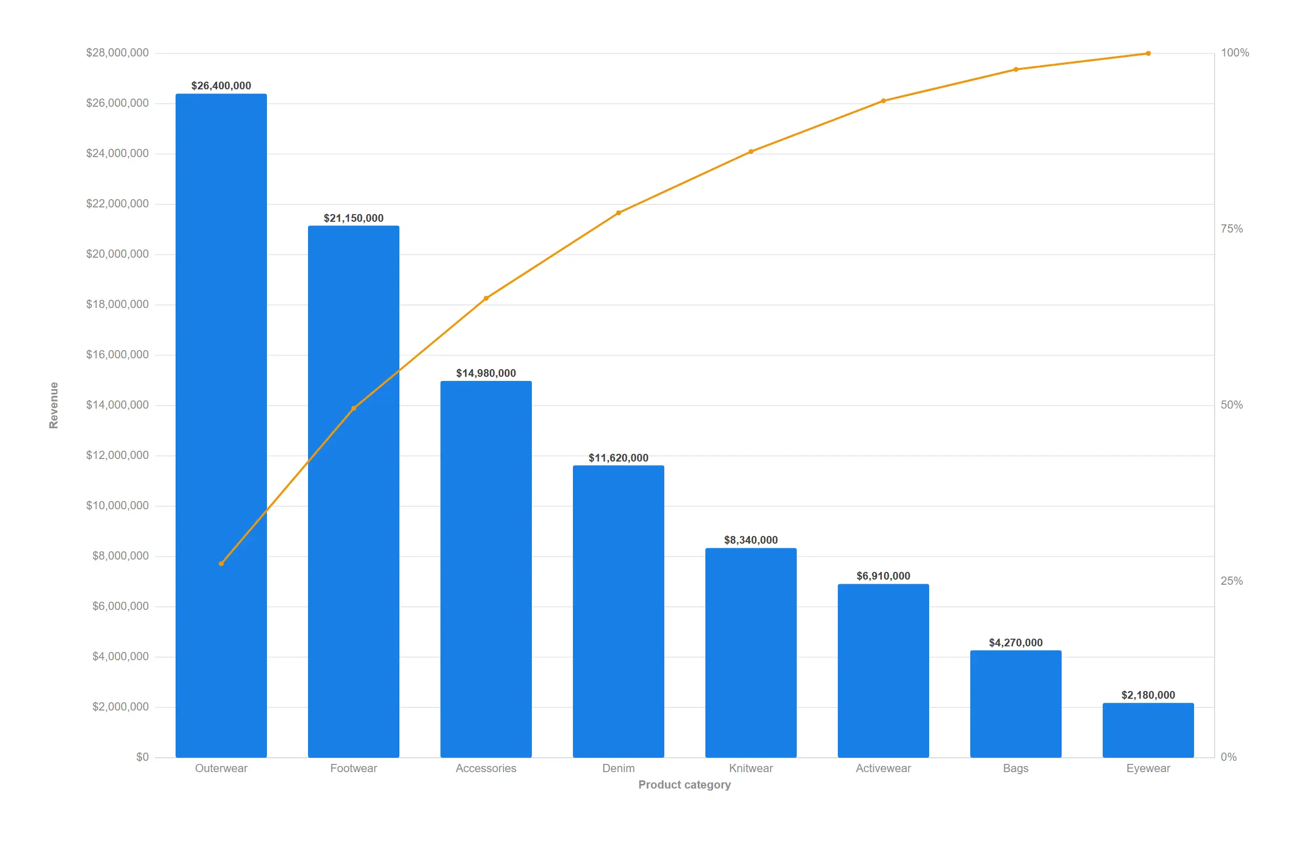
Find the handful of categories that drive most of the result, ranked and cumulated in one move.
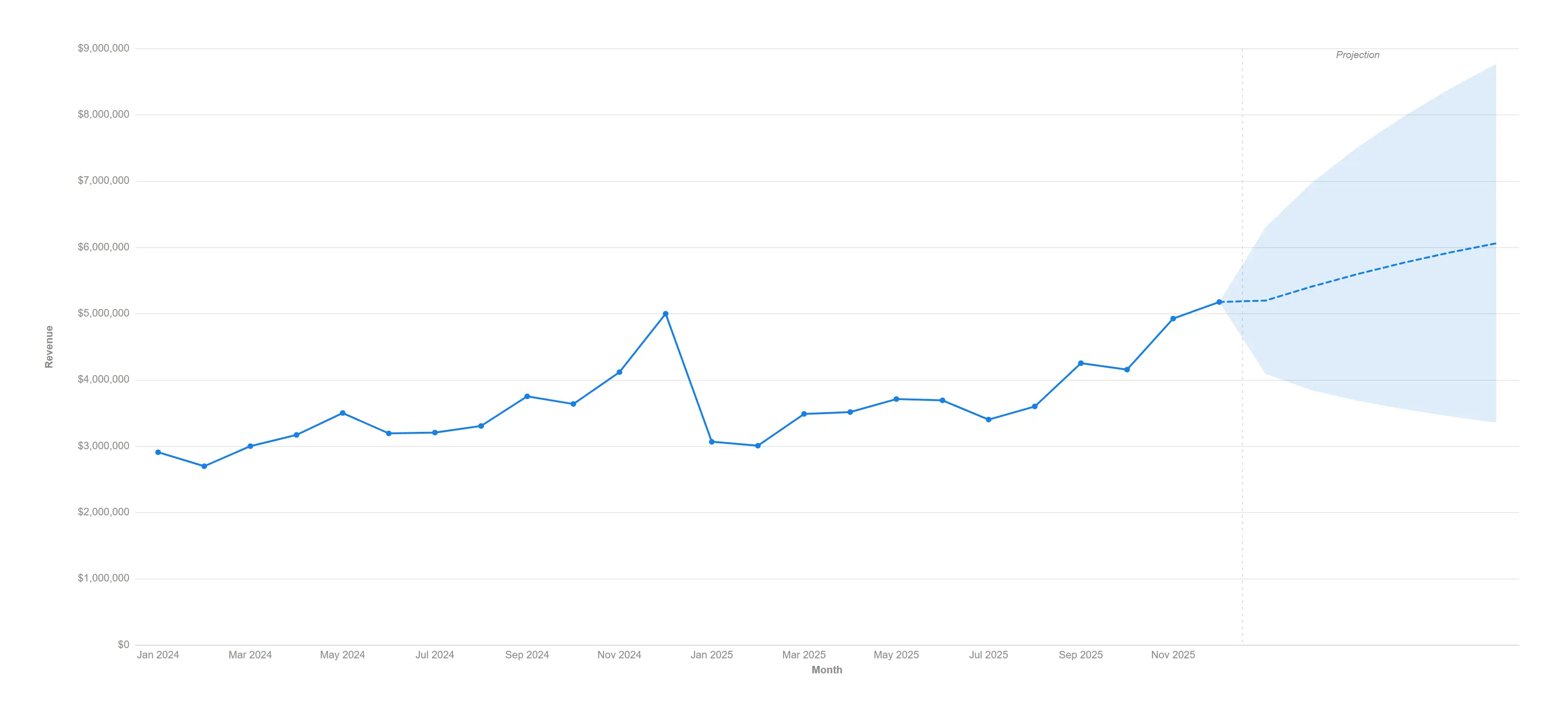
Extend the trend six months forward with a clearly labelled projection nobody can mistake for actuals.
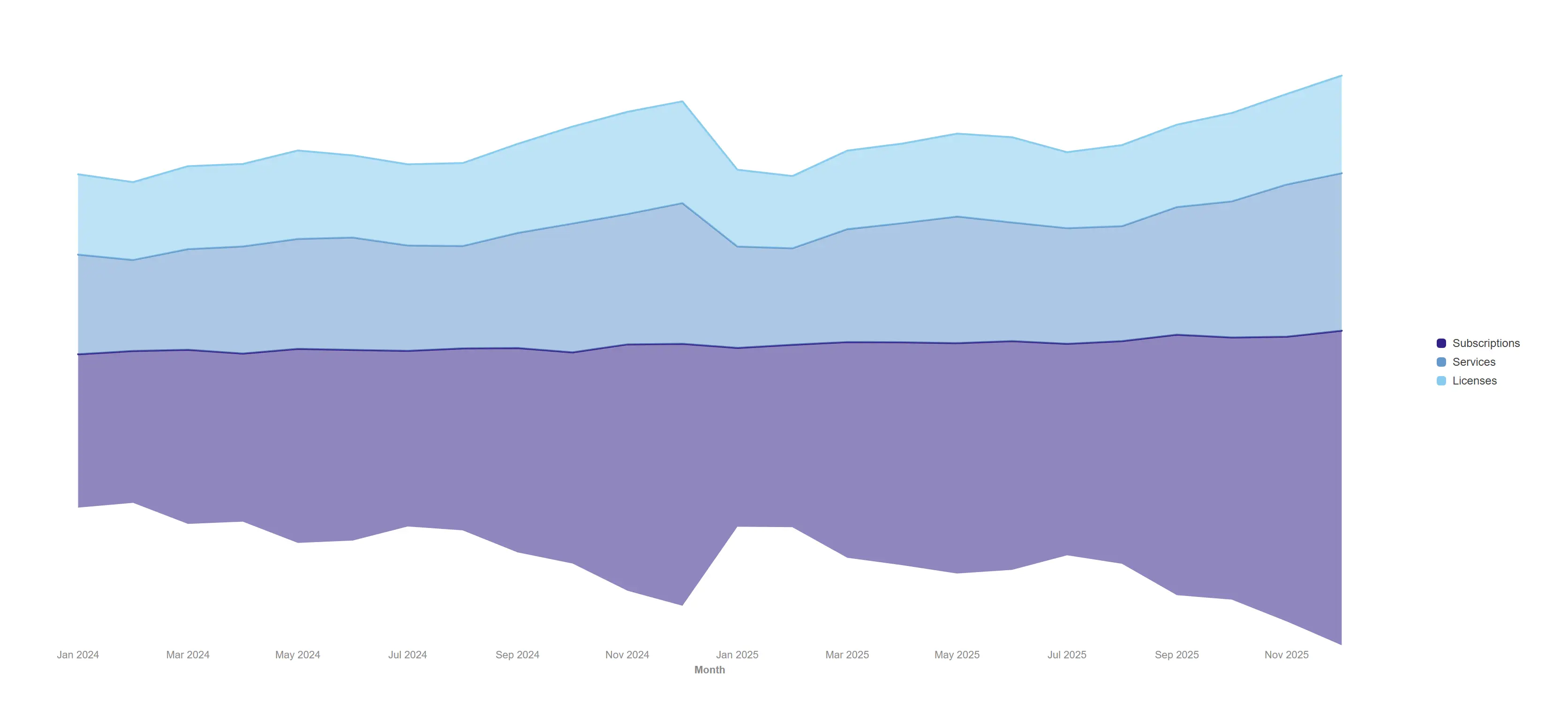
Trade the baseline for beauty when the story is rhythm and share rather than absolute totals.
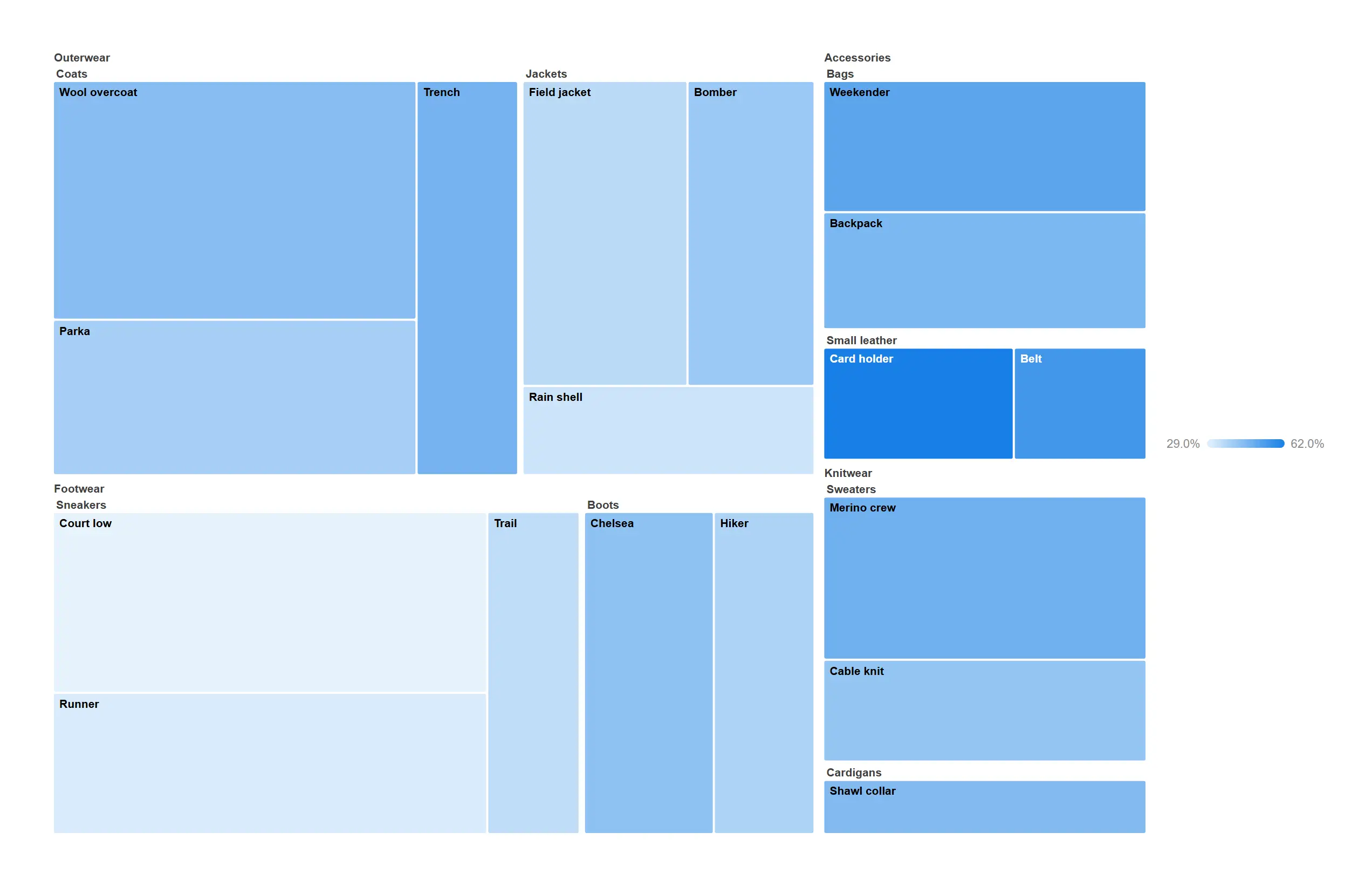
Fit a three-level product hierarchy into one rectangle and still see every product.
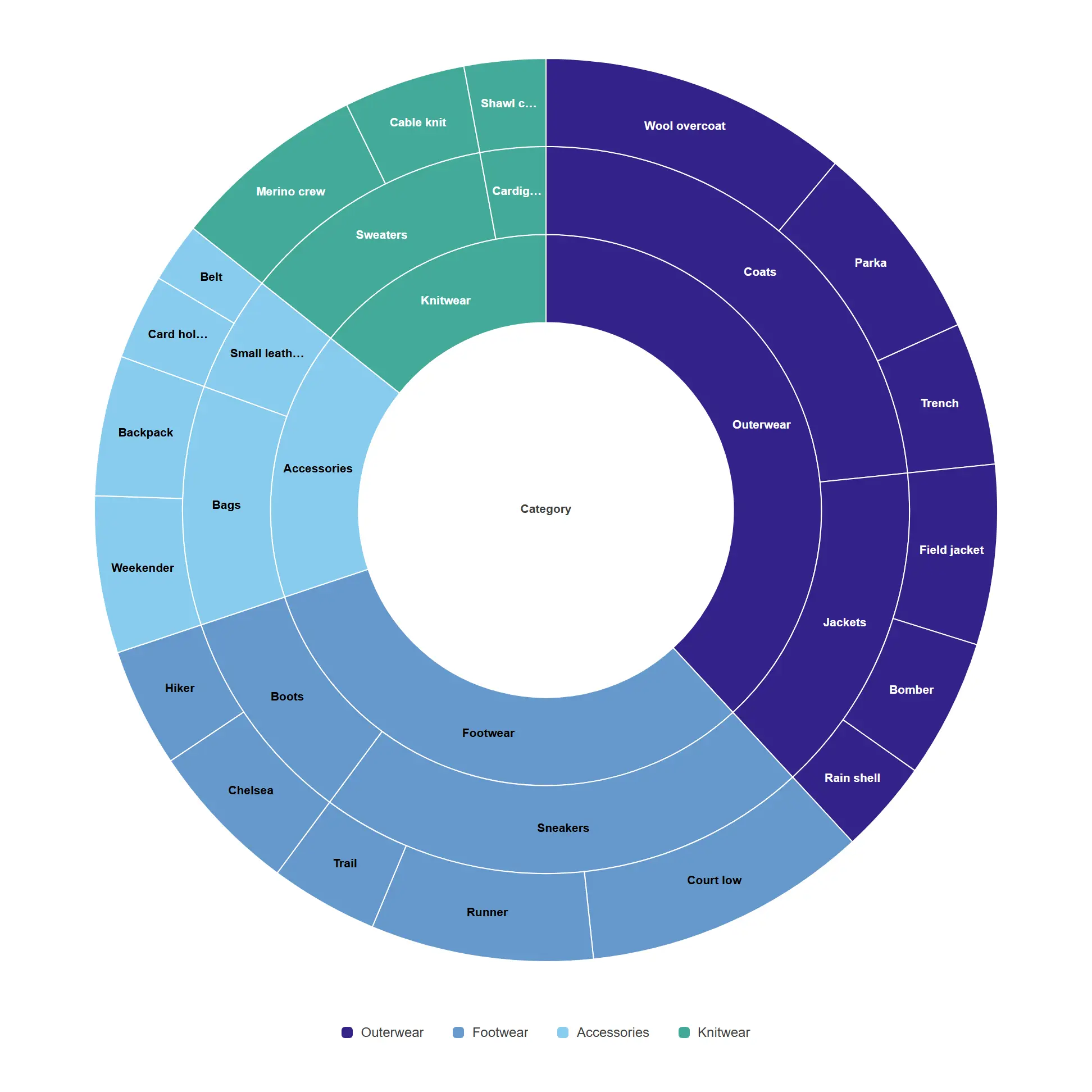
Read a hierarchy from the inside out, with every ring proportional to the level above it.
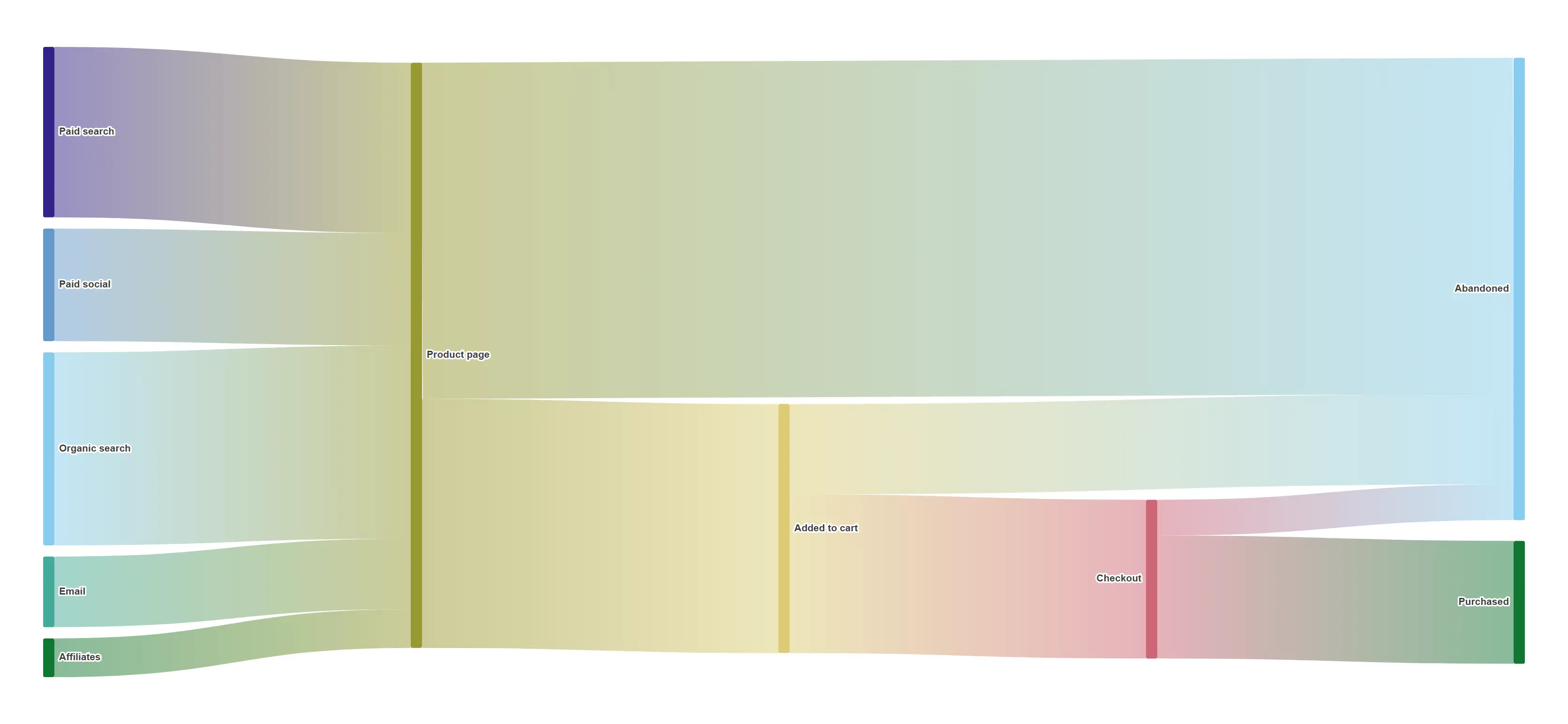
Follow every session from first touch to purchase and see precisely where the volume goes.
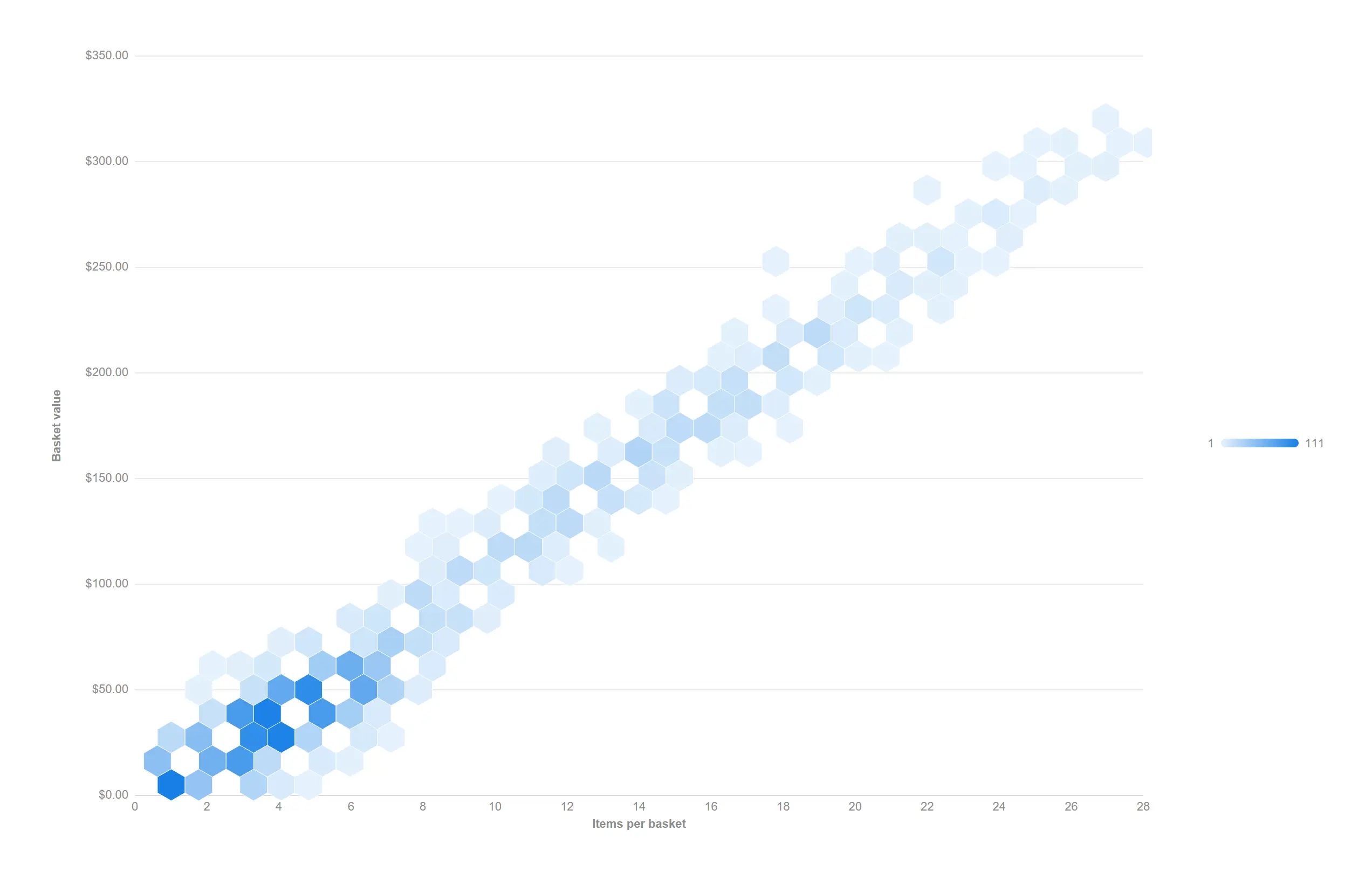
Thousands of transactions stop being a blob and start being a distribution.
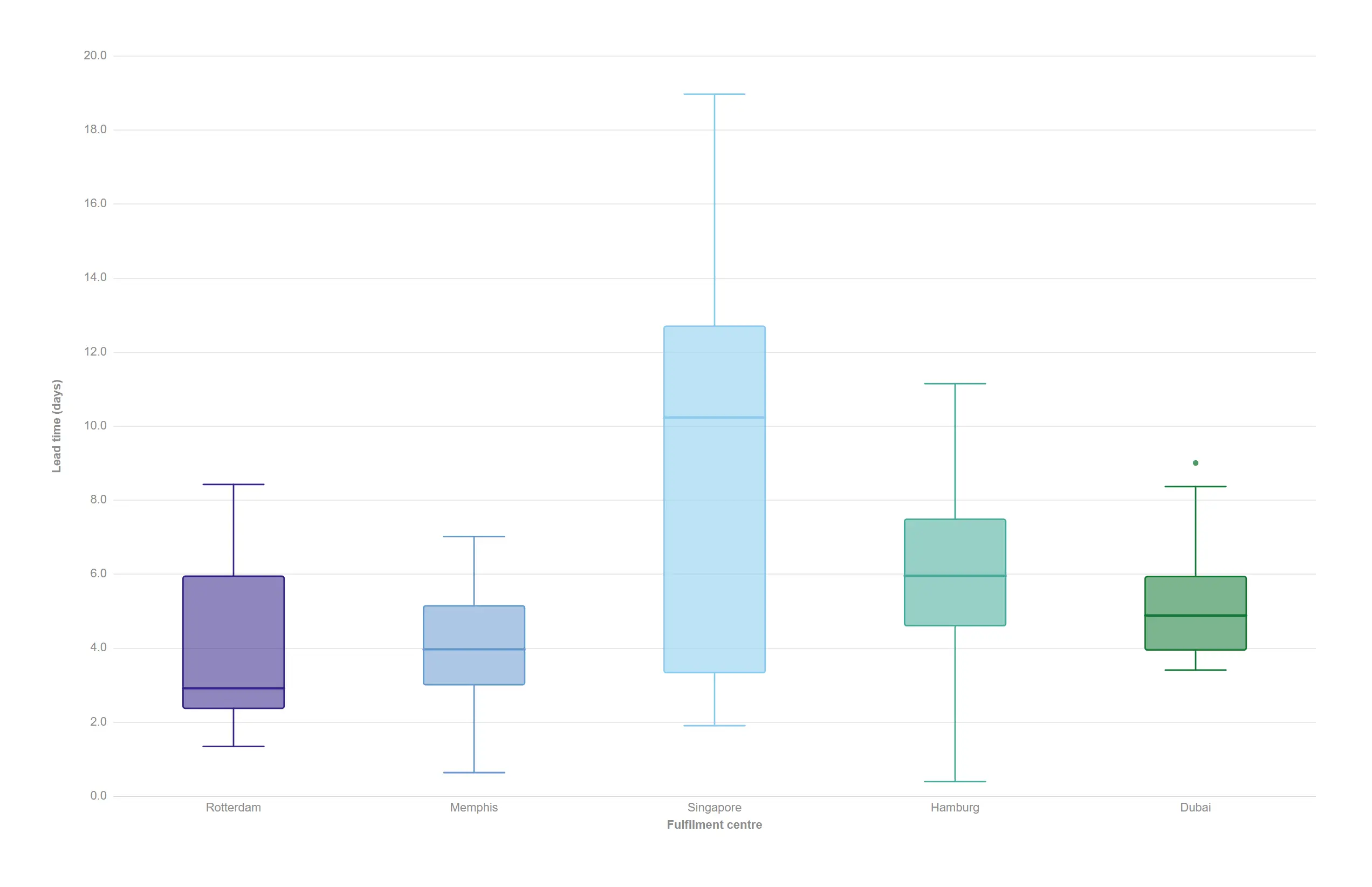
Quartiles, whiskers and outliers computed from the detail rows — no pre-aggregation needed.
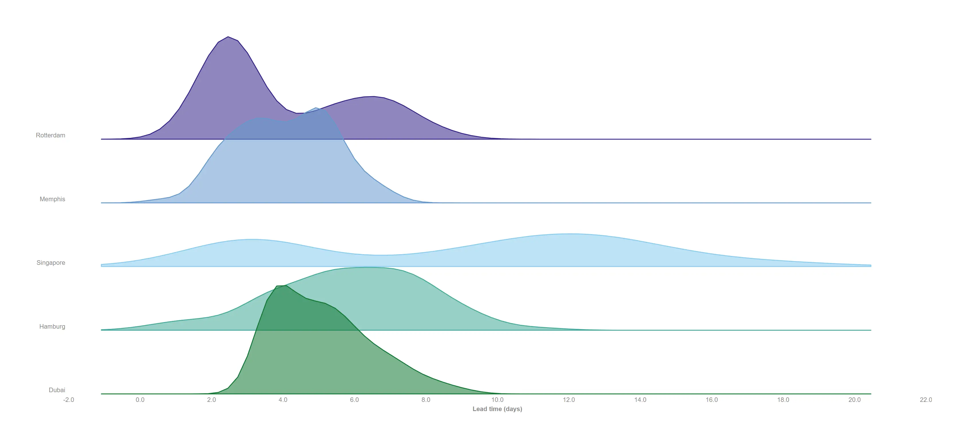
Stack every centre's lead-time distribution on one shared axis and read the whole network at once.
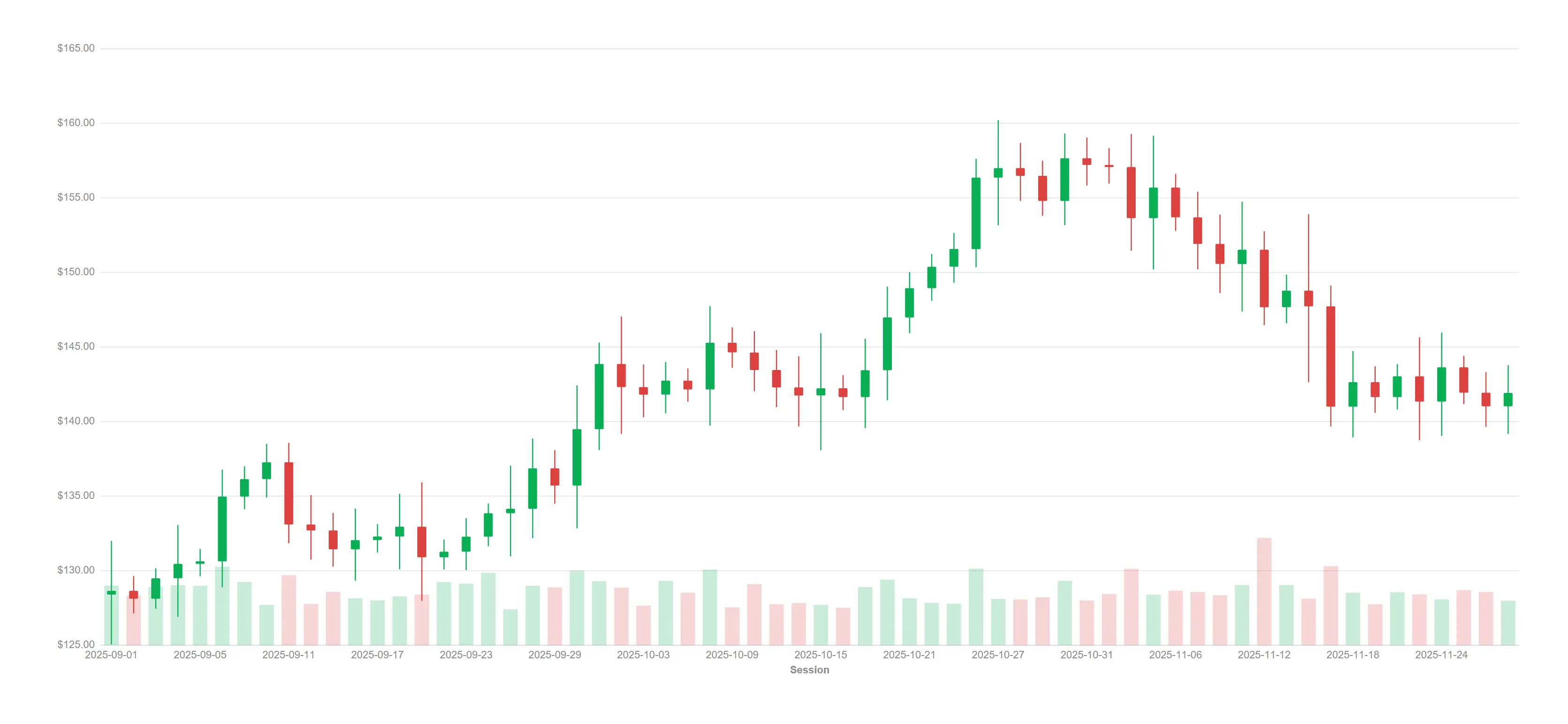
Full OHLC candles with a volume band along the floor — the finance view your traders expect.
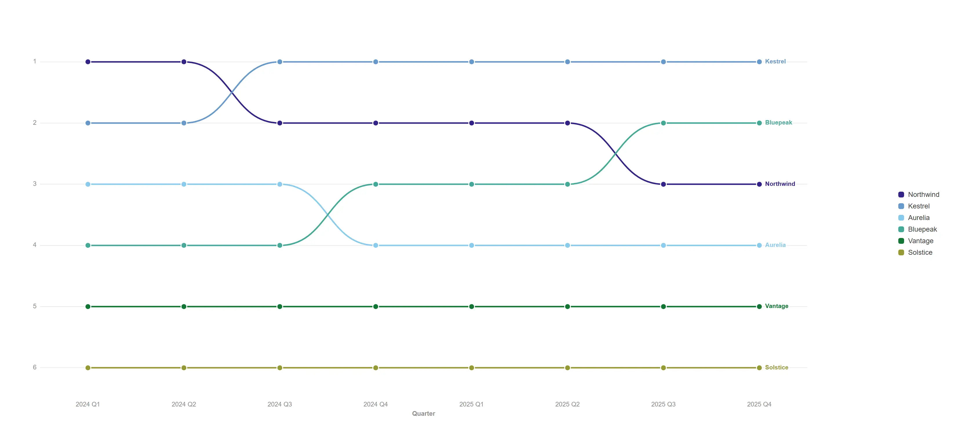
Watch competitive position change quarter by quarter, with every crossover called out.
A bar chart wrapped into a ring, so a repeating cycle reads at a glance instead of scrolling off the edge.
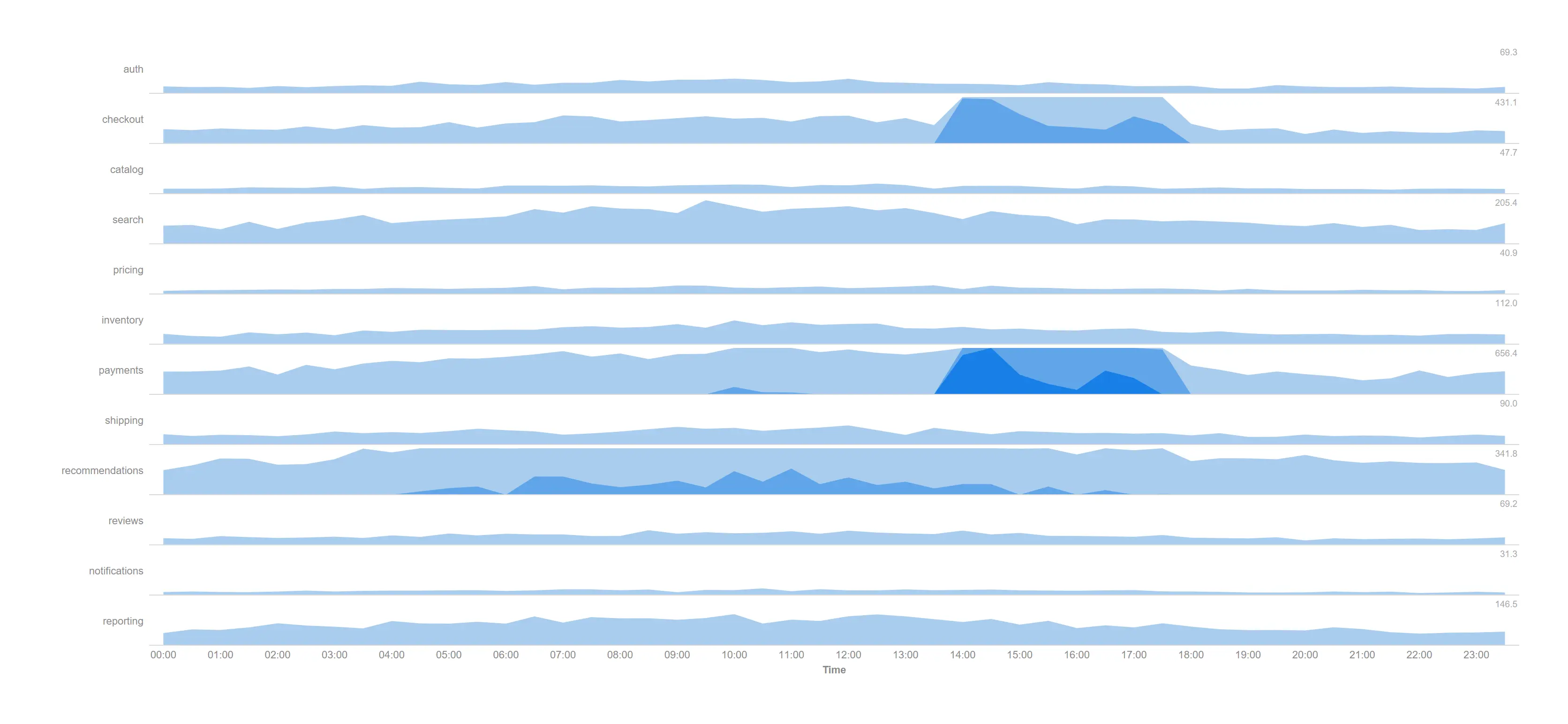
Watch twelve services through a whole trading day in the height a single line chart would need, and see the afternoon incident immediately.
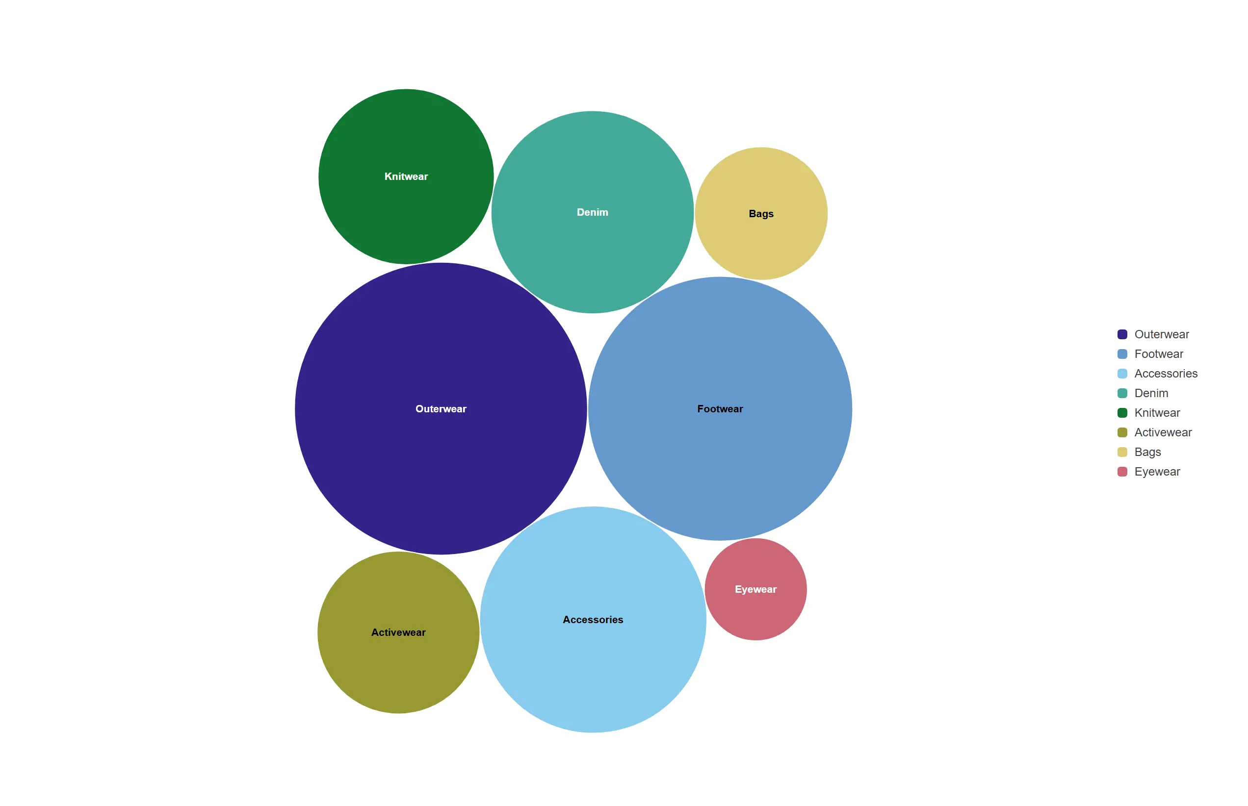
The relative size of every category as a tightly packed cloud, no axis required.
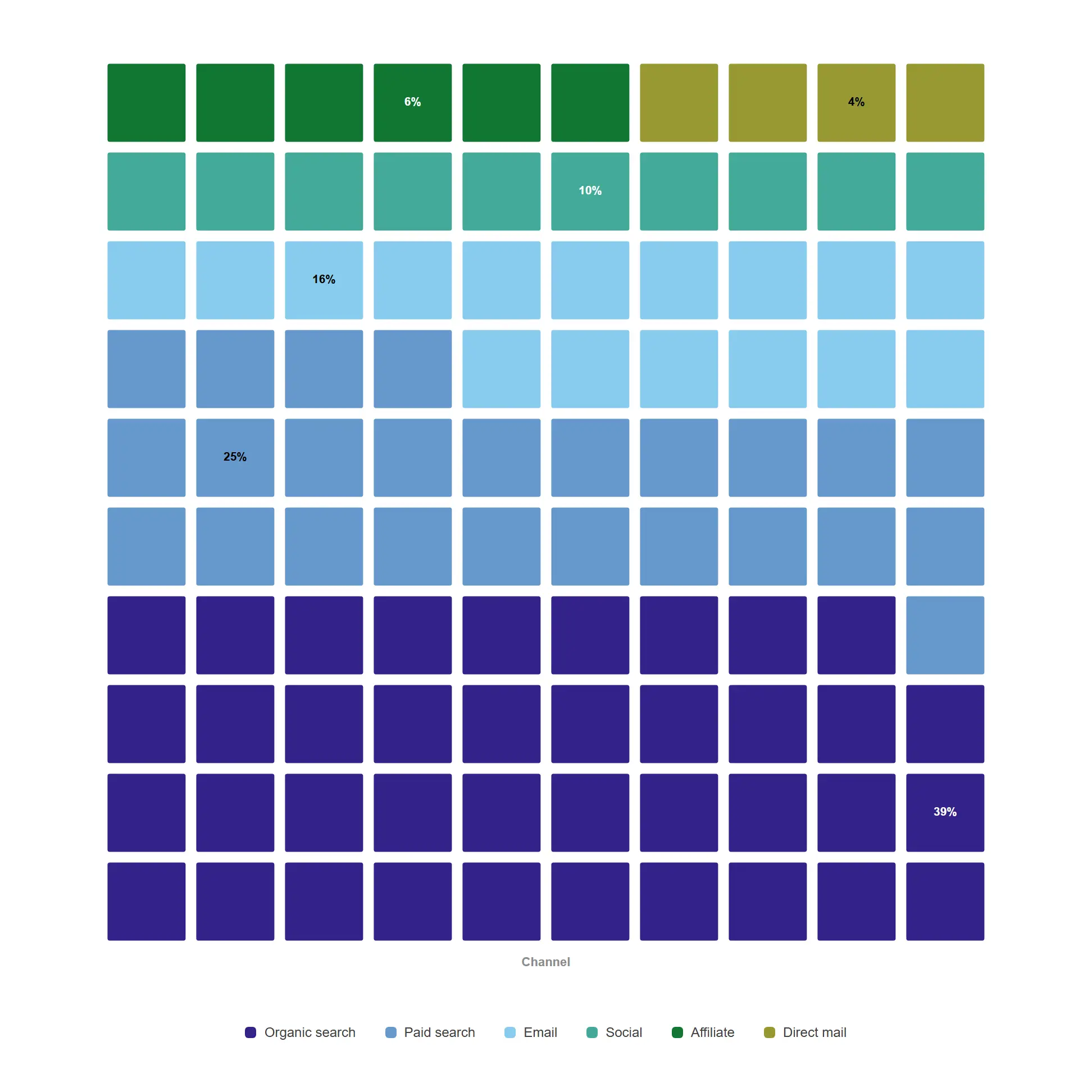
Let people count the share instead of estimating an angle — every square is one percentage point of the total.
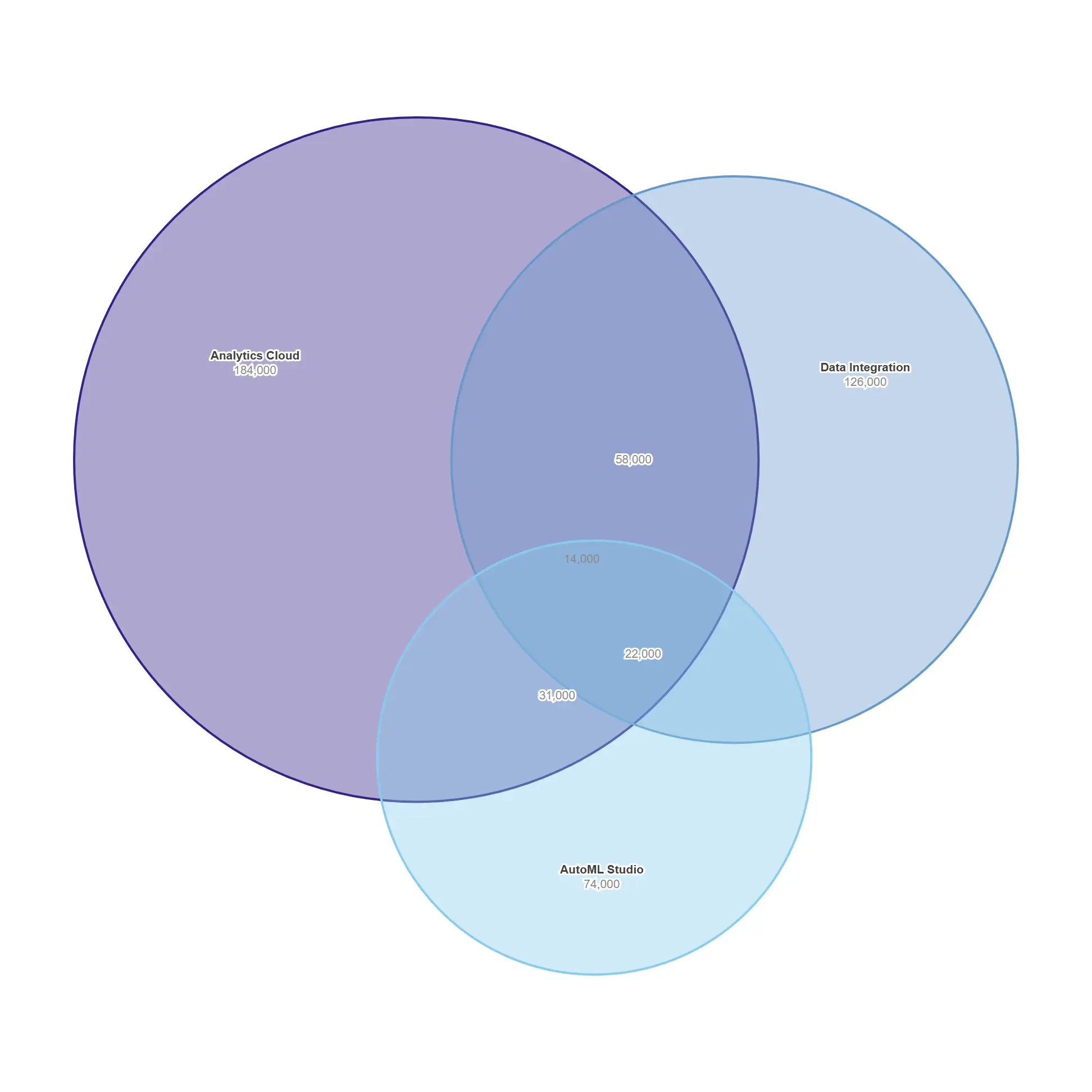
Size the overlap between product lines honestly, with areas that actually match the numbers.
Why this exists
947 Qlik Sense extensions — Qlik's own bundles, 579 open-source projects and 152 commercial products — recorded with their category, capabilities and maintenance state. Then 713 of them were cloned and read. Two findings shaped everything that followed.
Finding one
Qlik's current extension API is nebula / supernova. 4% of what is out there uses it. The rest was written against the API it replaced.
Finding two
576 of the 947 catalogued extensions are abandoned, stale or archived. Every one of them is still installed somewhere, still holding up a sheet someone depends on.
Counted from our ecosystem catalogue on 27 July 2026. The categories are the ones recorded in that survey: "stale" means no release in over a year, "abandoned" means the project is no longer developed.
The suite
The suite is deliberately small. One filter object carries seven display modes rather than shipping as seven products; one text object covers rich text, card grids and dividers. Fewer things in the asset panel, and one property vocabulary to learn.
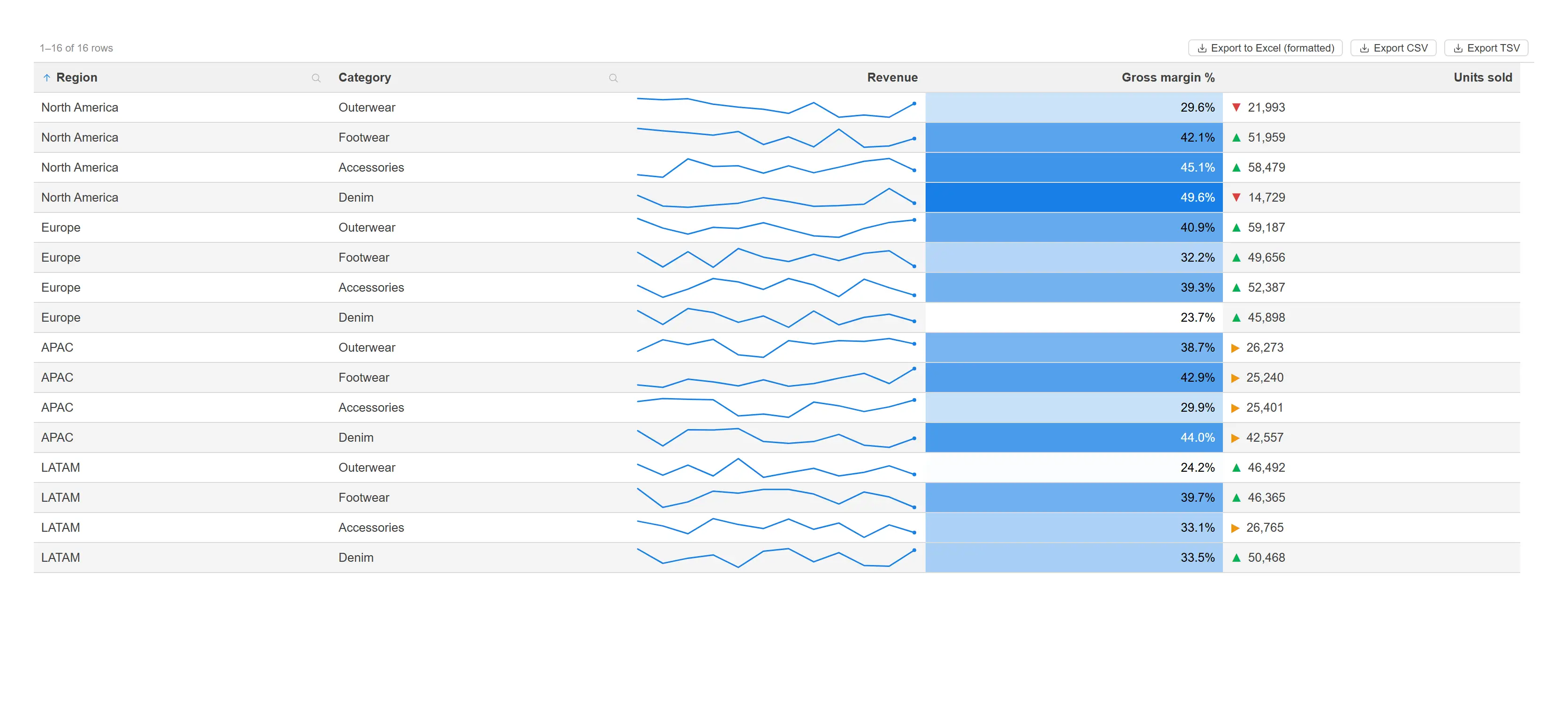
A straight table that earns its space: in-cell sparklines, heat gradients and threshold indicators.
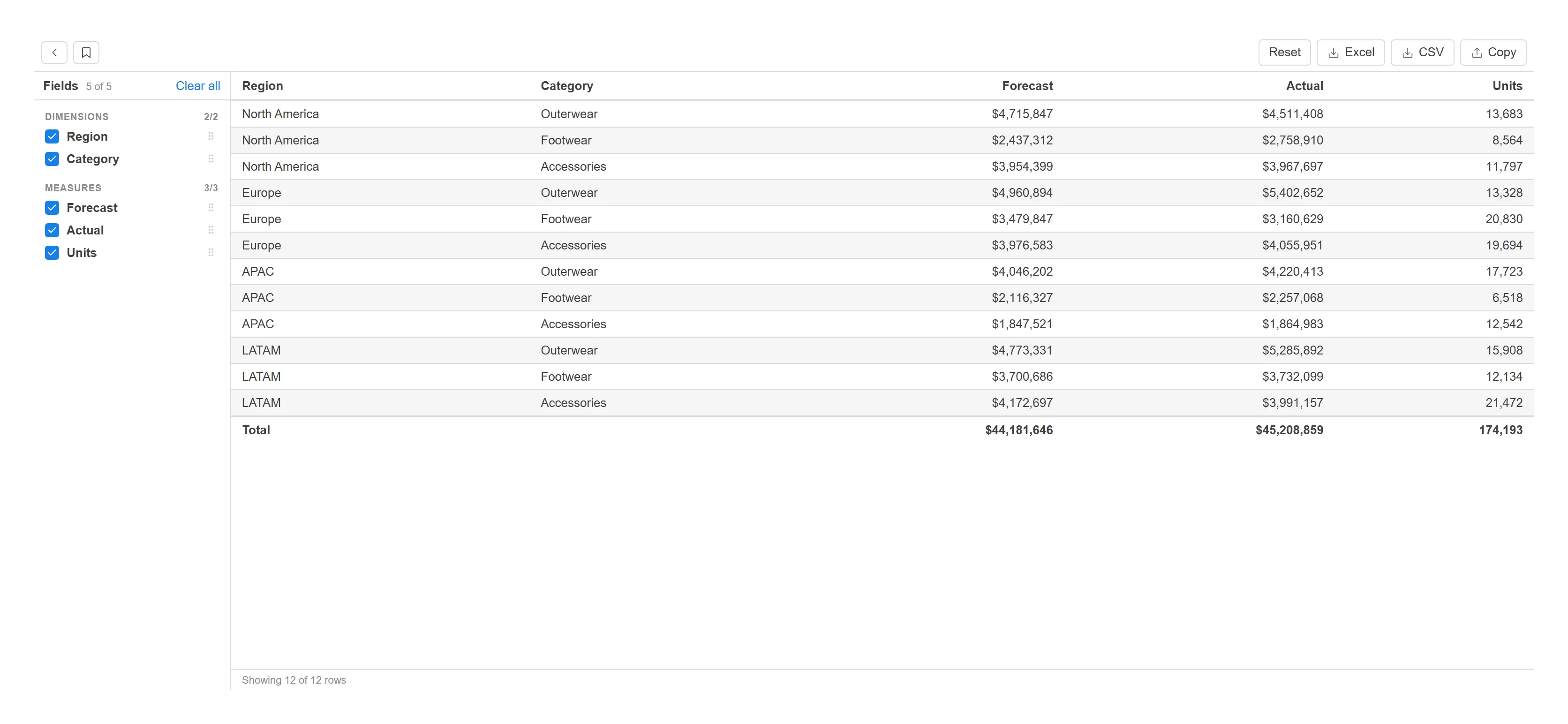
Let analysts assemble, reorder and export their own report without ever leaving the sheet.
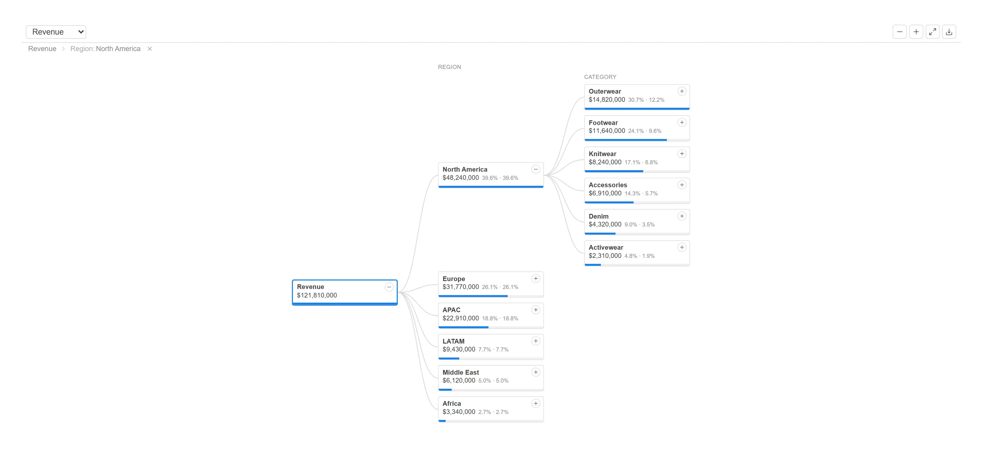
Let anyone break a total apart, one question at a time, and keep the path they took visible.
One runtime, forty chart types.
Forty chart types on one runtime — bars through sankeys, violins, horizon bands and network graphs. Trellis, reference lines, time axes, zoom and canvas rendering for large point counts are properties of the chart, not separate objects.
Replaces An entire commercial chart line, and the D3 one-offs teams paste into text objects.
Break one measure down dimension by dimension, choosing the order as you go. Each branch can follow its own path, and an AI split can probe the candidates and drill toward the highest or lowest contributor.
Replaces Power BI’s decomposition tree, which Qlik has no native answer to.
Project schedule, resource view and event timeline in one switchable object, with dependencies and milestones.
Replaces Qlik’s official guidance for this is a bar-chart workaround.
The number, with the context that makes it mean something.
Target comparison, colour banding, an embedded trend sparkline and a choice of progress bar, radial arc or bullet for the target display. Trellis mode repeats the whole card across a dimension.
Replaces The simple-KPI and tile products, and the KPI-designer layer canvas for everything short of pixel placement.
Up to ten concentric rings, each a value against a target or a shared range. Measure and dimension modes, with selection.
Replaces The one front the competitive analysis found completely unopposed.
Dense, exportable, and editable where it needs to be.
A straight table with minicharts, box plots, per-cell-type conditional formatting, images and links, and a true OOXML export that keeps number formats.
Replaces The commercial advanced-table products and the sparkline-table community extensions.
Self-service reporting inside a published app. The author offers candidate dimensions and measures; the reader assembles, reorders and exports — with nothing written back into the app, so view-only governance holds.
Replaces The flagship self-service report products, without their session-object model.
An editable grid over the data model whose edits persist to a REST endpoint, a Qlik Automate webhook or a variable — identically on client-managed and Cloud.
Replaces Writeback products that need a licensed server component to reach storage.
A validated data-entry form for surveys, CRM enrichment and ops capture, with an audit block attached to every submission. No native form object exists on either Qlik platform.
Replaces Form builders that route through a vendor backend.
The controls that make a sheet feel like an application.
One field-selection control with seven display modes, five search modes, paste-to-select for bulk lists, and per-value measures, icons and indicators. Windowed paging keeps ten-thousand-value fields responsive.
Replaces A commercial filter product plus roughly six community extensions.
Single date, range and presets-only modes, inline or popup, with a preset engine that understands fiscal calendars and dual-field ranges.
Replaces The whole date-picker zoo.
Current selections as chips on the sheet — one pill per field, individually clearable, with lock badges and a global clear.
Replaces Quick-selection bars that live off-sheet.
Set a variable from buttons, a dropdown, an input field or a slider. The value binds through an expression, so every object re-renders the moment it changes anywhere in the app.
Replaces The bundle variable input, and the slider and switch products.
Structure without hacking the Qlik client.
An in-grid navigation bar with icons, expression-driven states and popovers — Cloud-safe, because it never touches the client chrome.
Replaces Two split product lines whose chrome-hiding breaks on Qlik Cloud.
Five display modes — tabs, accordion, carousel, dropdown and hidden — hosting real master visualisations, each keeping its own hypercube and selections. Active pane persists, which the native container does not do.
Replaces The container box and container grid products.
Rich HTML or Markdown with live inline expressions, data-driven content from a measure, and card grids with images and selections. Sanitised by default, with an offline icon set that needs no CDN.
Replaces The advanced-text, cards and divider products at once.
Colour and select regions of any SVG — floorplans, seat maps, stadiums, warehouses, process diagrams. No GeoJSON, no tile server, no network call.
Replaces Geo products, for every map that is not geography.
Grounded in your data model, validated by the engine.
Describe what you want to see and get it built from this app’s own data model. The Copilot reads your fields, master items and current selections, designs a specification, and has the Qlik engine check every expression before anything renders. What comes back are Chart+ charts, and "Add to sheet" turns them into real objects.
Replaces AI chart features that need a vendor backend and per-seat quotas.
Writeback
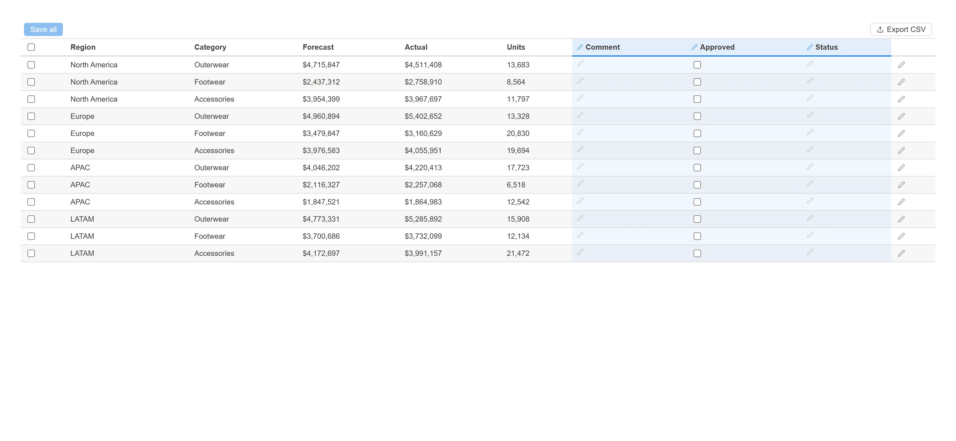
The established writeback products reach a database through the vendor's own backend — a Windows service or a Docker container to license, install, patch and secure. On Qlik Cloud those same products fall back to REST anyway.
ExtraSense writes to a REST endpoint, a Qlik Automate webhook or a variable, straight from the object, with validation and an audit block attached to every submission. There is no ExtraSense server, because there is nothing for it to do.
The case
Each of these is a structural difference rather than a feature-list comparison. Feature lists change every release; these do not.
The API generation decides how gracefully your sheets survive Qlik’s roadmap, and whether a fix to selection behaviour lands in one object or has to be repeated in seventeen.
How the market does it
Of 947 catalogued extensions, 581 are built on Qlik’s legacy Extension API and 39 on nebula/supernova. Across Vizlib’s 52 products, 46 are legacy and none are nebula.
ExtraSense
Every ExtraSense object is a nebula supernova on a shared core. Forty chart types are not forty codebases — they are forty renderers on one runtime that owns hypercube mapping, selection state, theme palettes and number formatting exactly once.
You are choosing a maintenance relationship, not a download.
How the market does it
576 of the 947 catalogued extensions are abandoned, stale or archived. That is the true cost of assembling a dashboard from the community: the object works until the day it does not, and there is no one to call.
ExtraSense
One vendor, one release train, one shared foundation. Sixteen packages ship together, versioned together, with 236 test files across the suite.
No extra box in the architecture diagram, no second procurement, and identical behaviour on client-managed and Cloud.
How the market does it
The market-leading writeback products reach a database through the vendor’s own backend — a Windows service or a Docker container that must be licensed, installed, patched and secured. On Qlik Cloud those same products fall back to REST.
ExtraSense
ExtraSense writeback targets REST endpoints and Qlik Automations directly from the object. There is no ExtraSense server, because there is nothing for it to do.
Fewer objects in the asset panel, one property vocabulary to learn, and a sheet that looks like one product.
How the market does it
Suites grow by adding products: a listbox, a dropdown, a button-filter and a filter-popup are four purchases and four property panels to learn.
ExtraSense
One Filter object carries seven display modes. One Variable Input covers slider, switch and range. One Smart Text covers rich text, card grids and dividers. One Chart+ covers 40 chart types.
The person who builds the sheet is usually not the person who reads the manual.
How the market does it
Depth in this market is usually expressed as more toggles. It is normal to meet panels with well over a hundred settings, and layer canvases whose own documentation recommends a maximum layer count.
ExtraSense
Progressive disclosure is a rule in our design system, not an aspiration: first useful result in two fields, everything else in collapsed Advanced groups with defaults that are already right.
The default output is the presentable output — which is the only setting most sheets ever use.
How the market does it
Most extensions accept whatever colours the author picks, render numbers with their own formatter, and leave accessibility to the buyer.
ExtraSense
Data ink is checked against its background by a contrast guard before it is drawn. Categorical colours come from a colourblind-safe palette. Every number is formatted by the Qlik engine through the field’s own qNumFormat, so a figure on an ExtraSense chart matches the same figure in a native table.
Nothing here is a mockup
All 130 gallery shots are rendered by the shipping extension code through an automated harness, against a synthetic business dataset. Each one is checked programmatically — for ink coverage, colour range and console errors — before it is allowed into the gallery, and 130 of 130 passed on the current run. The Copilot screenshots above are from the suite's live verification run against a generated demonstration app. No mockups, no concept art, no screenshots of somebody else's dashboard.
A demo runs against a Qlik app you already have, so the question stops being whether the charts look good and starts being whether they answer your question. Tell us what your sheets are struggling with and we will build that.