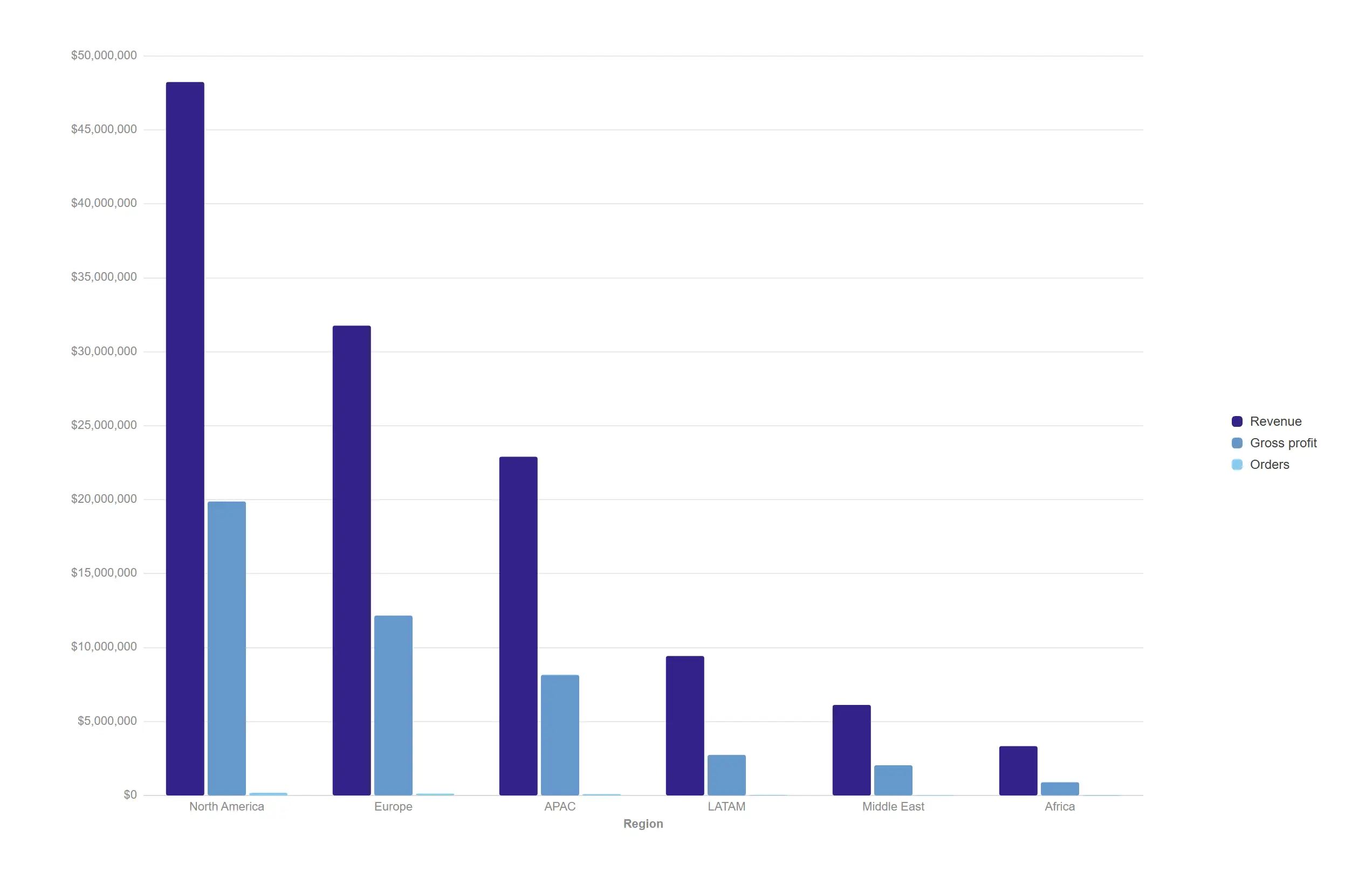
Grouped bar
Chart+Compare several measures across every category at a glance, with the legend, axis formats and colours already right.
Three measures, auto series legend, gridlines on.
Gallery
Not mockups and not concept art. Each image below was produced by the shipping extension code running against a synthetic business dataset, then checked programmatically before it was allowed in. The line under each caption names the settings that produced that particular result, in the same words the property panel uses.
Rendered 25 July 2026 · 130 of 130 shots passed automated quality checks on this run.
The everyday workhorses — bars, lines, areas and combos that carry most of a dashboard, finished to a premium standard straight out of the box.
Compare several measures across every category at a glance, with the legend, axis formats and colours already right.
Three measures, auto series legend, gridlines on.
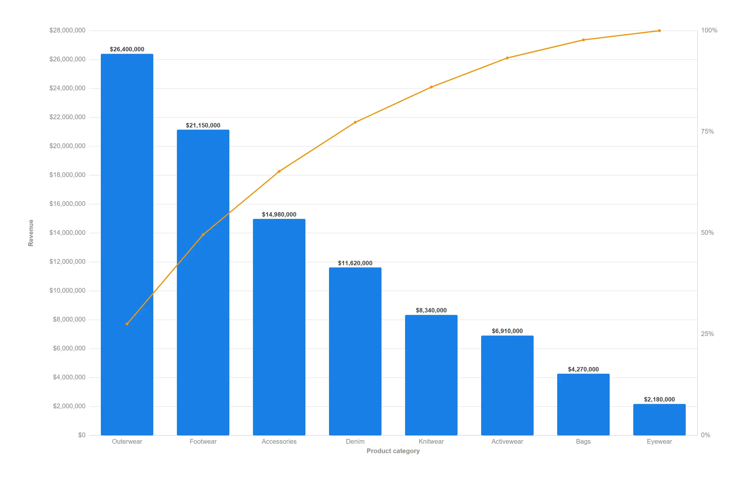
Find the handful of categories that drive most of the result, ranked and cumulated in one move.
props.bar.pareto = true with value labels on the bars.
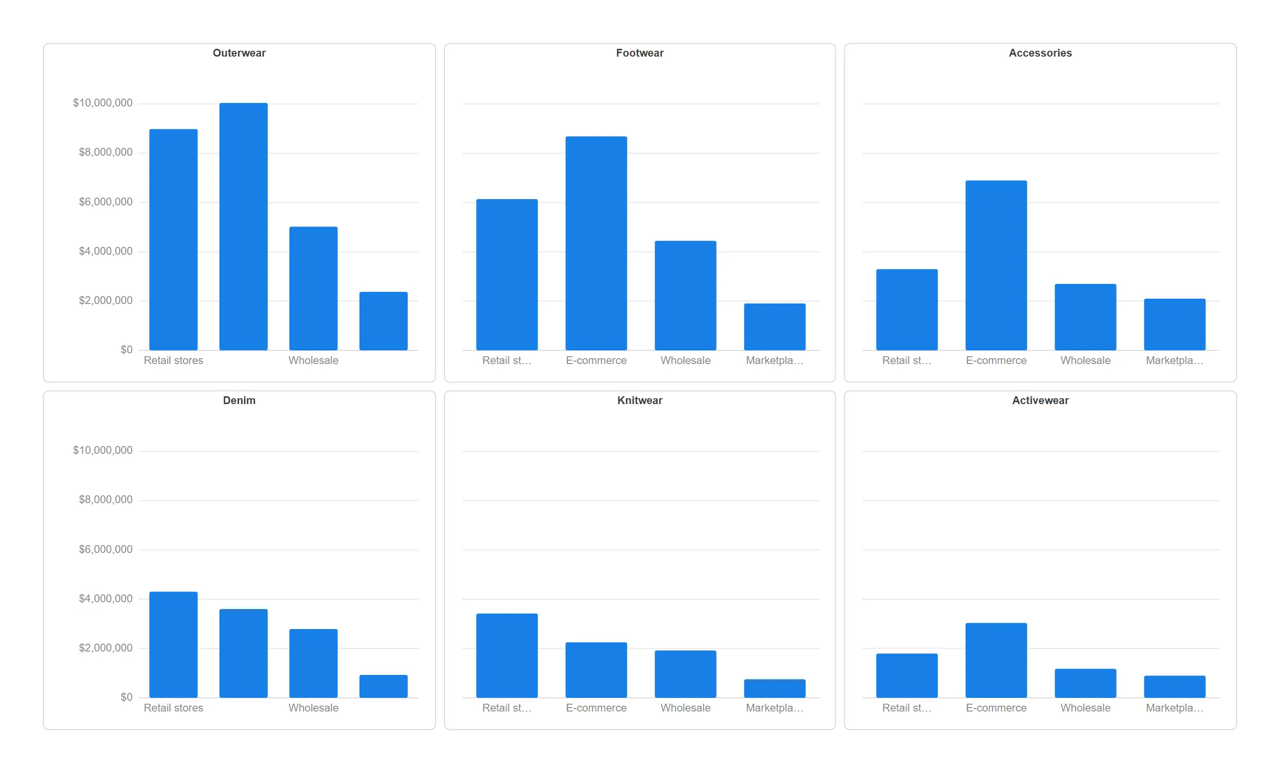
Repeat the same chart once per category so differences jump out instead of hiding inside a stack.
props.trellis.enabled = true with shared scales across all six cells.
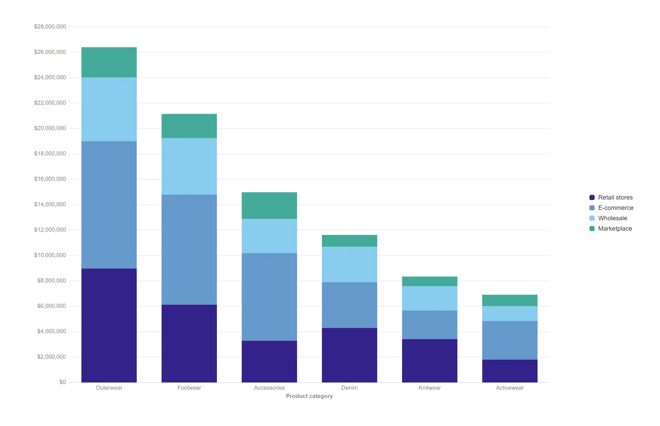
Keep the total readable while still showing what each channel contributes to it.
Two dimensions: categories on the axis, channel as the stack.
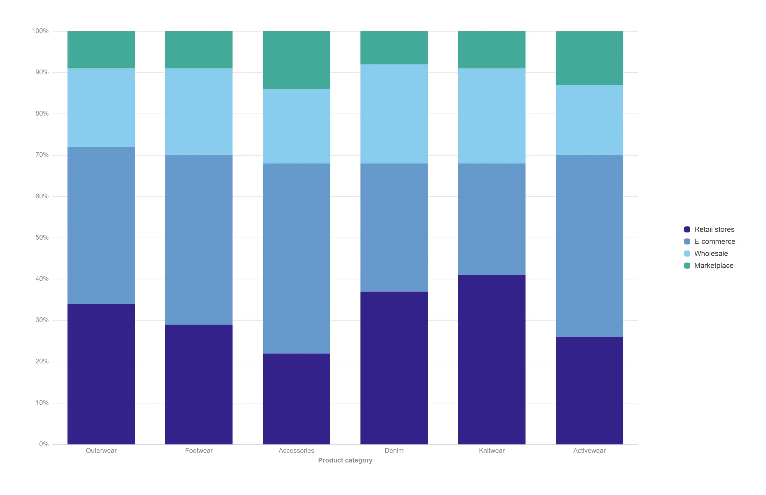
Compare mix instead of size, so a small category argues on equal terms with a large one.
props.stack.percent = true (relative stacking).
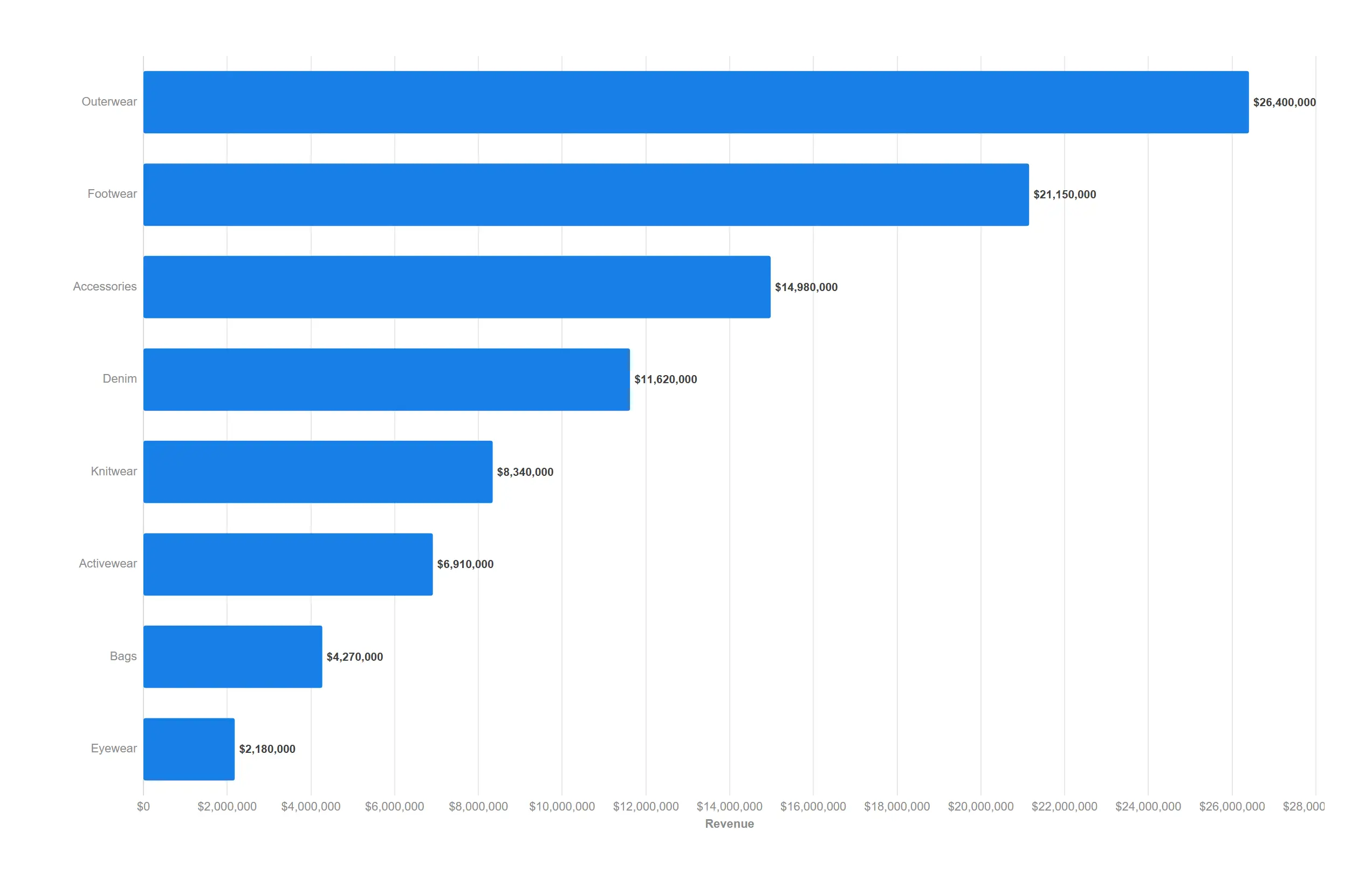
Give long category names the room they need and let the ranking read top to bottom.
Value labels on, gridlines on, single measure.
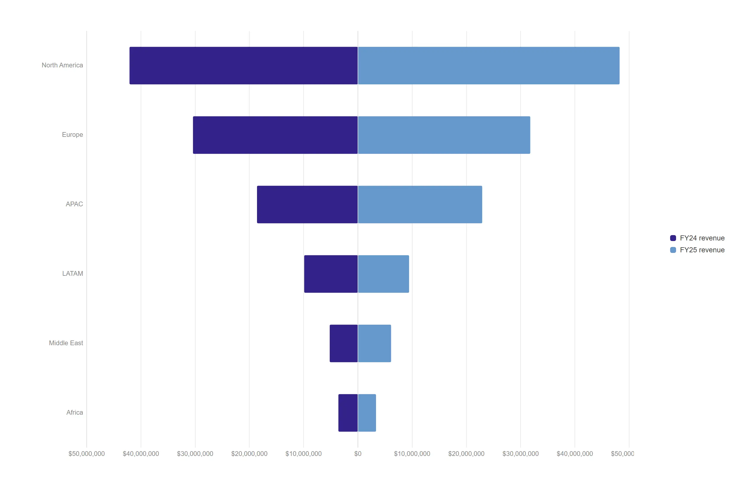
Set two years against each other on a shared spine so the shift in shape is impossible to miss.
props.barH.butterfly = true with two measures.
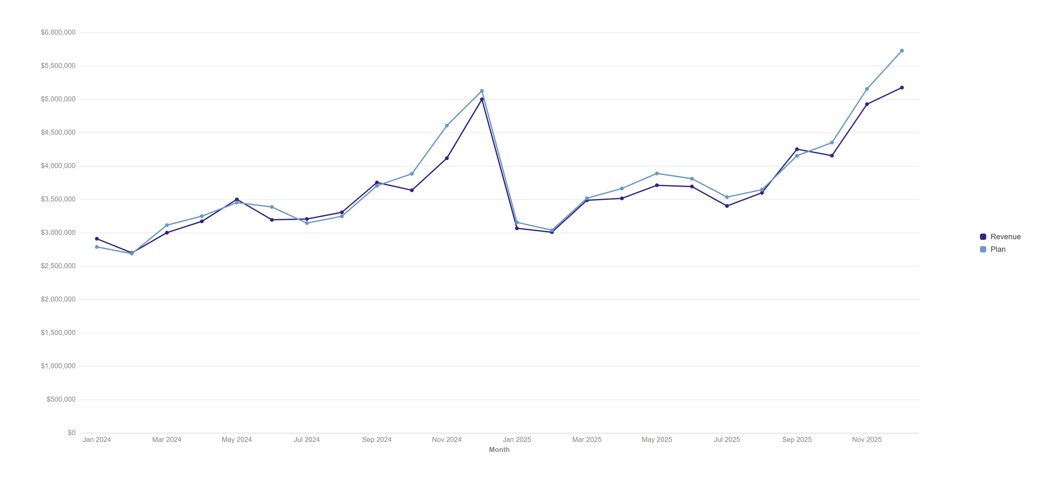
Track performance against plan across two years of months without a single formatting decision.
Point markers on, engine date axis, gridlines.
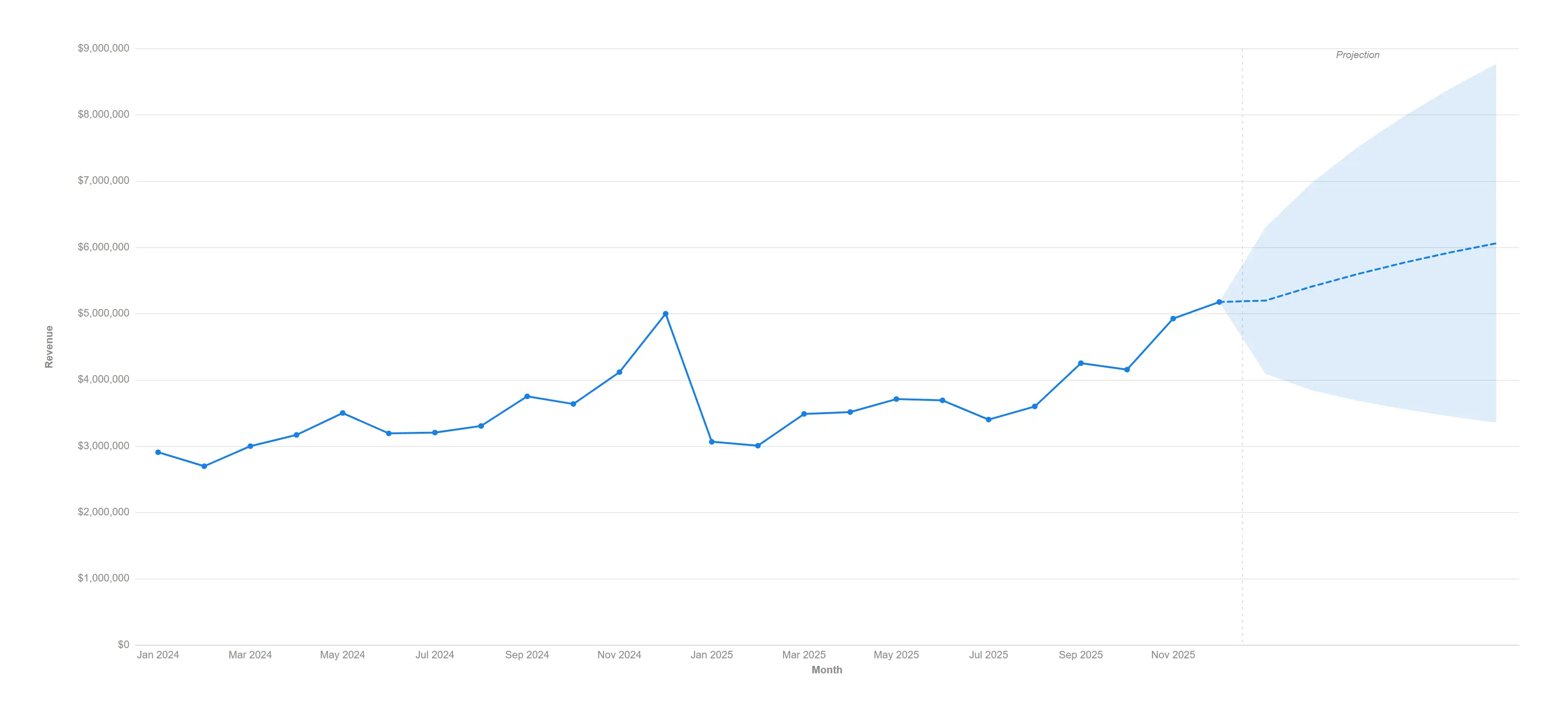
Extend the trend six months forward with a clearly labelled projection nobody can mistake for actuals.
props.forecast.enabled with the damped-trend (Holt) method, 6 periods.
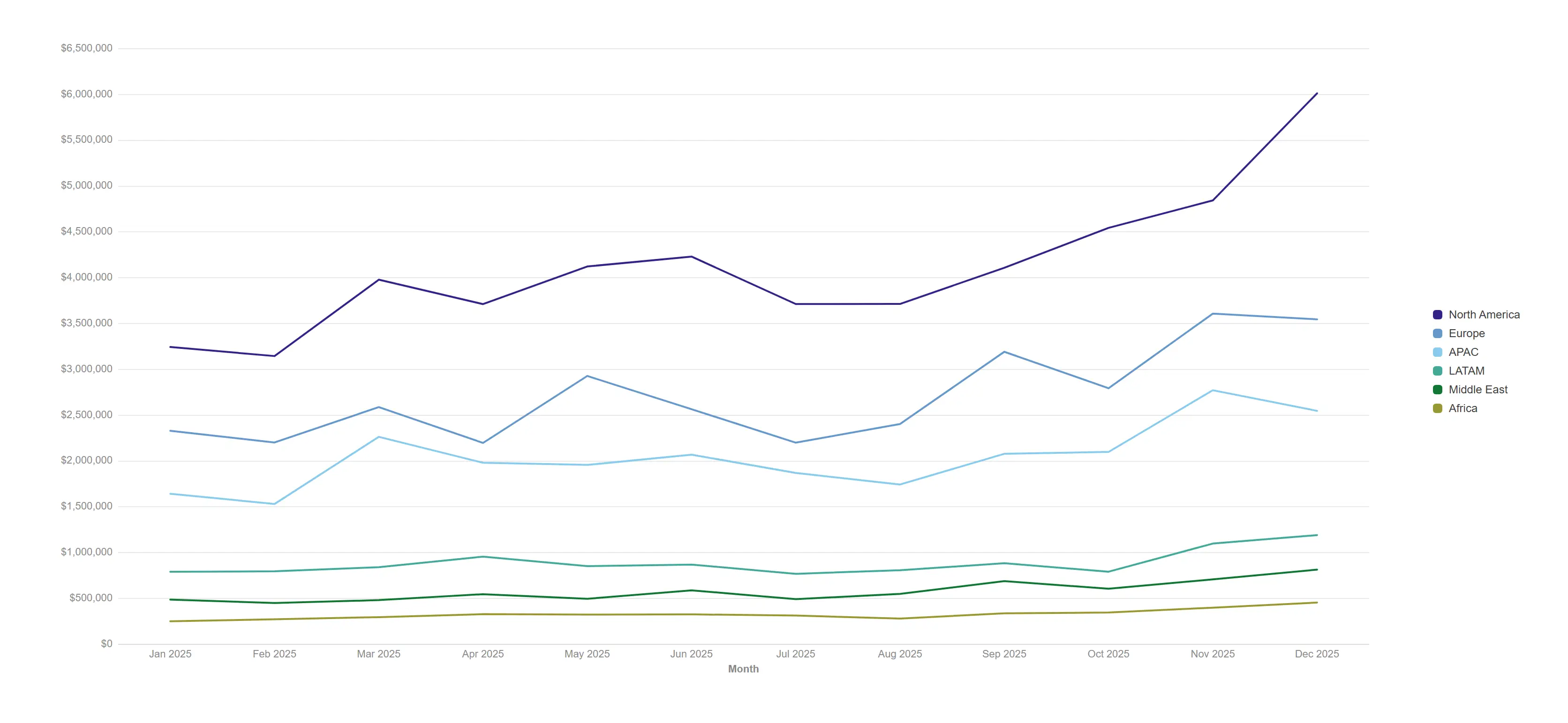
Put every region on one time axis and let the outlier find you.
Two dimensions (month × region), brush zoom armed on the date axis.
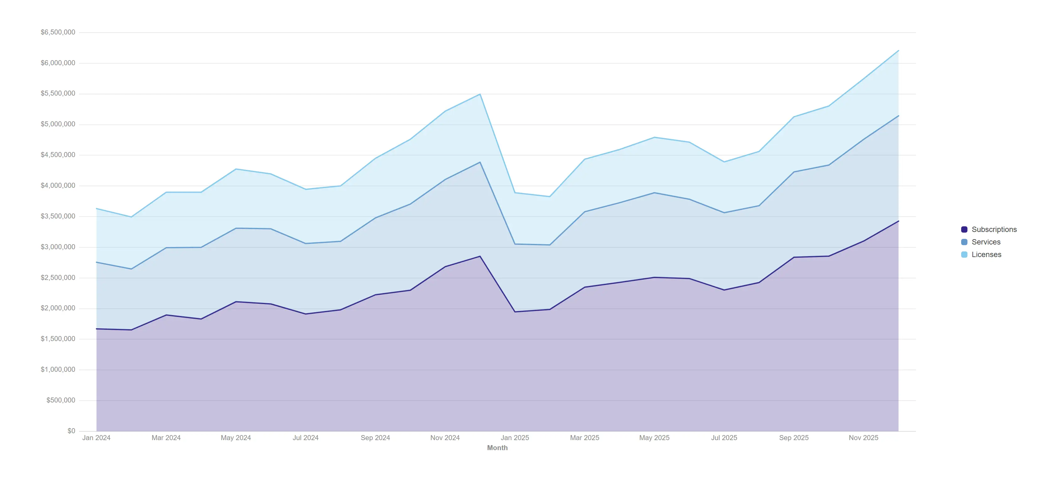
Show how the revenue mix grew, not just that it grew.
props.area.stacked = true over three revenue streams.
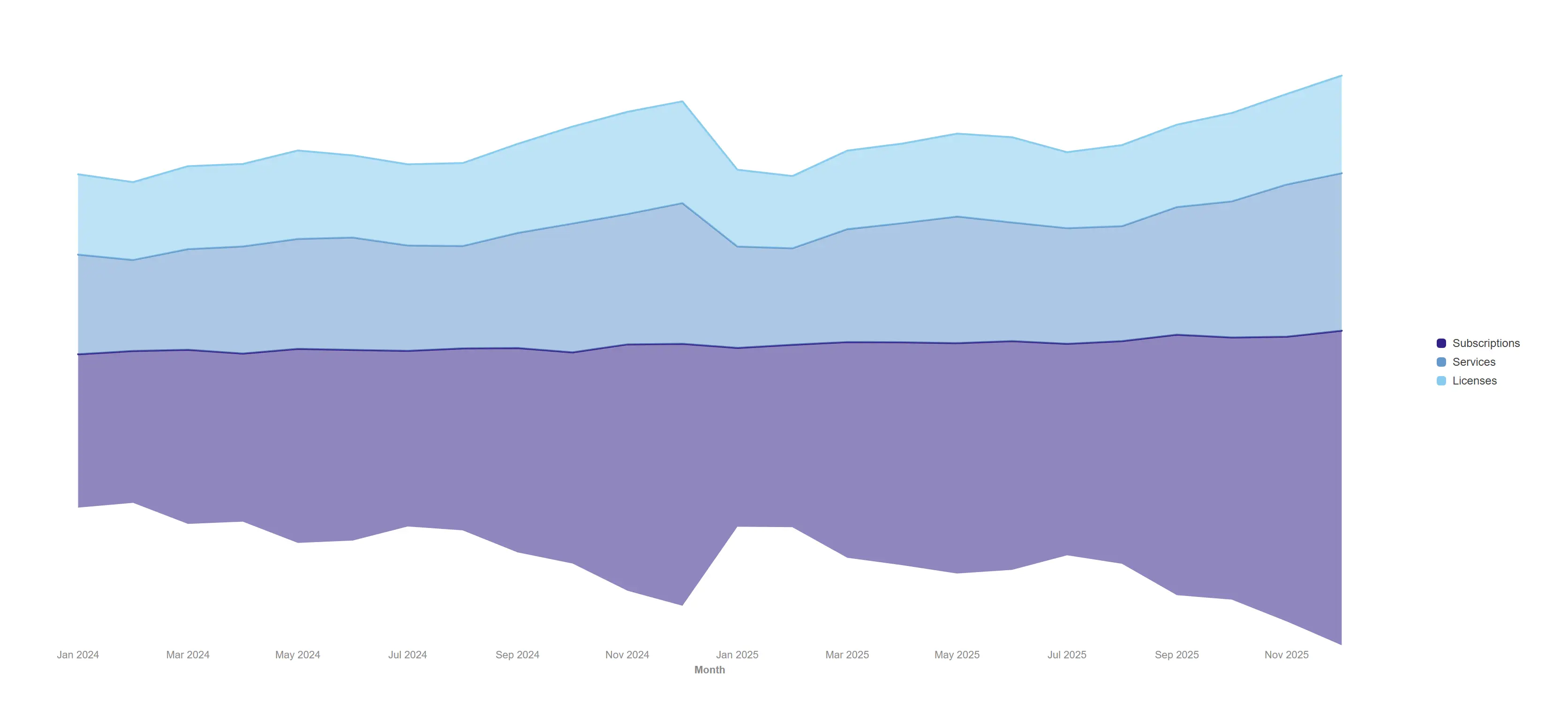
Trade the baseline for beauty when the story is rhythm and share rather than absolute totals.
props.area.offset = "wiggle" on a stacked area.
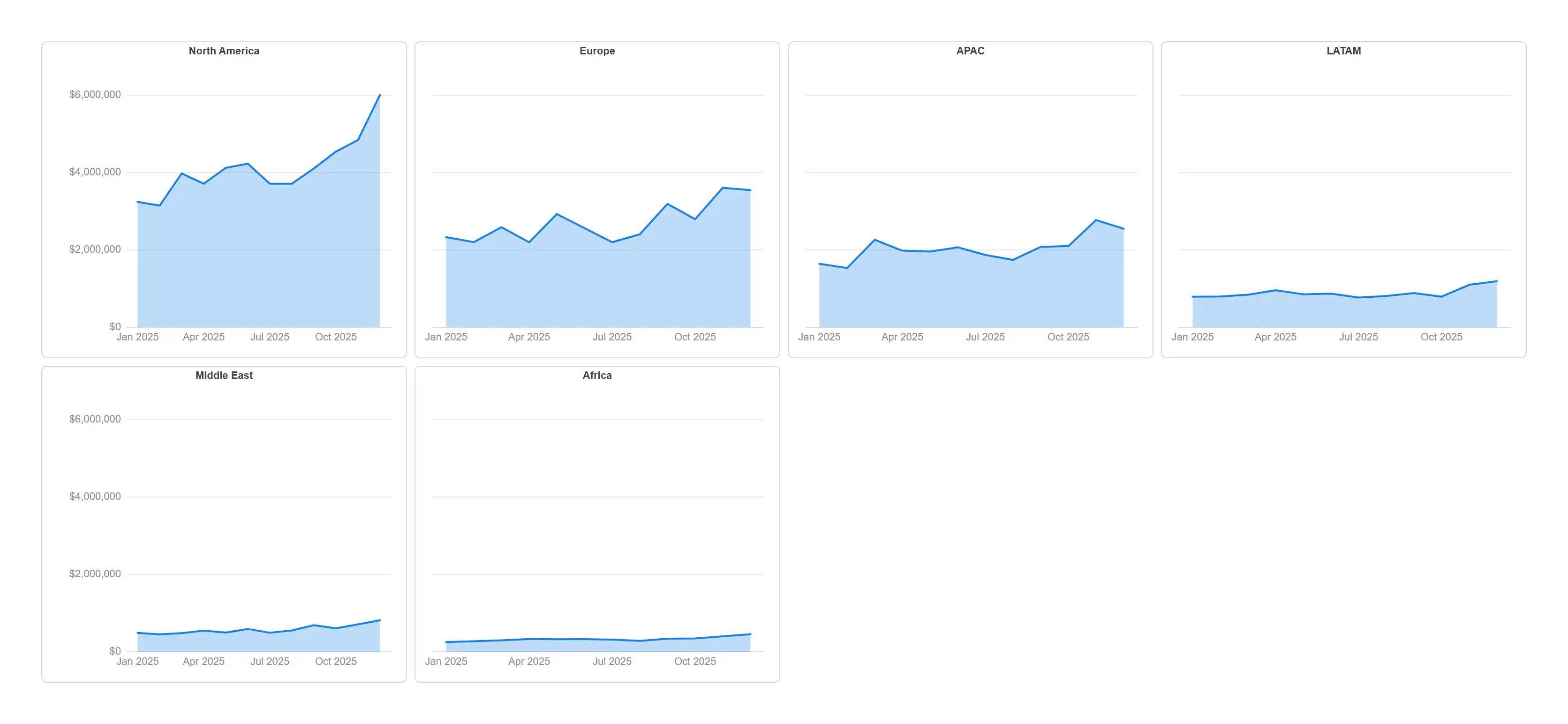
Give every region its own panel and compare shapes on one shared scale.
props.trellis.enabled with shared scales; last dimension repeats.
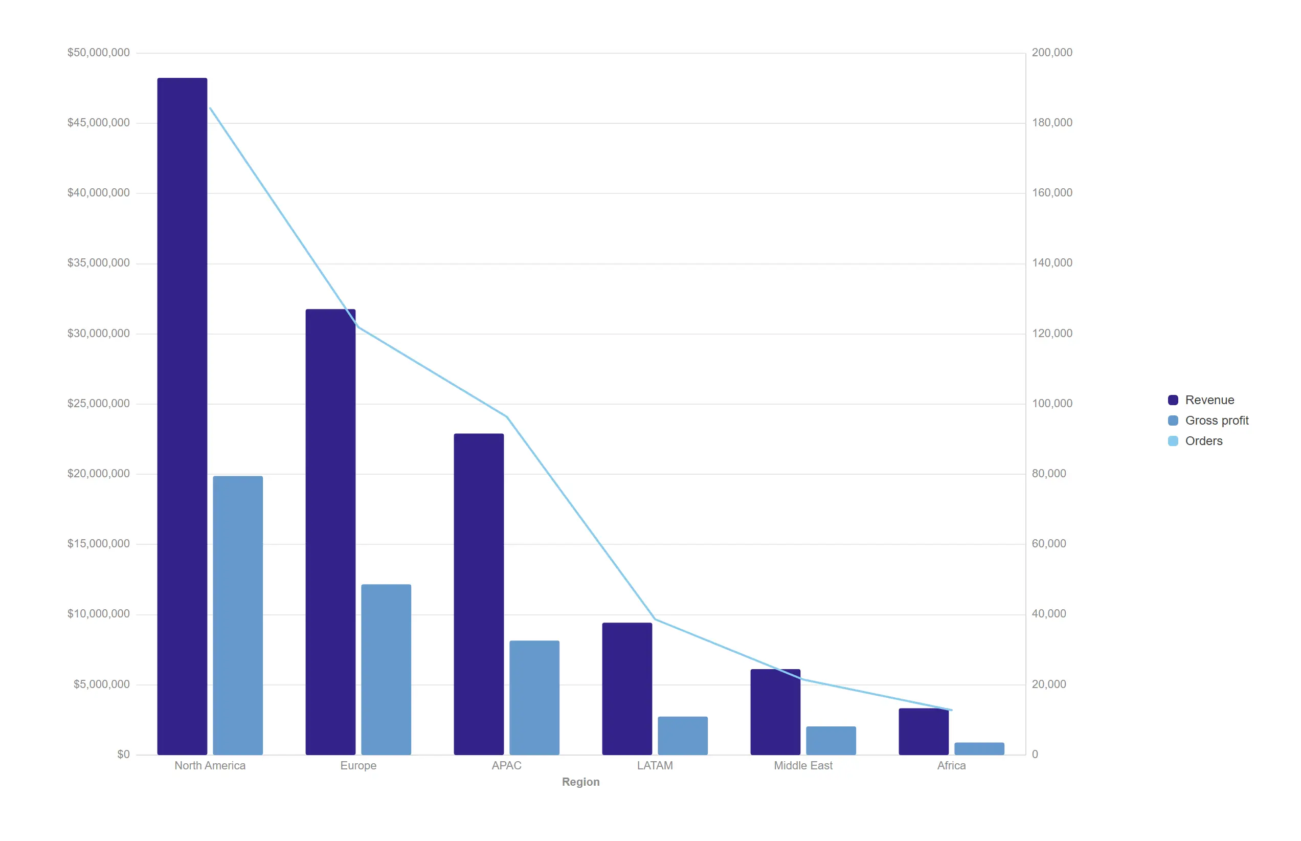
Mix volume and rate in one frame with a second axis that does the arithmetic for you.
props.combo.roles pins measures 1–2 to bars and measure 3 to a line.
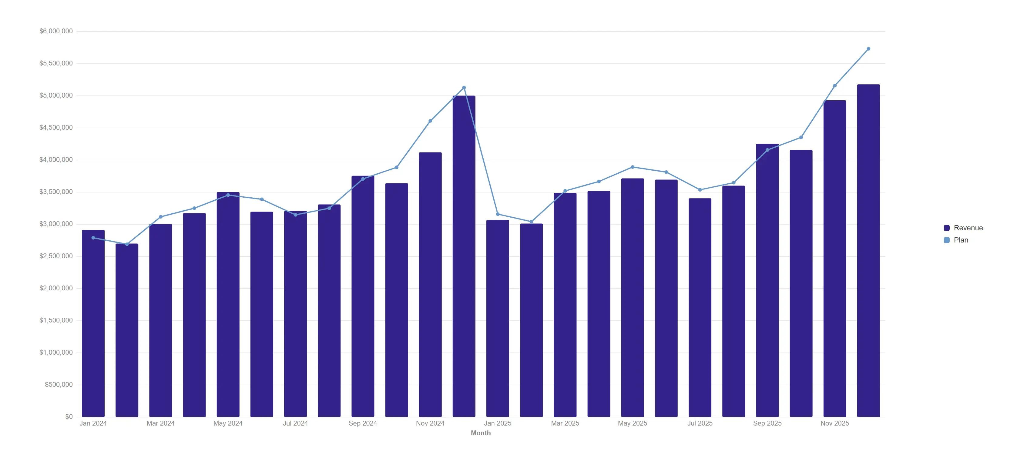
Bar the actuals, line the plan, and let the gap tell the story month by month.
props.combo.roles = bar + line with markers.
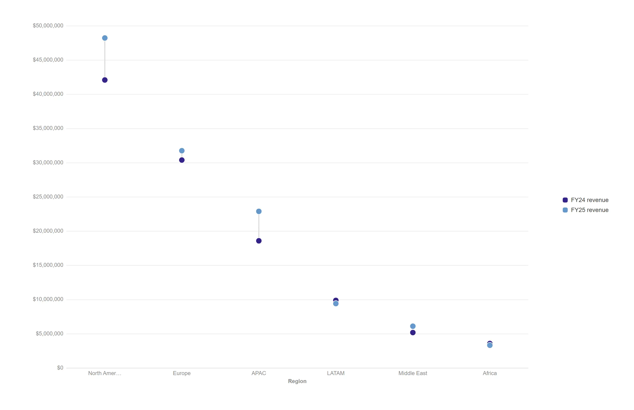
Show the distance travelled between two periods rather than making people subtract two bars.
Two measures produce the dumbbell; connector plus per-measure dots.
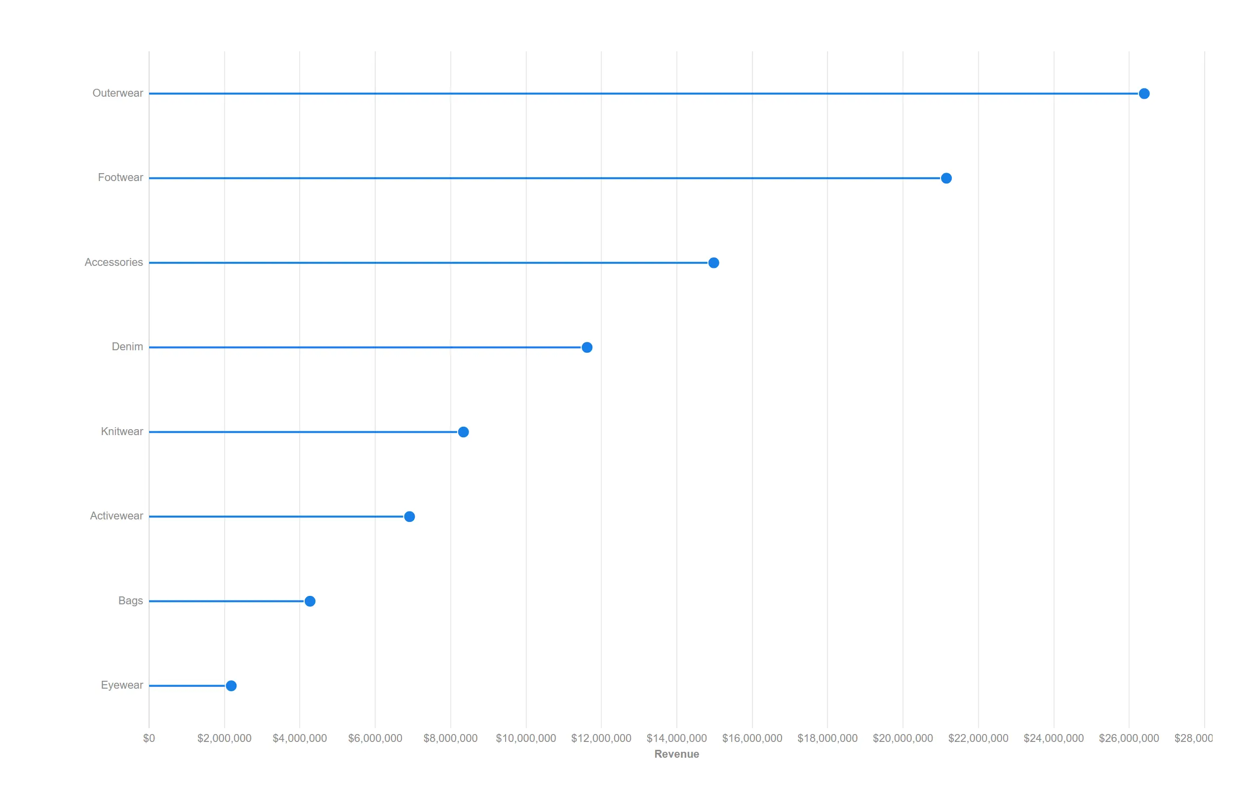
All the ranking a bar chart gives you, with a fraction of the ink.
Single measure plus props.dot.horizontal = true.
Show how a total breaks apart, from a single donut to a four-level product hierarchy, without leaving the object.
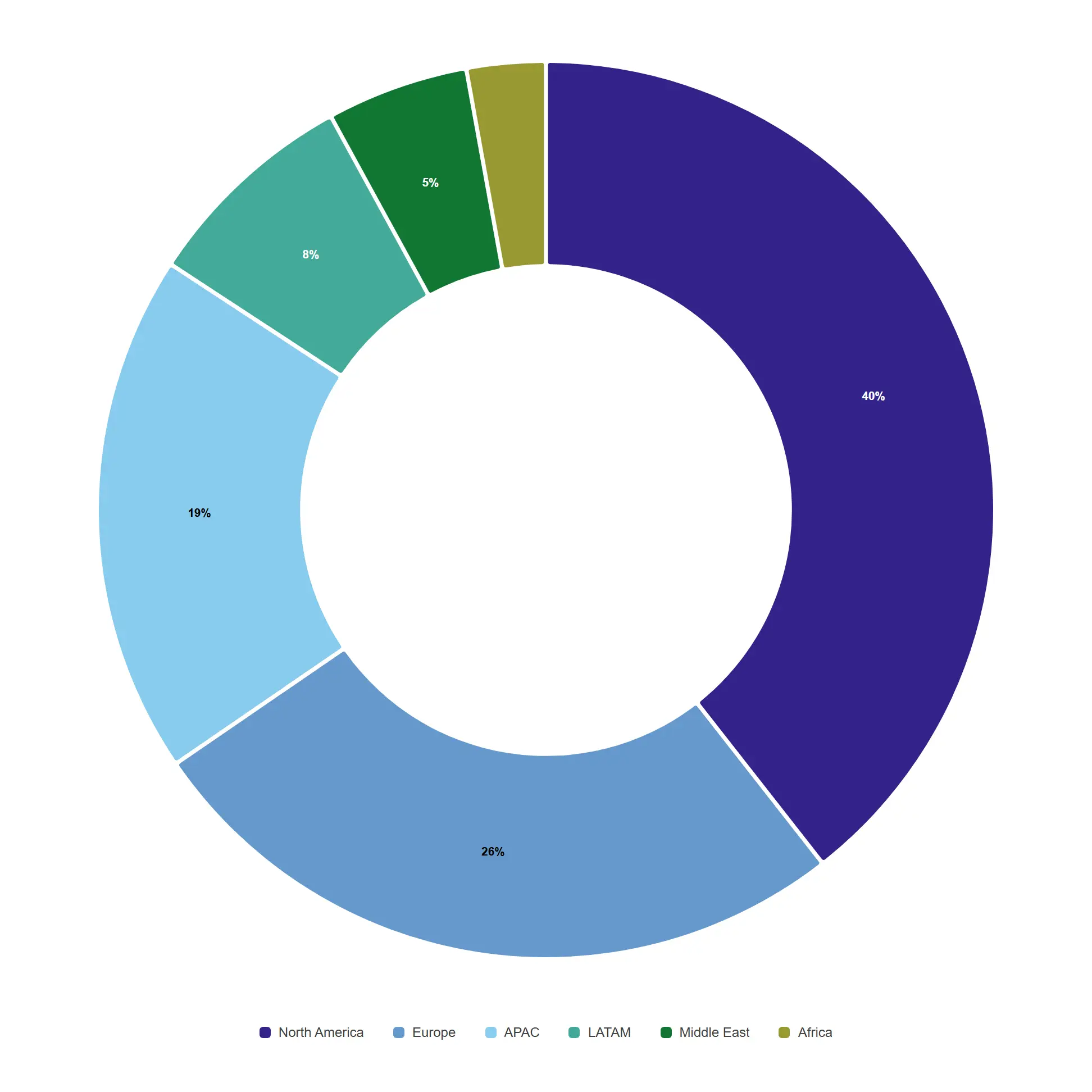
The share-of-total classic, with native Qlik colours and engine-formatted values built in.
props.pie.donut = true (the default look) with value labels.
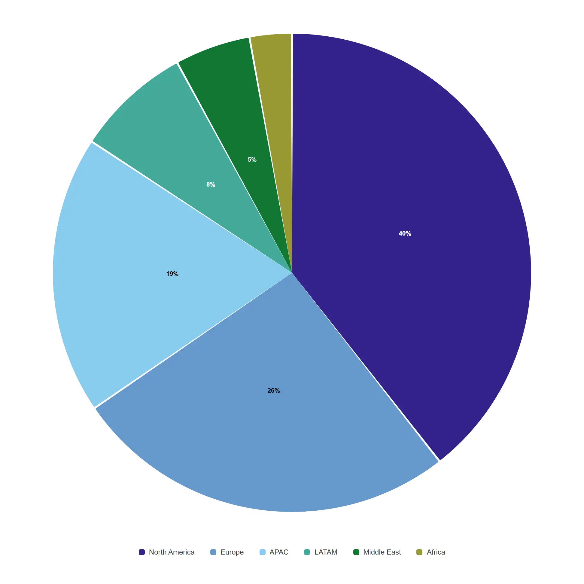
When the total itself is the headline, close the hole and let the whole circle speak.
props.pie.donut = false with labels on the slices.
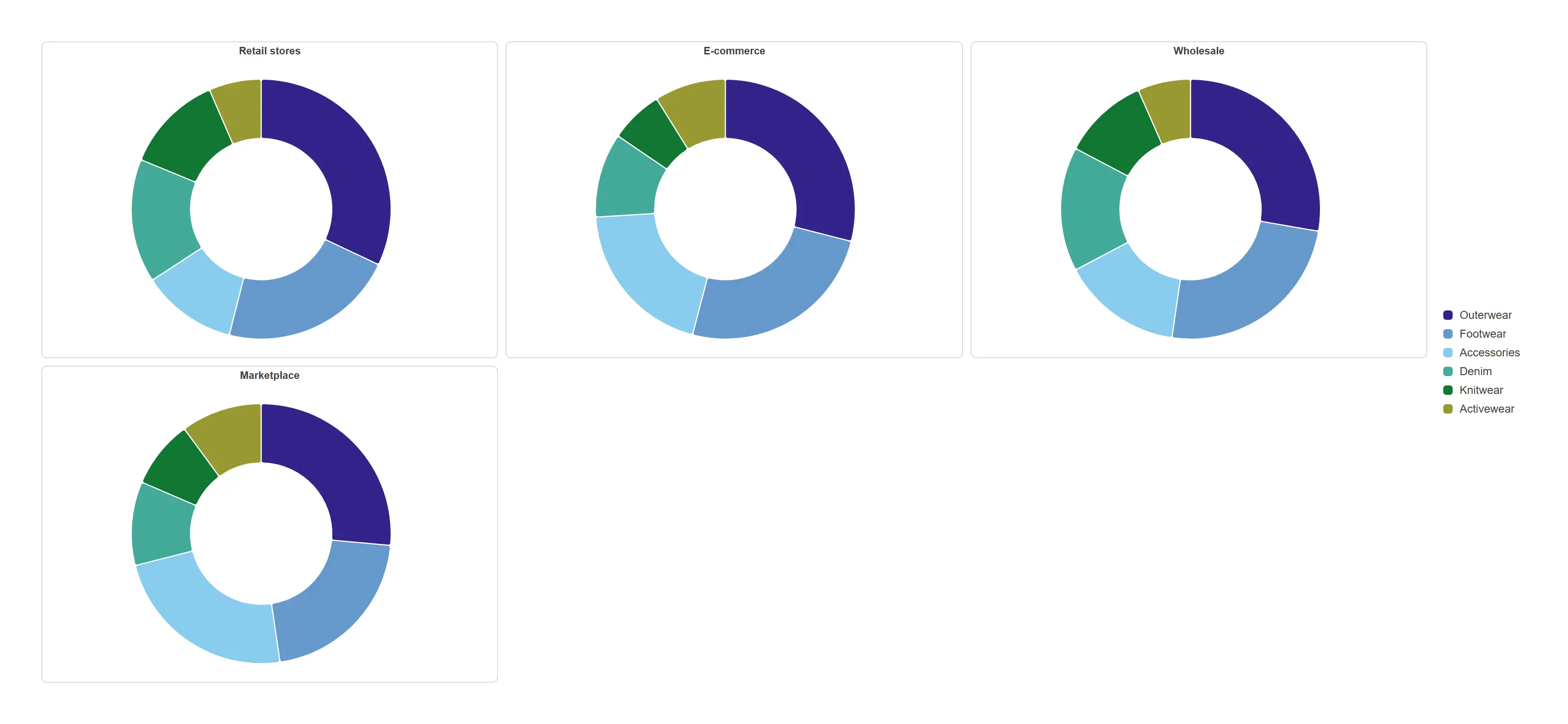
One donut per channel, so mix differences across channels read side by side.
props.trellis.enabled repeats the donut over the last dimension.
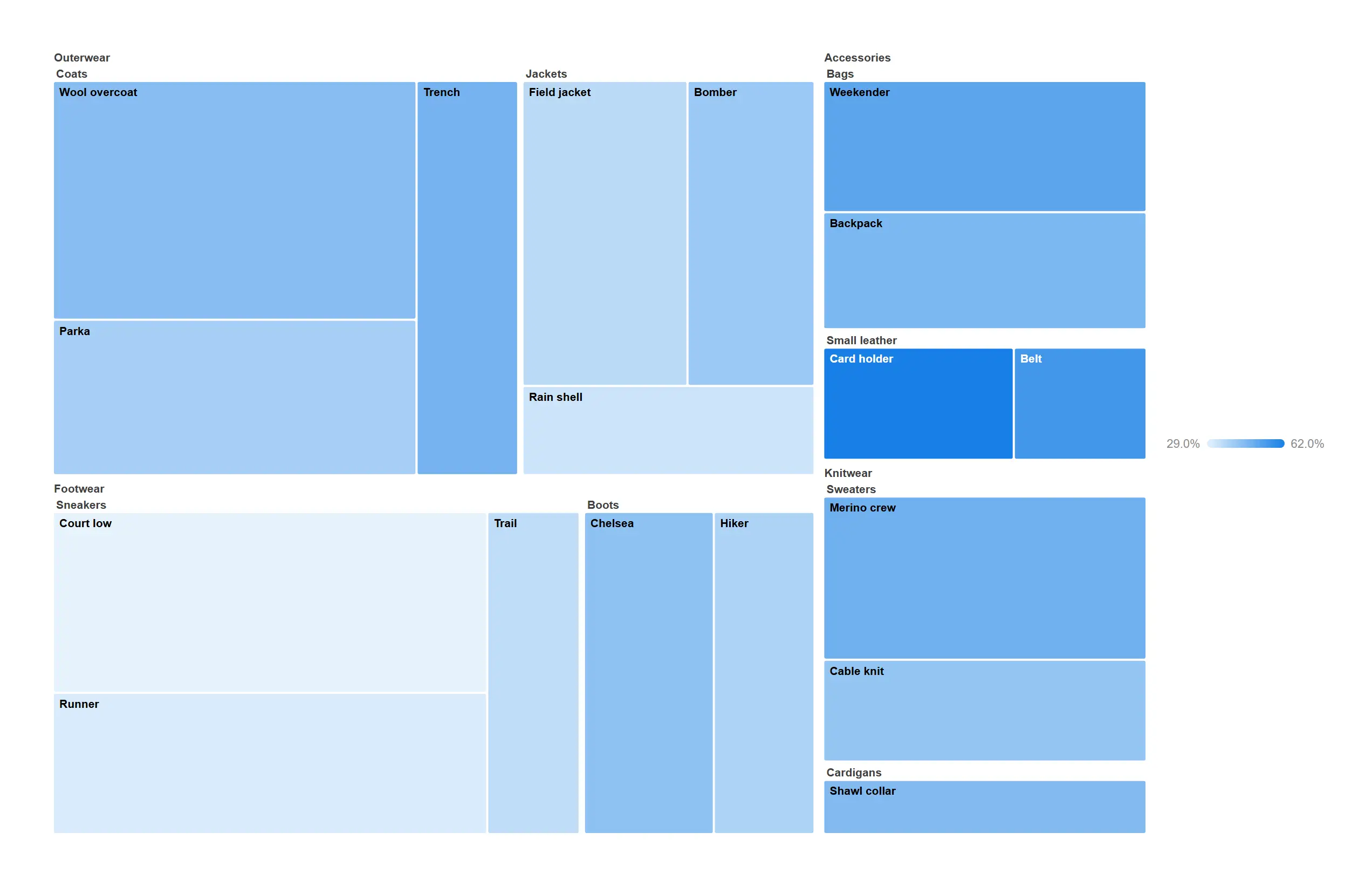
Fit a three-level product hierarchy into one rectangle and still see every product.
Category → subcategory → product sized by revenue, coloured by margin.
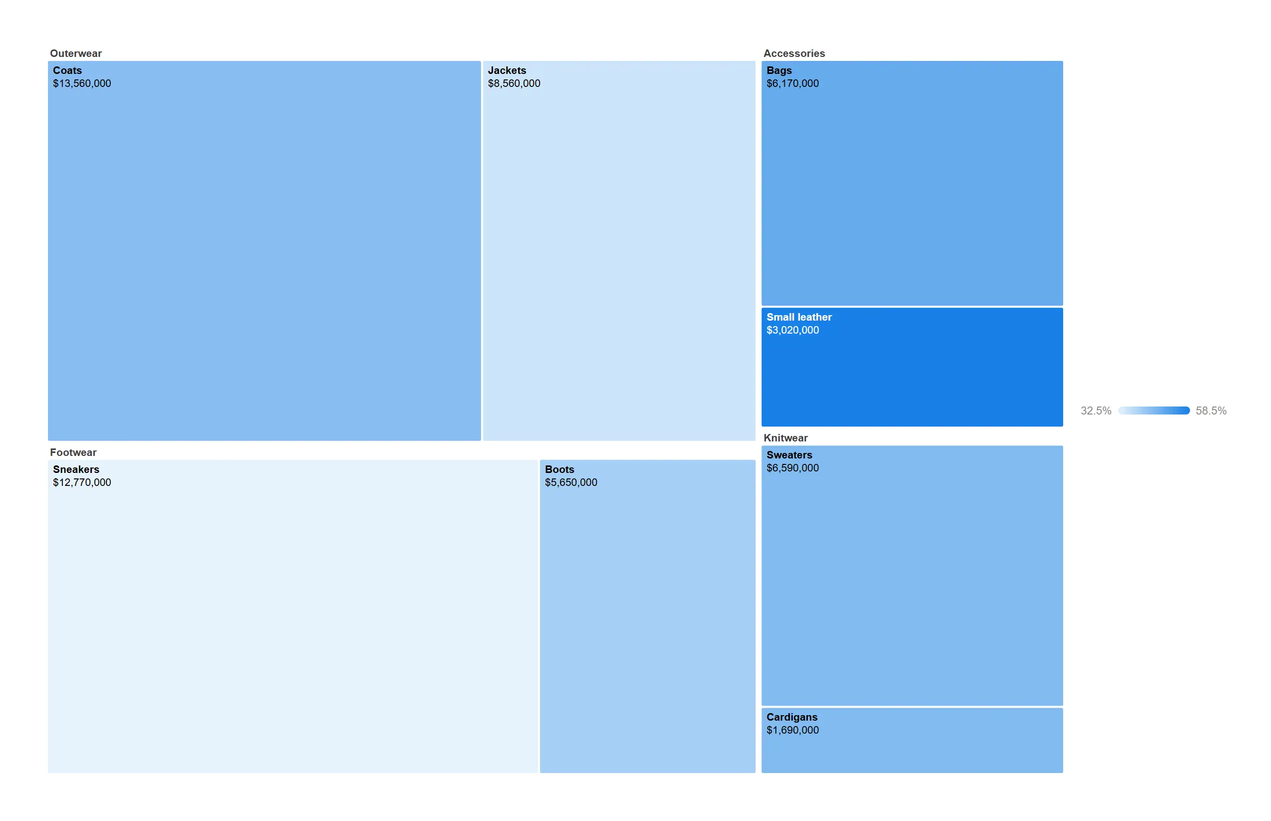
Keep the map readable on a small tile by stopping the hierarchy one level early.
Two dimensions with value labels on the cells.
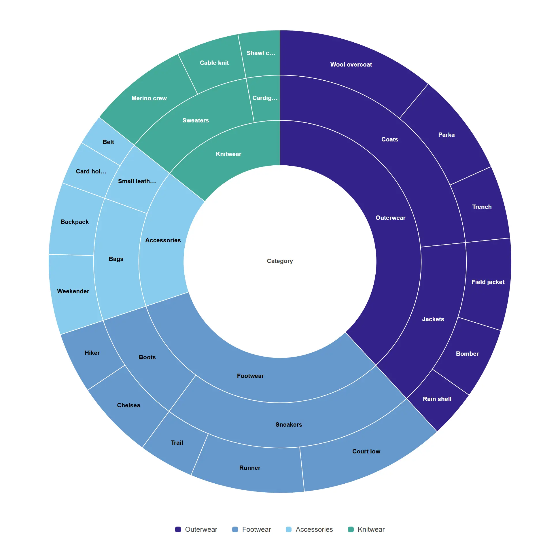
Read a hierarchy from the inside out, with every ring proportional to the level above it.
Three nested dimensions, single size measure.
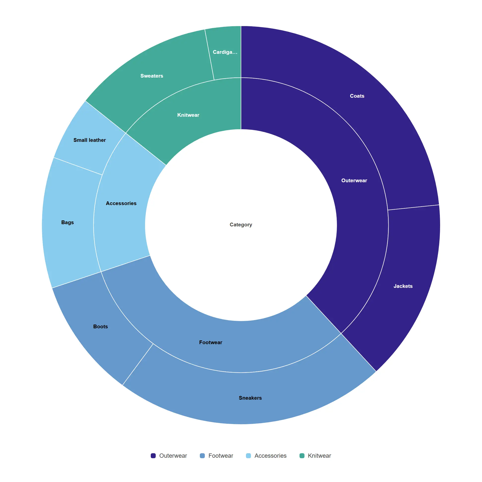
A compact composition ring that still shows where each subcategory sits.
Two dimensions with the legend on the right.
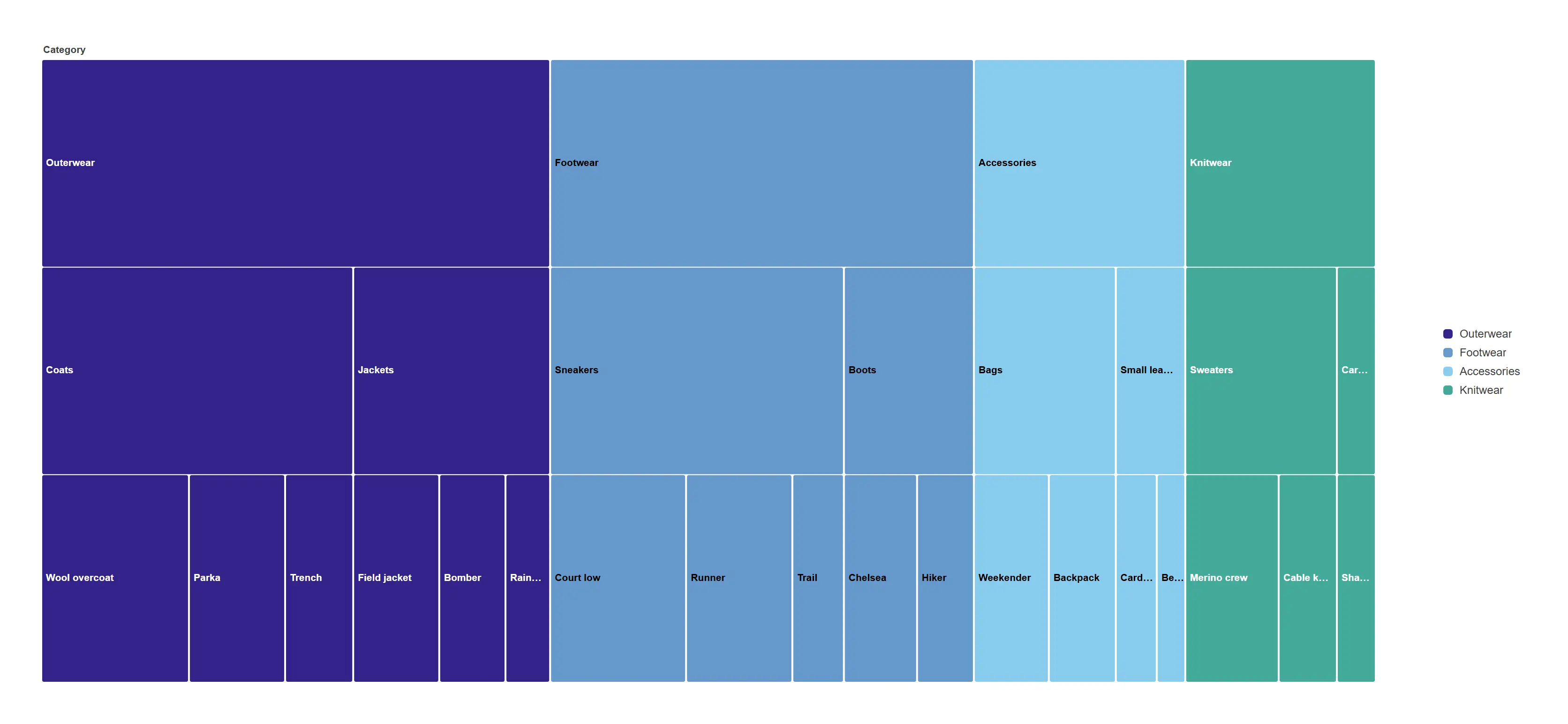
The same hierarchy as a sunburst, squared off — so the labels run horizontally and a deep tree stays readable.
props.sunburst.layout = icicle. Click a block to drill in, the breadcrumb to come back.
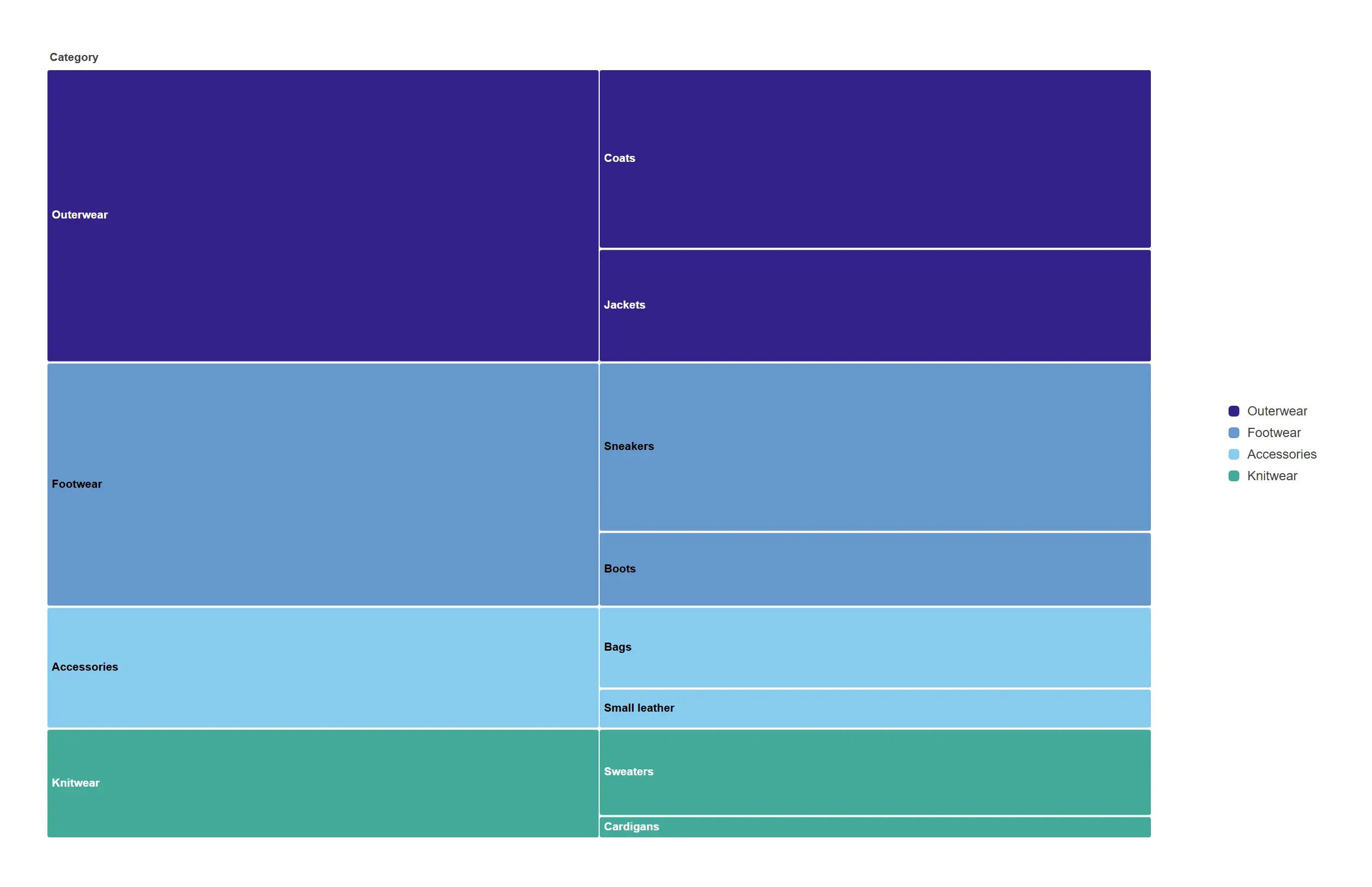
Grow the levels sideways when the category names are long — every label gets the full width of its block.
props.sunburst.orient = horizontal on the same nested cube.
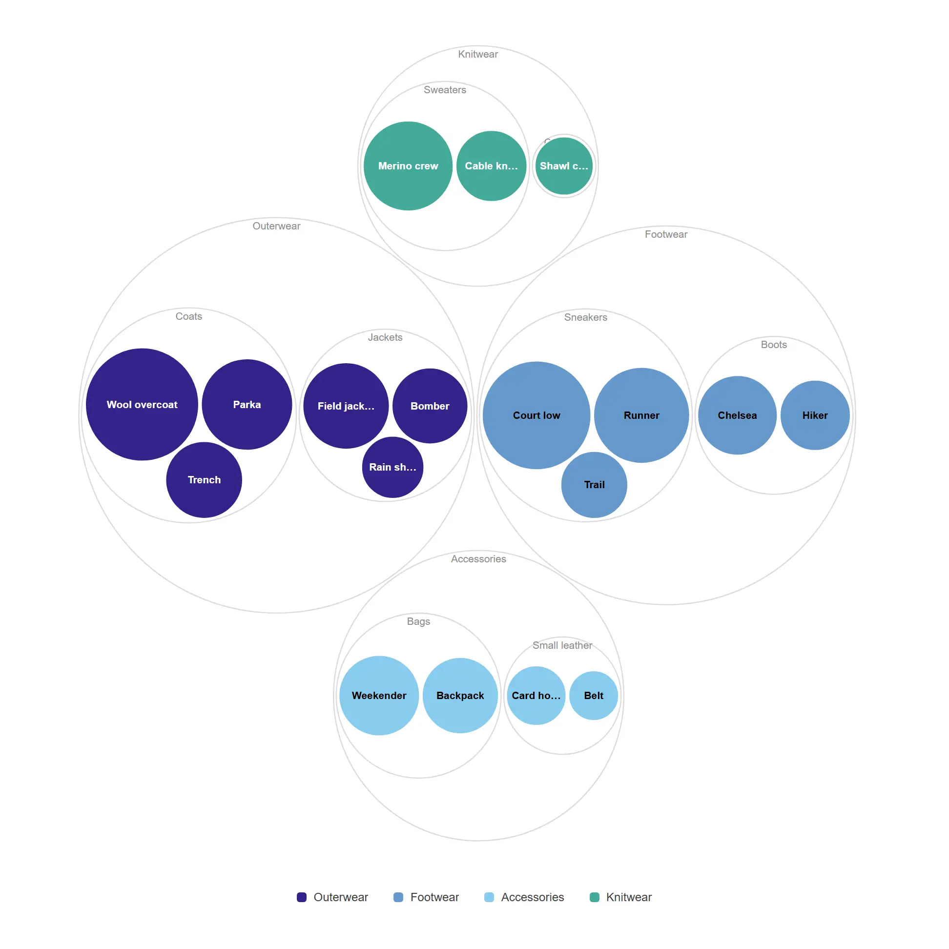
A hierarchy that reads as structure first and numbers second — ideal for exploring an unfamiliar catalogue.
Three dimensions, area proportional to revenue.
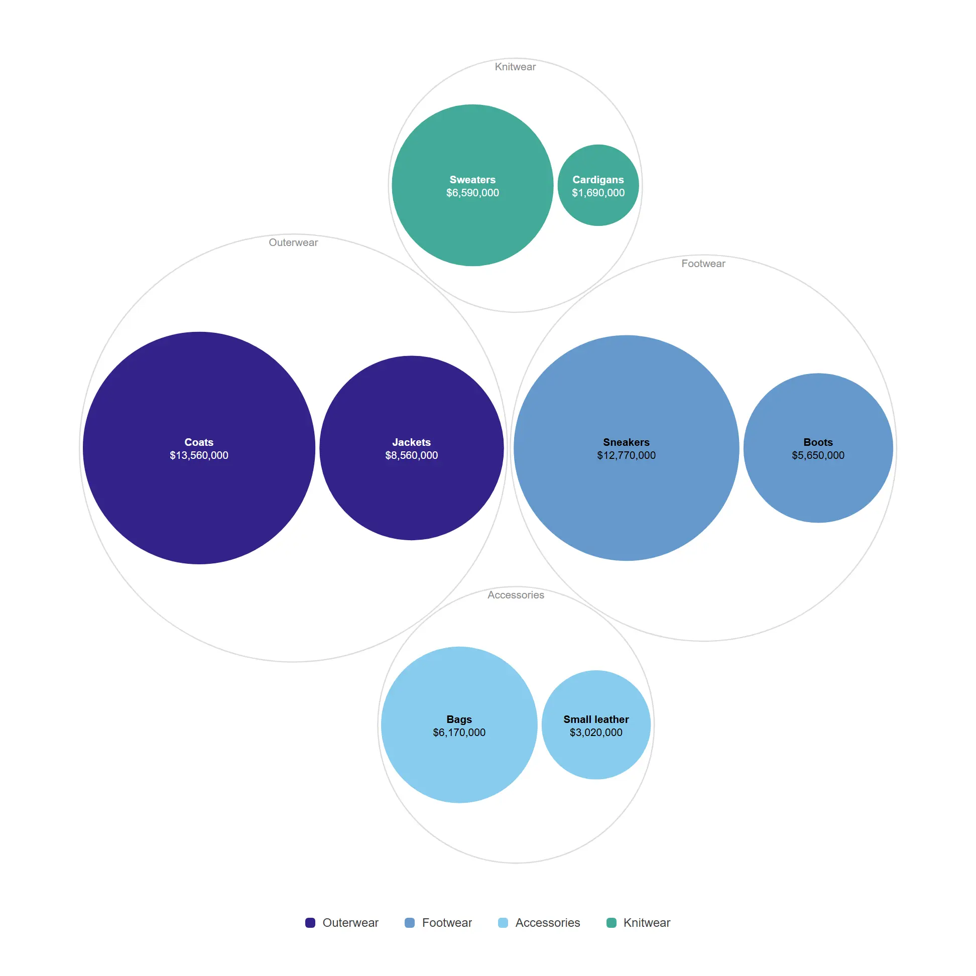
Fewer levels, bigger circles, labels that survive on a dashboard tile.
Two dimensions with data labels.
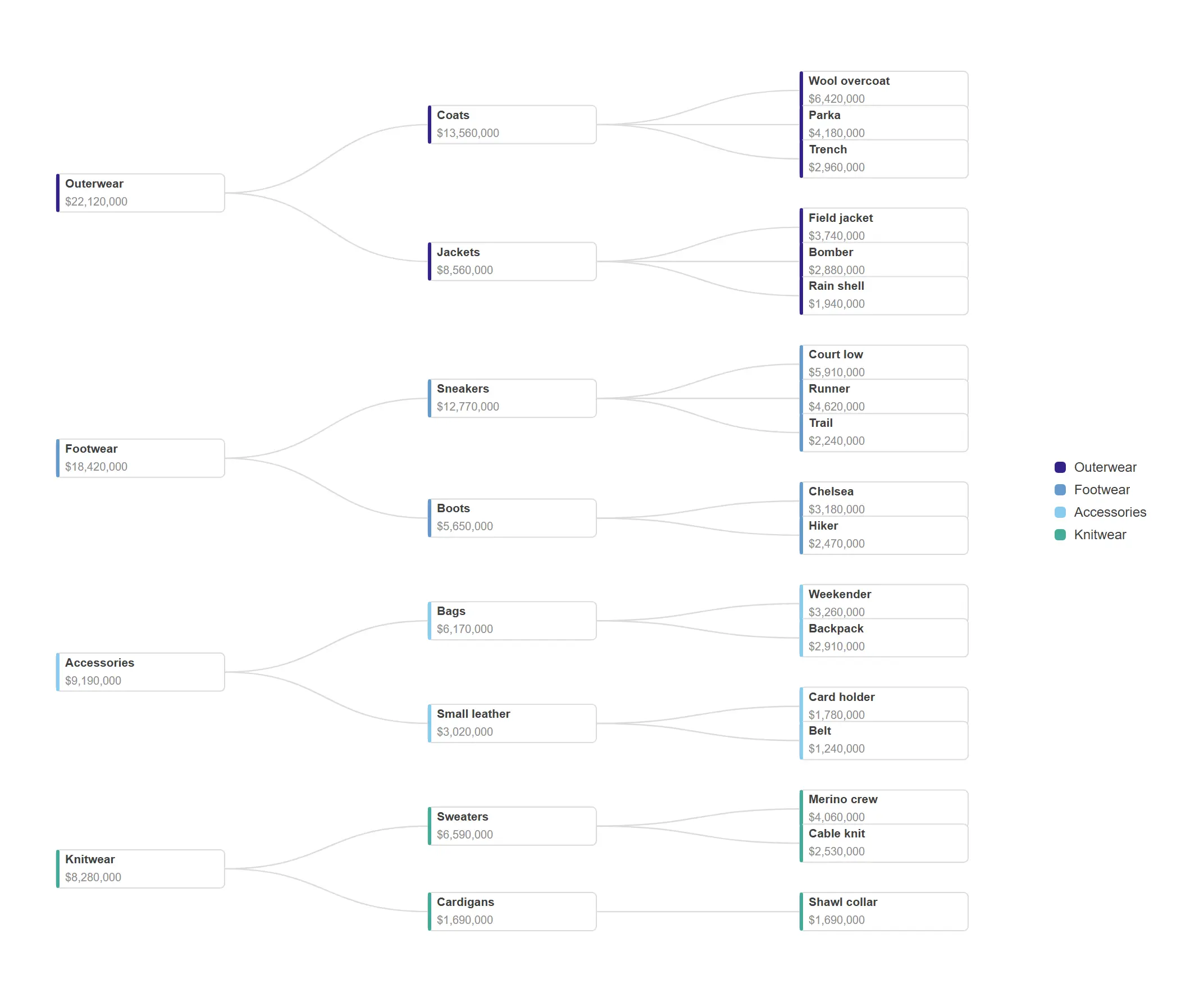
The org-chart view of a hierarchy, laid out left to right so long product names stay legible.
props.tree.layout = "tidy", orient horizontal.
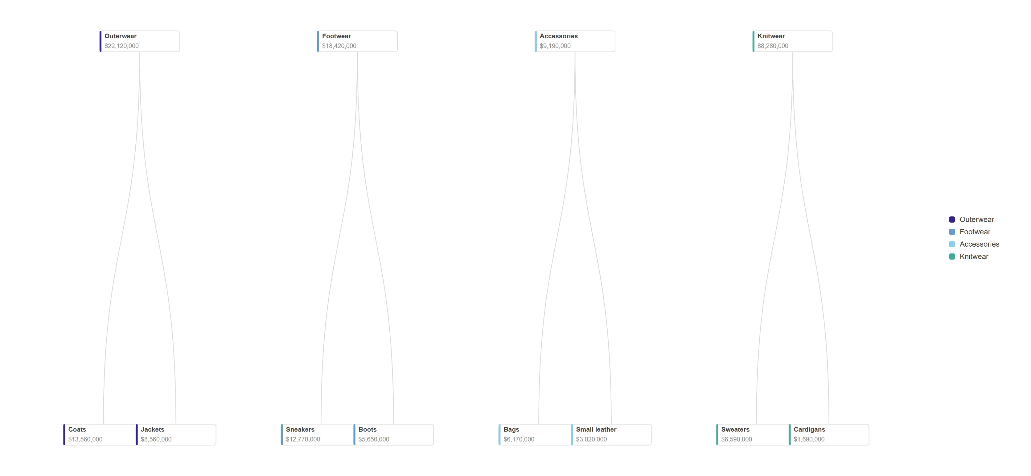
Align every leaf on one edge when what matters is grouping, not depth.
props.tree.layout = "cluster" with a vertical orientation.
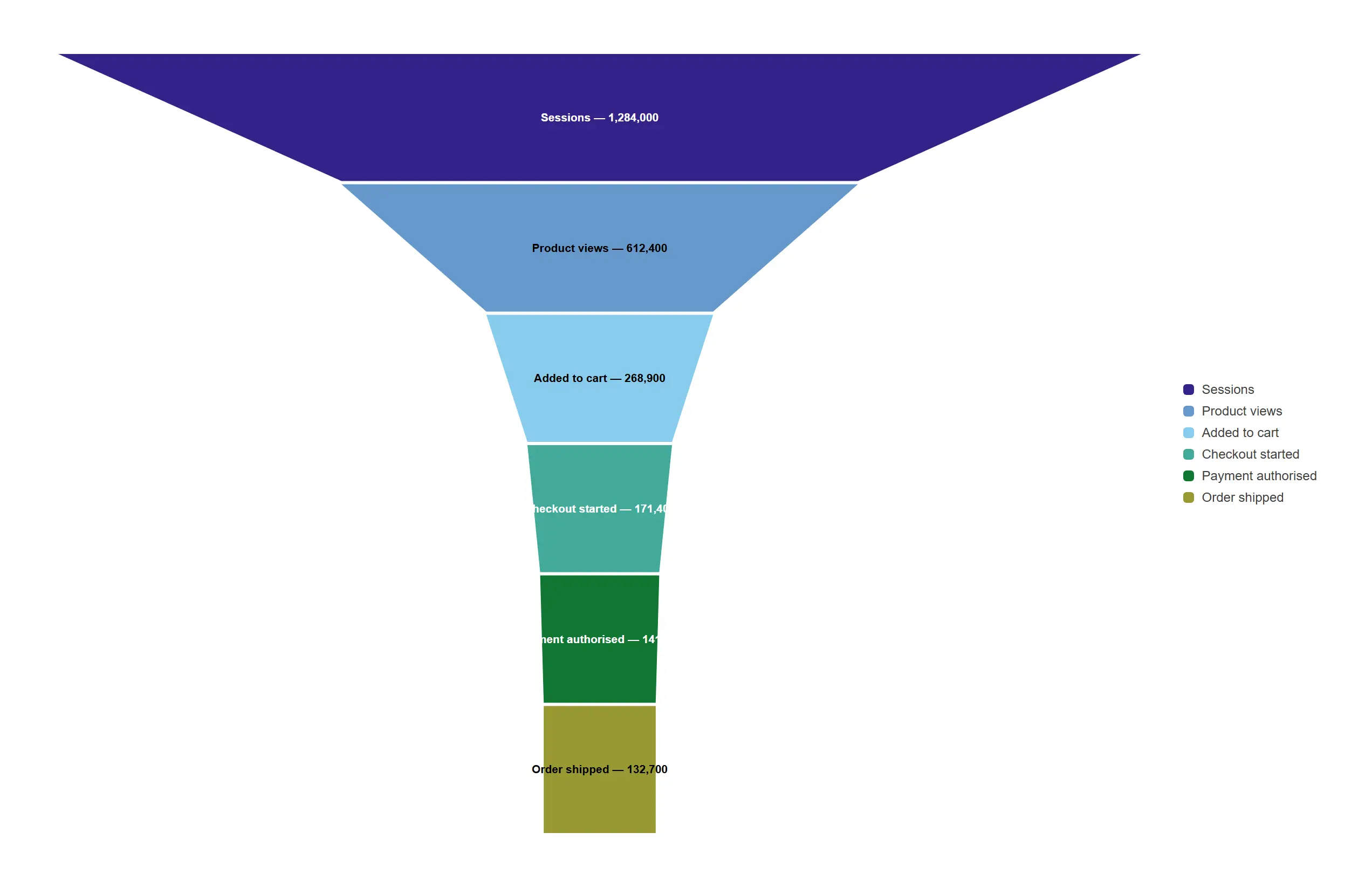
See exactly where the journey leaks, stage by stage, without building a single expression.
props.funnel.style = "area" (tapered) with labels on the stages.
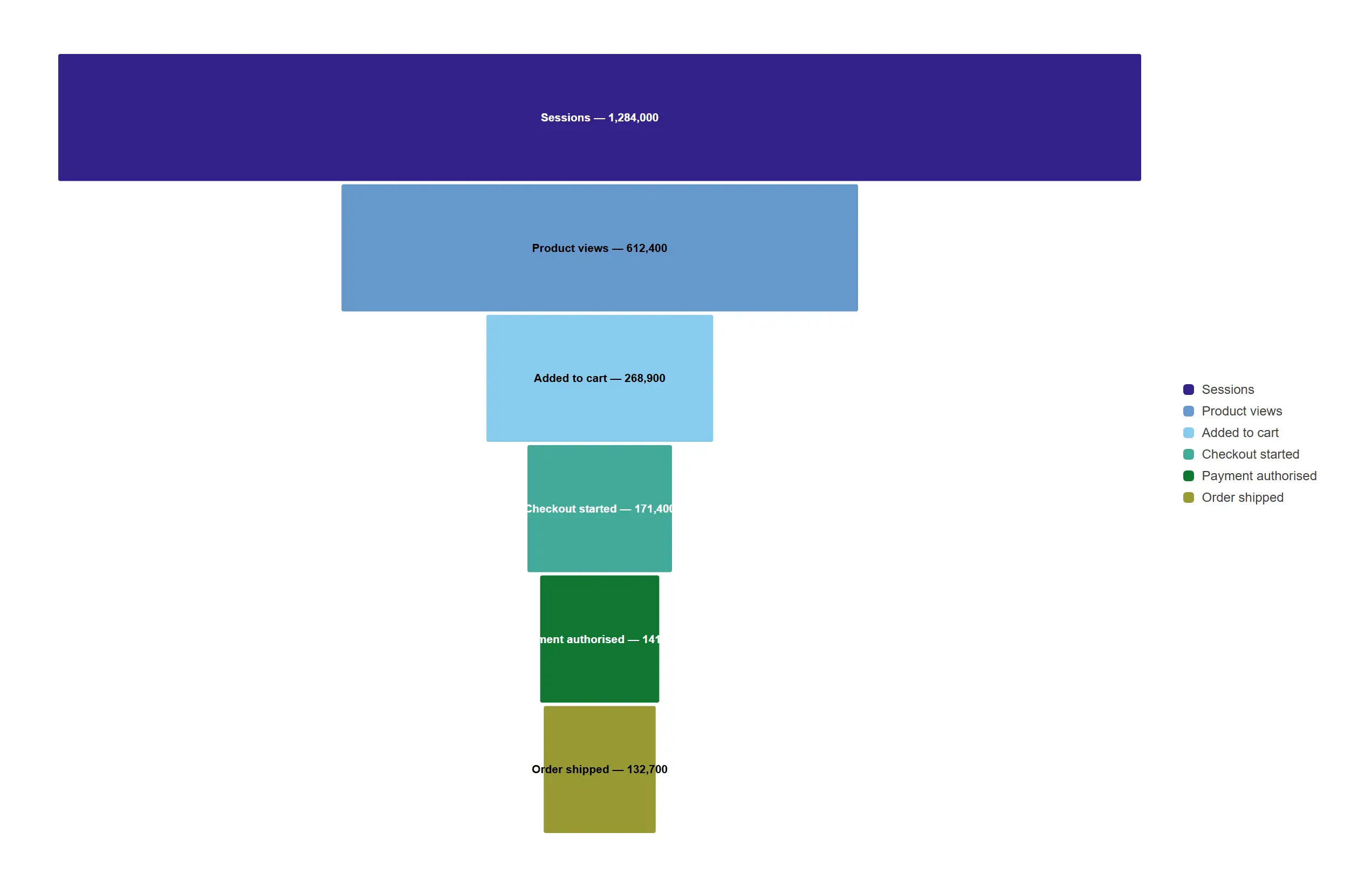
A centred bar funnel for when the drop-off numbers matter more than the silhouette.
props.funnel.style = "bars".
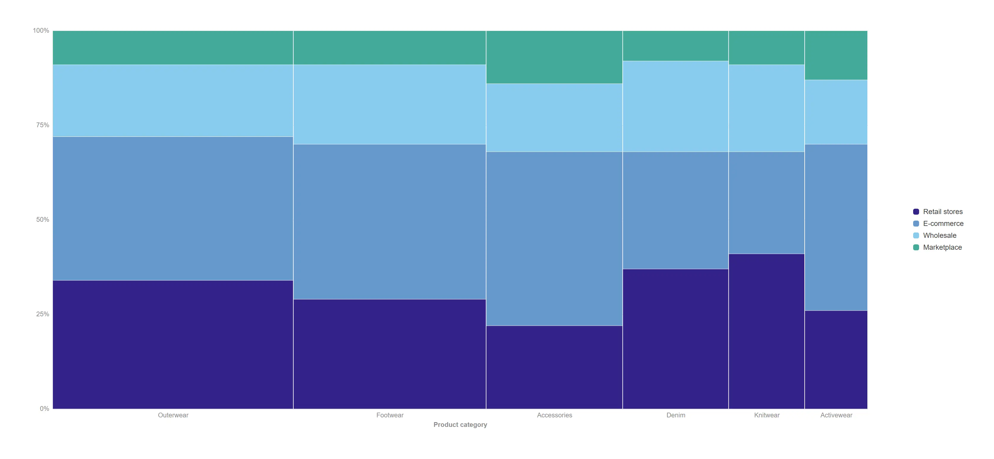
Two proportions in one chart: how big each category is, and how it splits inside.
props.mekko.labels = "percent"; both axes are 100%.
Keep the mekko geometry but label segments with real money for board-level reading.
props.mekko.labels = "absolute" (engine-formatted values).
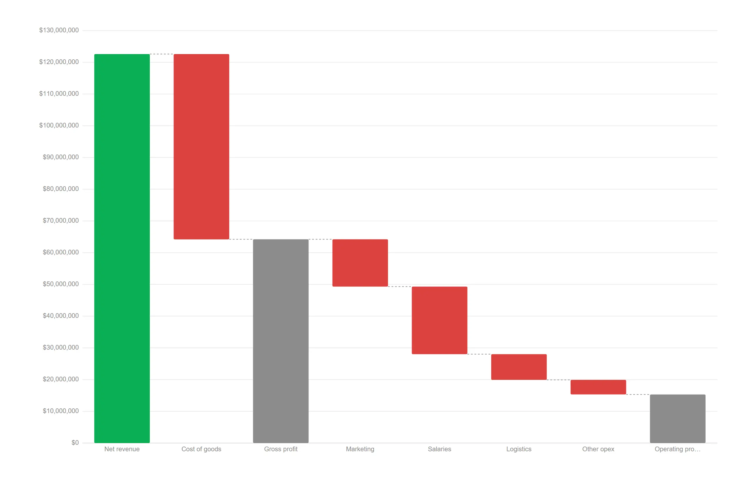
Walk from revenue to operating profit with subtotals that always reconcile.
props.waterfall.mode = "measures" with per-measure add / subtotal / total roles.
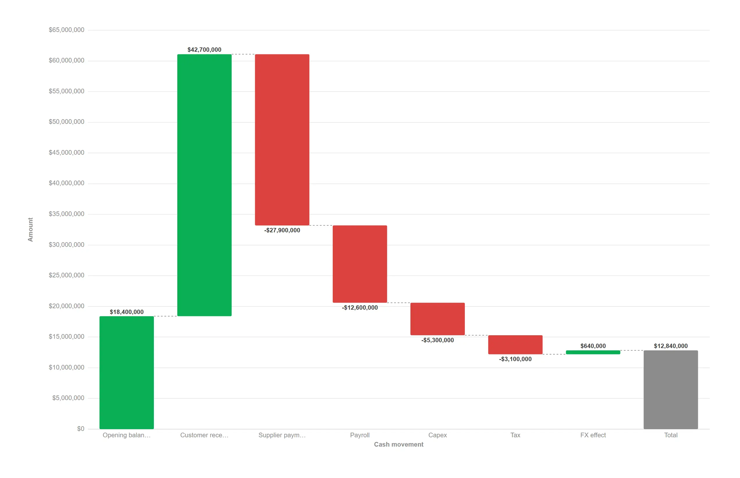
One step per cash movement and an automatic closing total — no helper columns required.
props.waterfall.mode = "dimension" with the Total cap on.
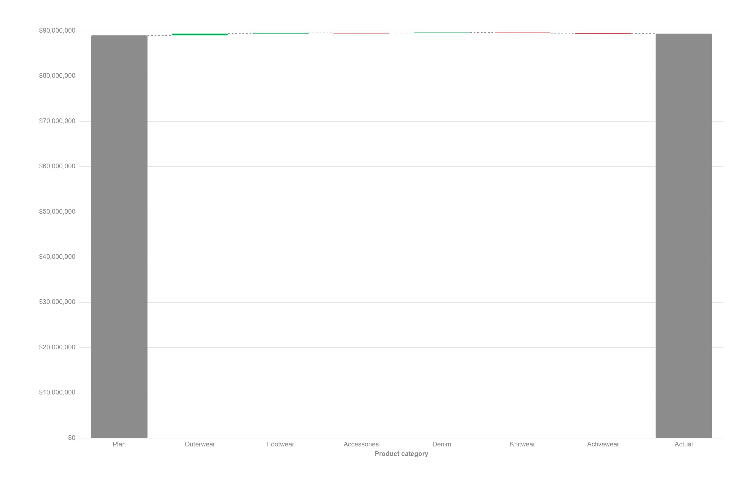
The IBCS bridge from plan to actual, exact by construction, in a single object.
props.waterfall.mode = "variance" with plan and actual measures.
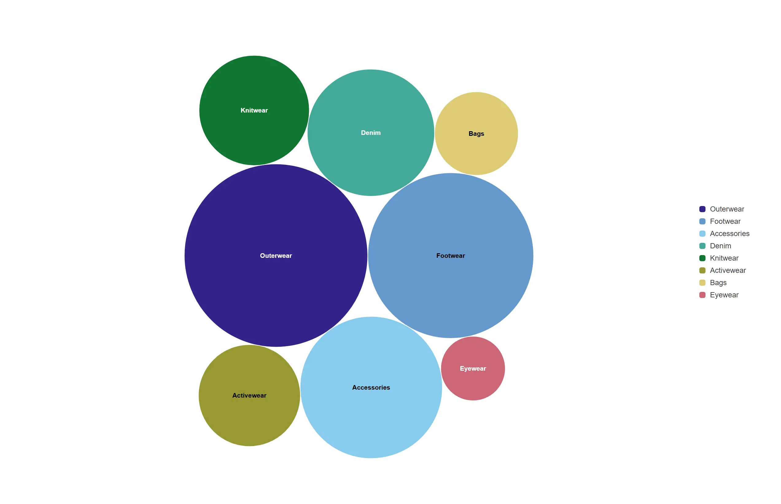
The relative size of every category as a tightly packed cloud, no axis required.
One dimension + one measure; each bubble is area-true and coloured by the dimension. Packing is deterministic — reload and the layout is identical.
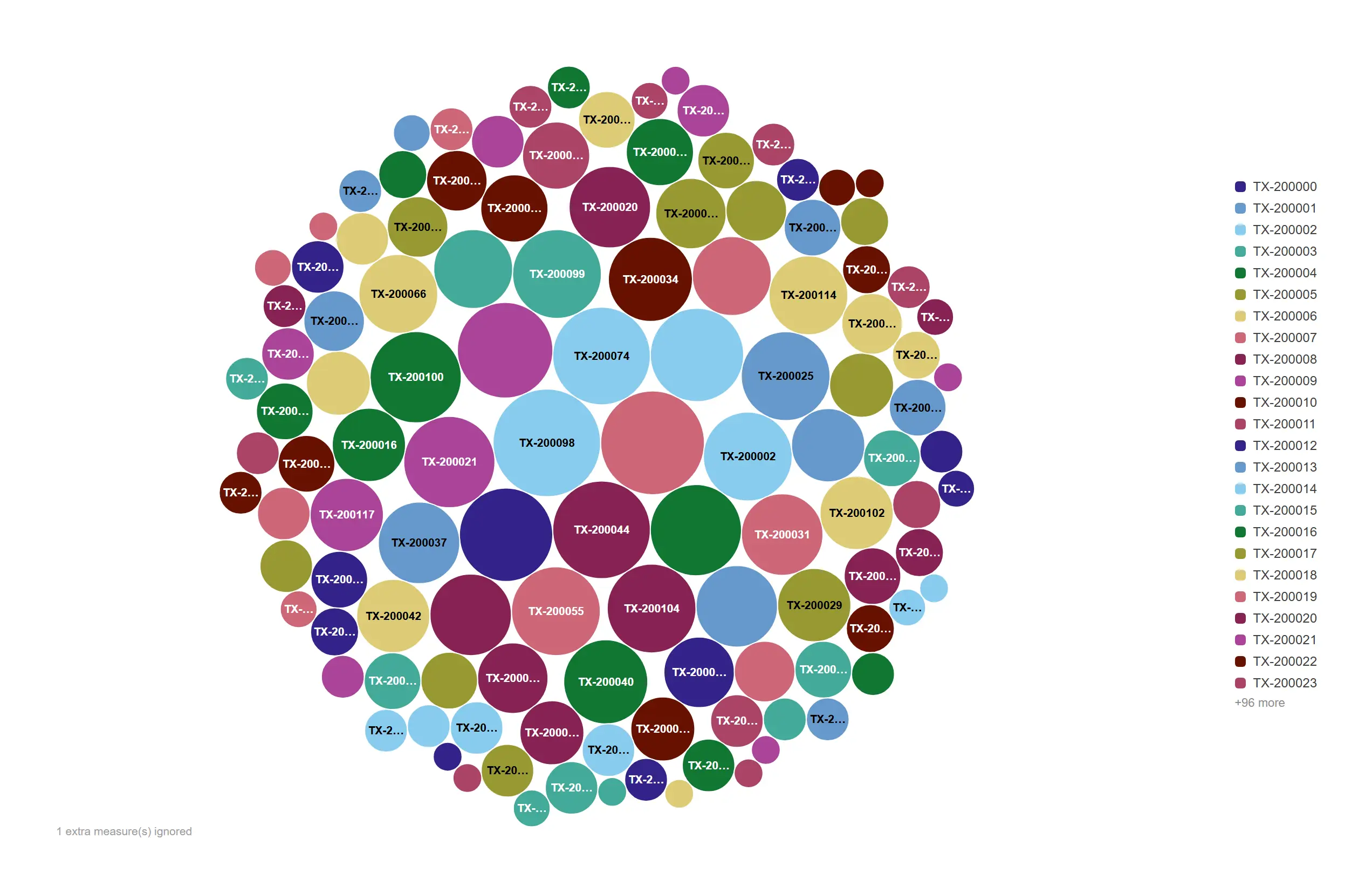
A denser cloud stays legible by keeping only the labels that fit.
props.labels.declutter = "collision" hides labels that would overlap, keeping the largest bubbles labelled.
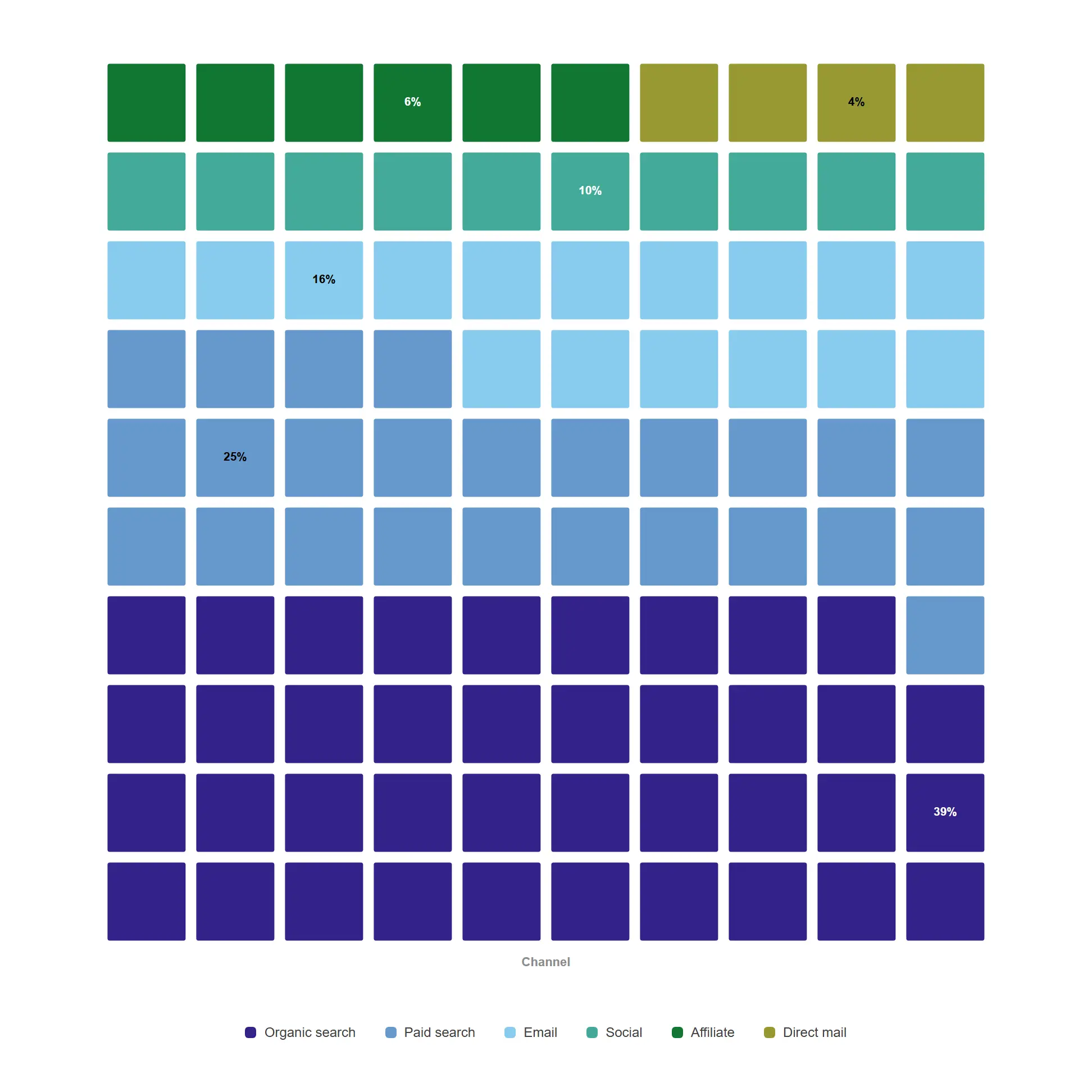
Let people count the share instead of estimating an angle — every square is one percentage point of the total.
10×10 grid, largest-remainder apportionment, value labels printing each block’s share.
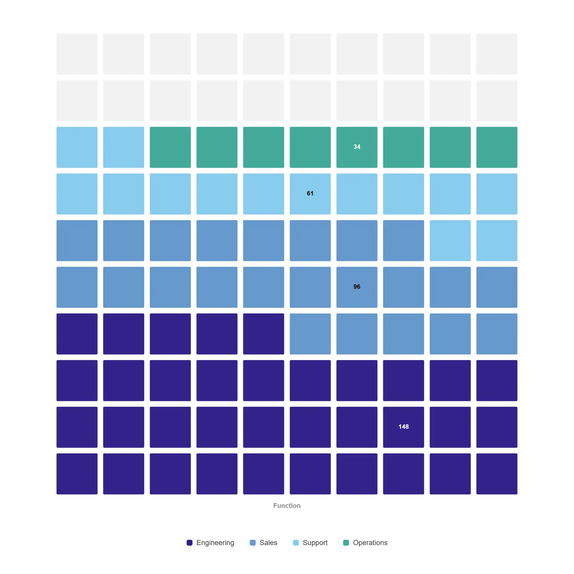
Show progress toward a plan with the shortfall left deliberately empty, so the gap is the thing you see.
props.waffle.total set to the approved headcount — unfilled cells are the remainder, labels show counts.
Follow value as it moves between things — journeys, trade lanes, overlaps and correlations.
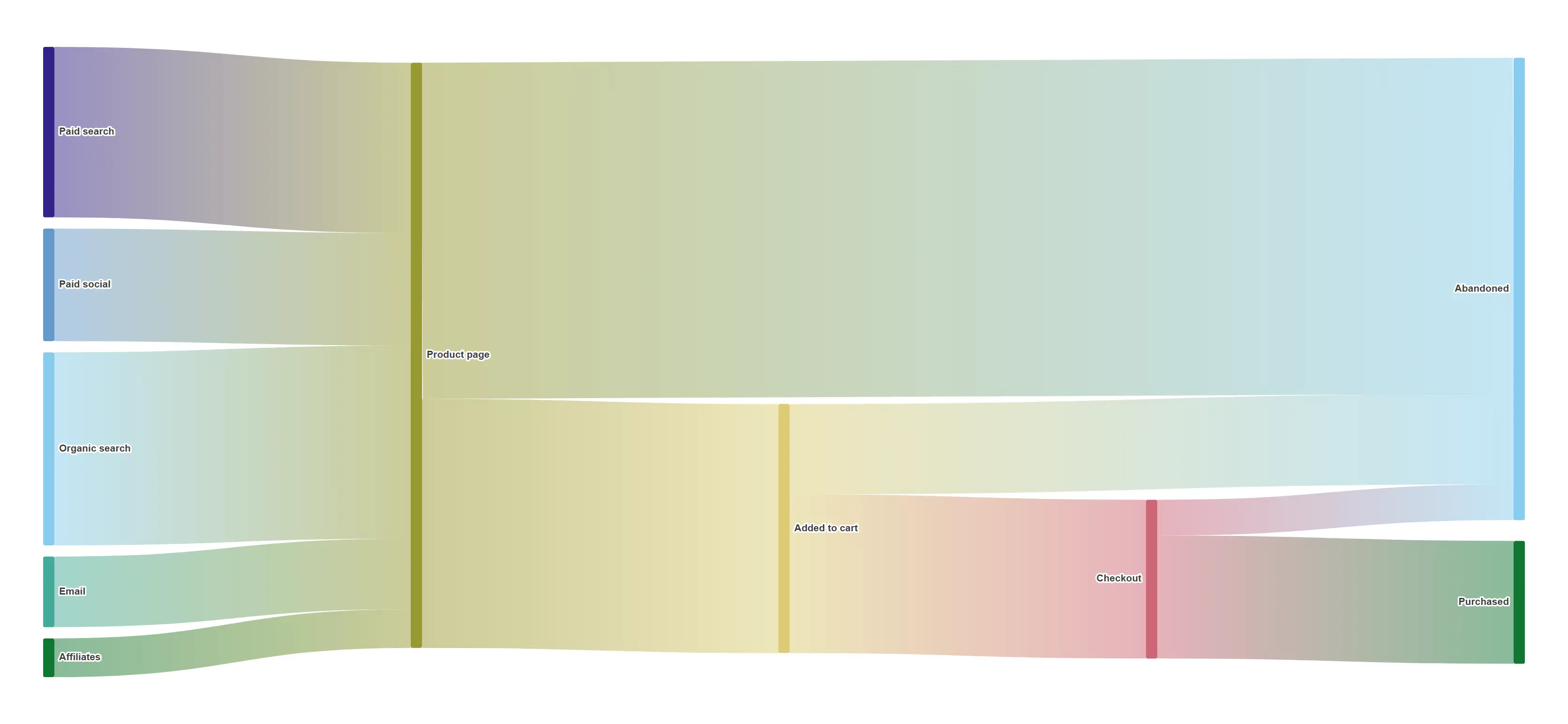
Follow every session from first touch to purchase and see precisely where the volume goes.
Two dimensions as source → target with a session-count flow measure.
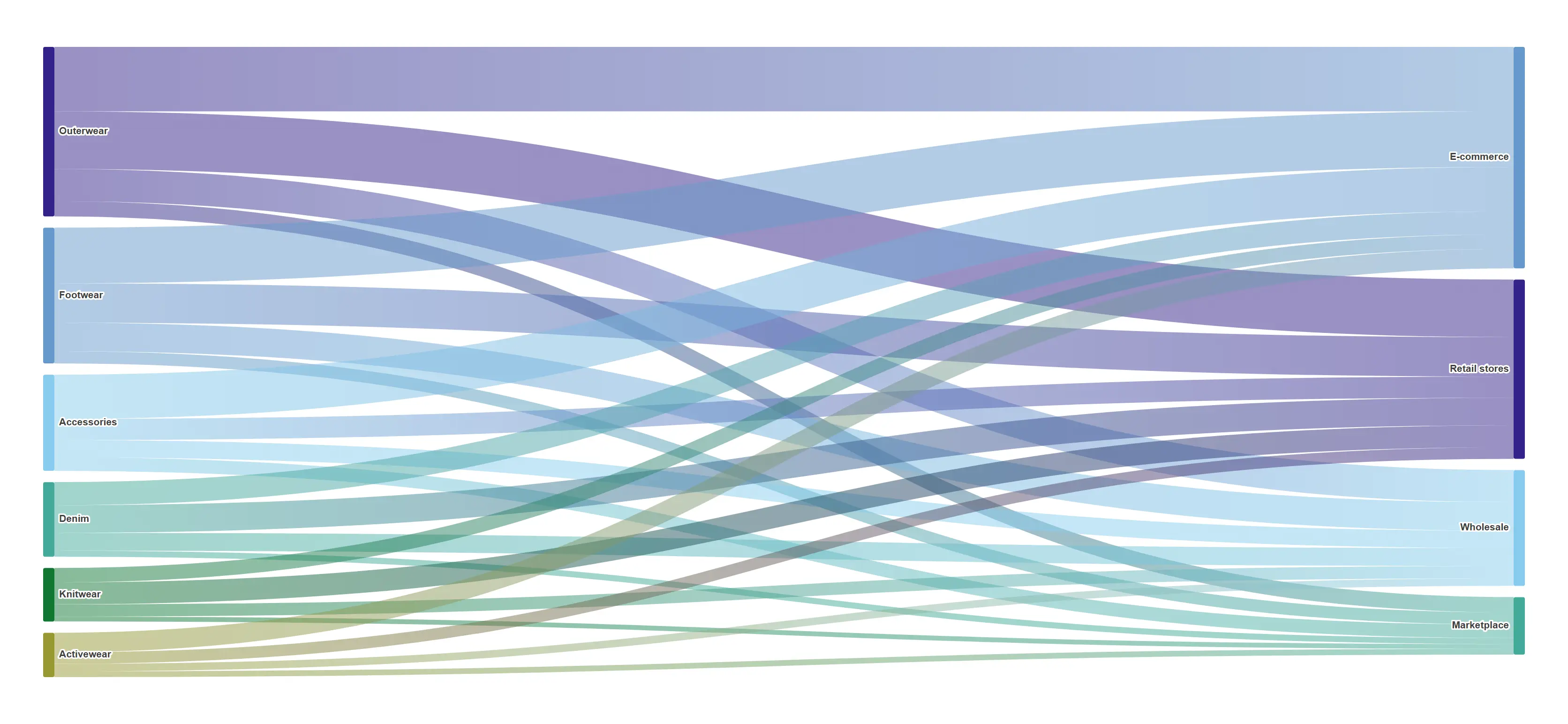
Turn a crosstab into a flow and the dominant routes become obvious instantly.
Bipartite category → channel flows, node labels as the legend.
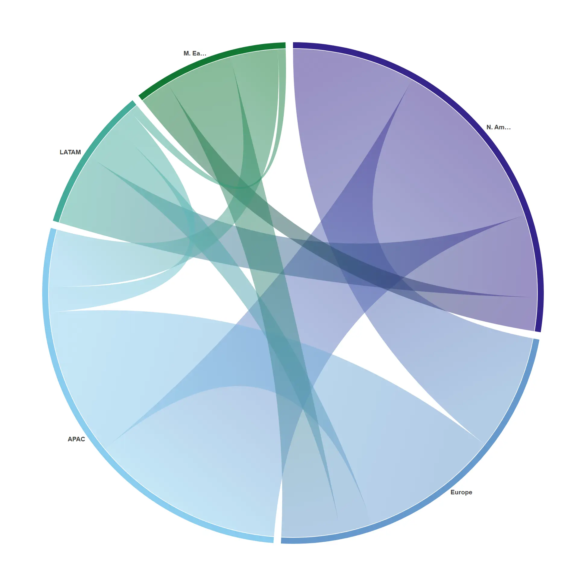
Show two-way relationships — who ships to whom, and how much comes back.
Two dimensions merged into shared arcs; ribbons gradient between end colours.
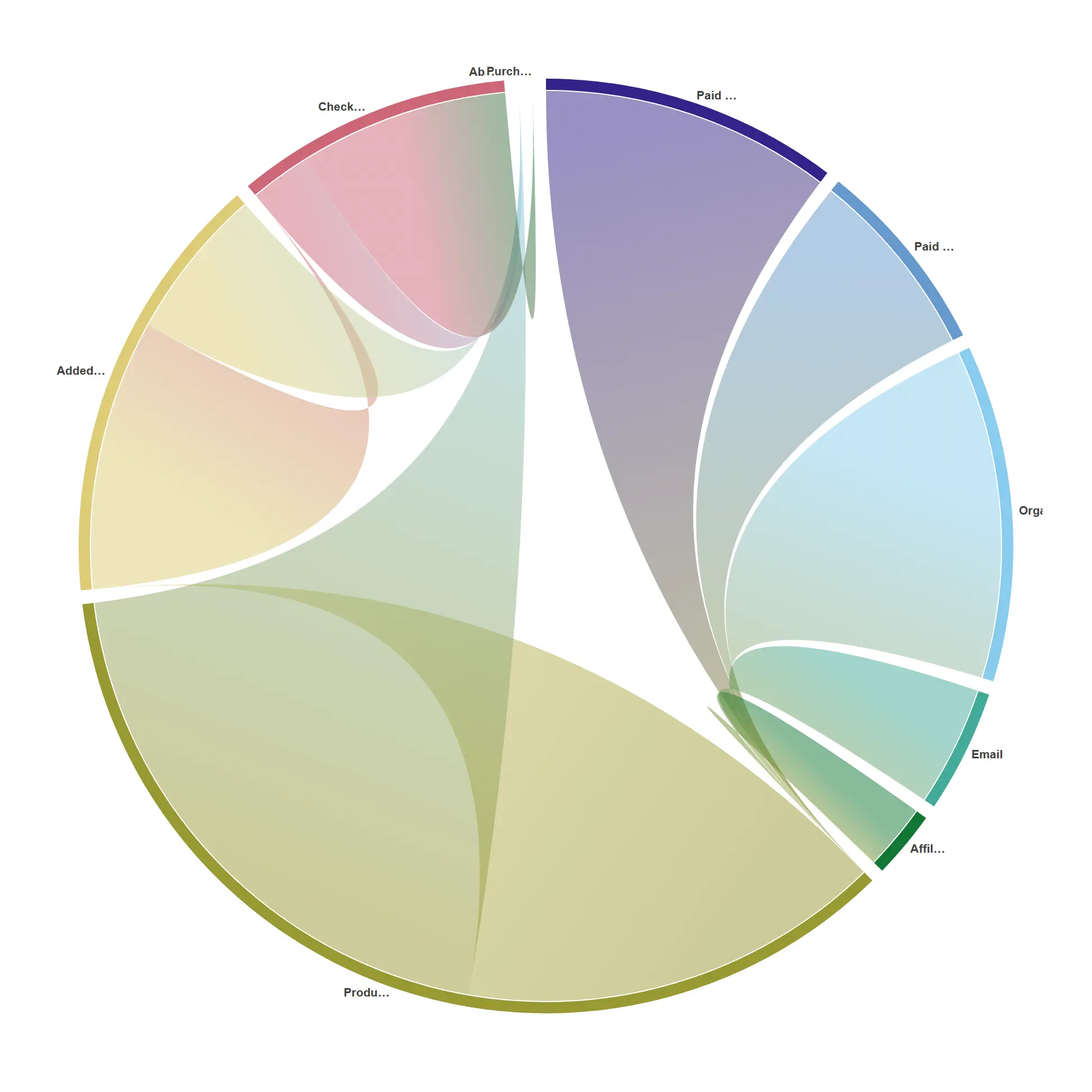
A compact circular read of a funnel when you care about the connections more than the order.
Same source → target cube as the sankey, rendered as arcs and ribbons.
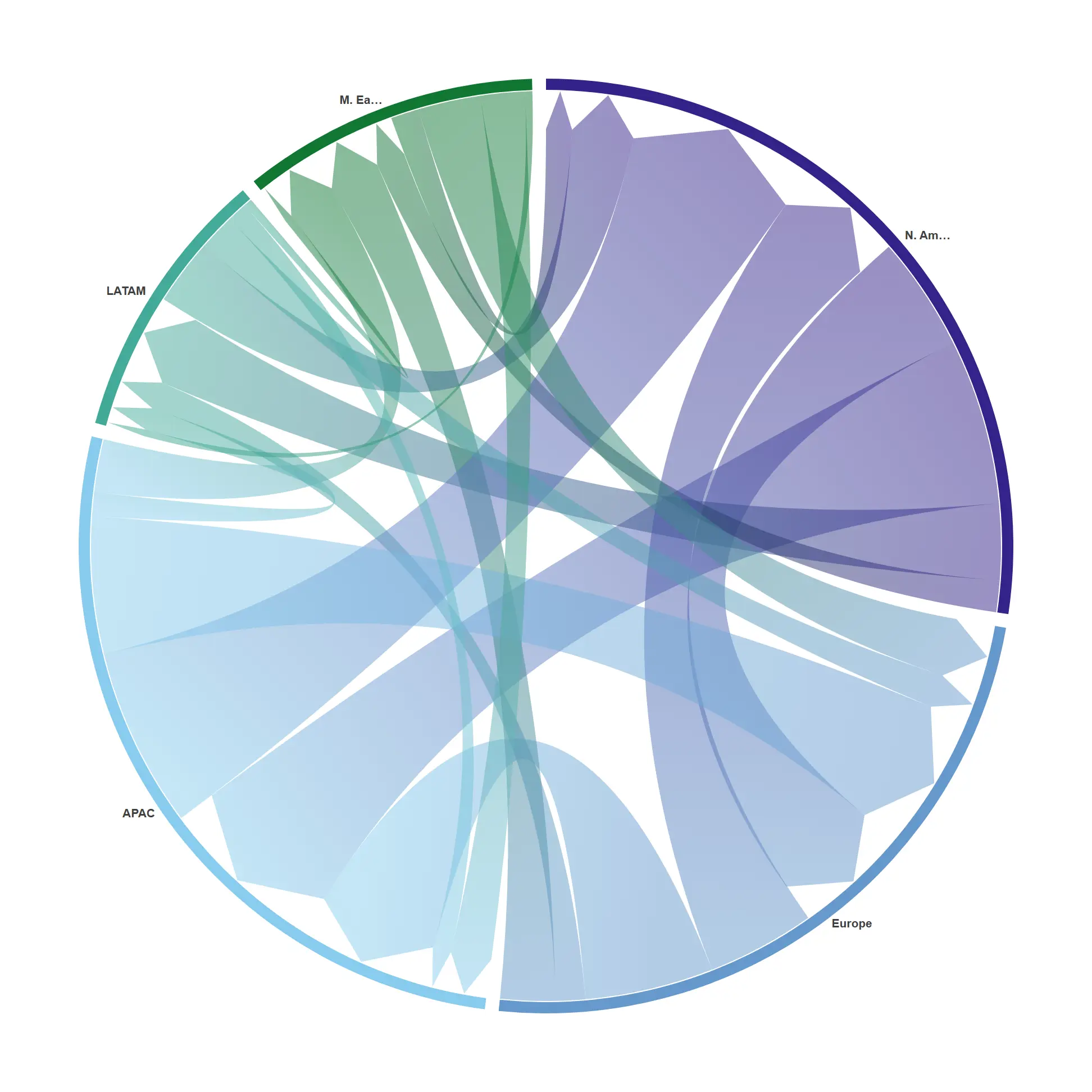
Arrow ribbons show WHICH WAY value moves, so a two-way relationship reads as direction, not just magnitude.
props.chord.directed = true — chordDirected + ribbonArrow on the same trade cube.
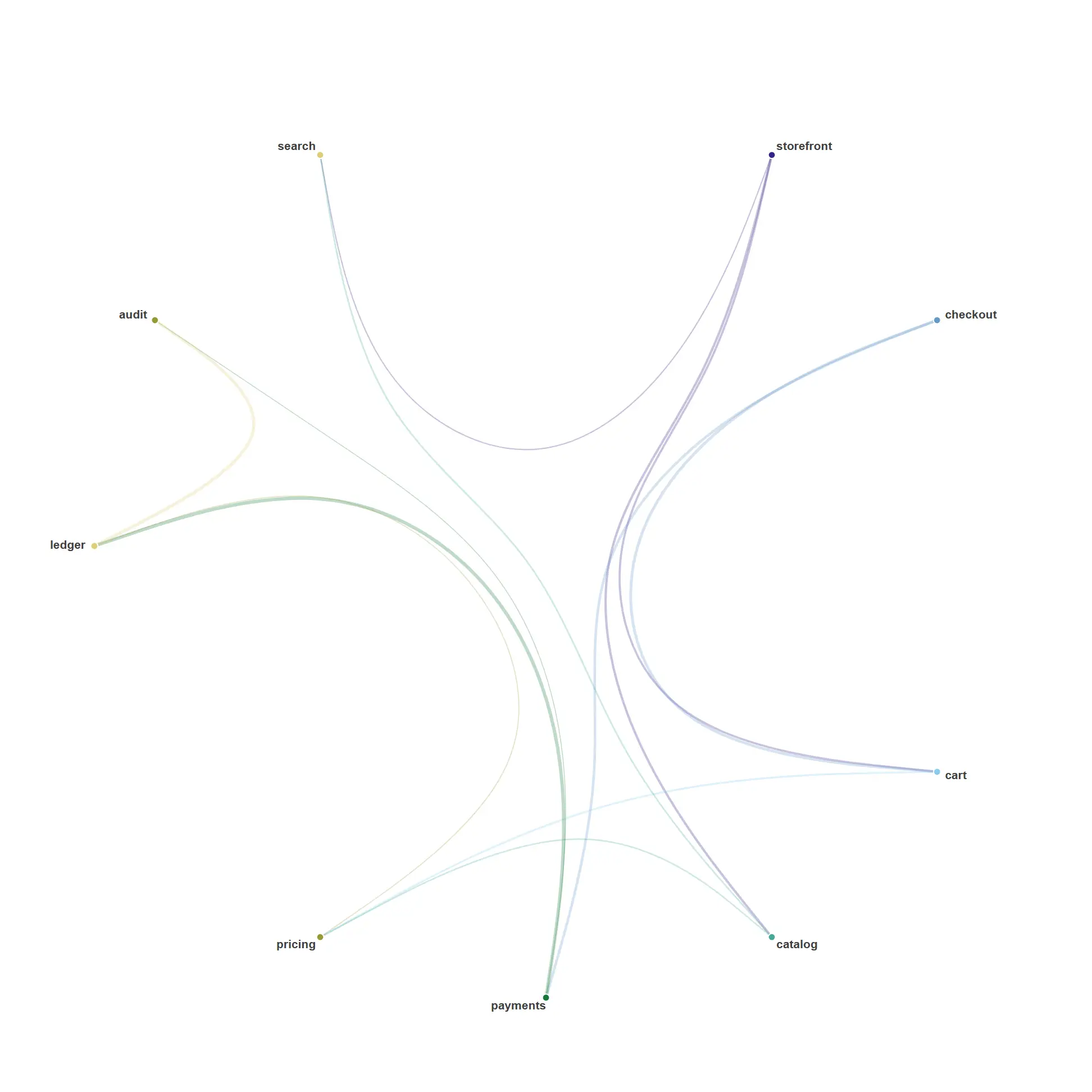
Group nodes by a name hierarchy and route every link along the tree — the elegant dependency / impact map for a dense graph.
props.chord.layout = bundle; node names split on "." into a hierarchy, links drawn with a bundling curve.
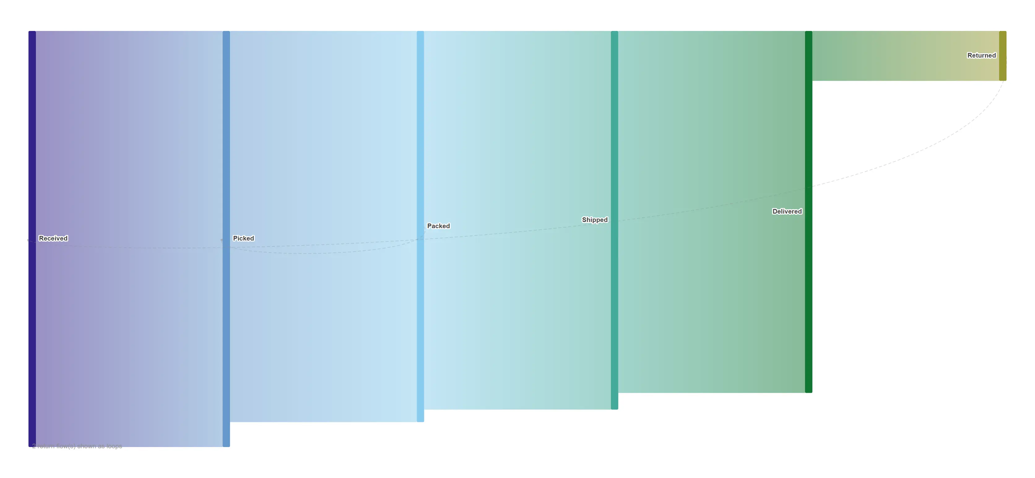
Returns, rework and win-backs routed as dashed loops instead of being dropped — the honest picture of a flow that circles back.
props.sankey.cyclic = true — closing links routed as arrowed return curves.
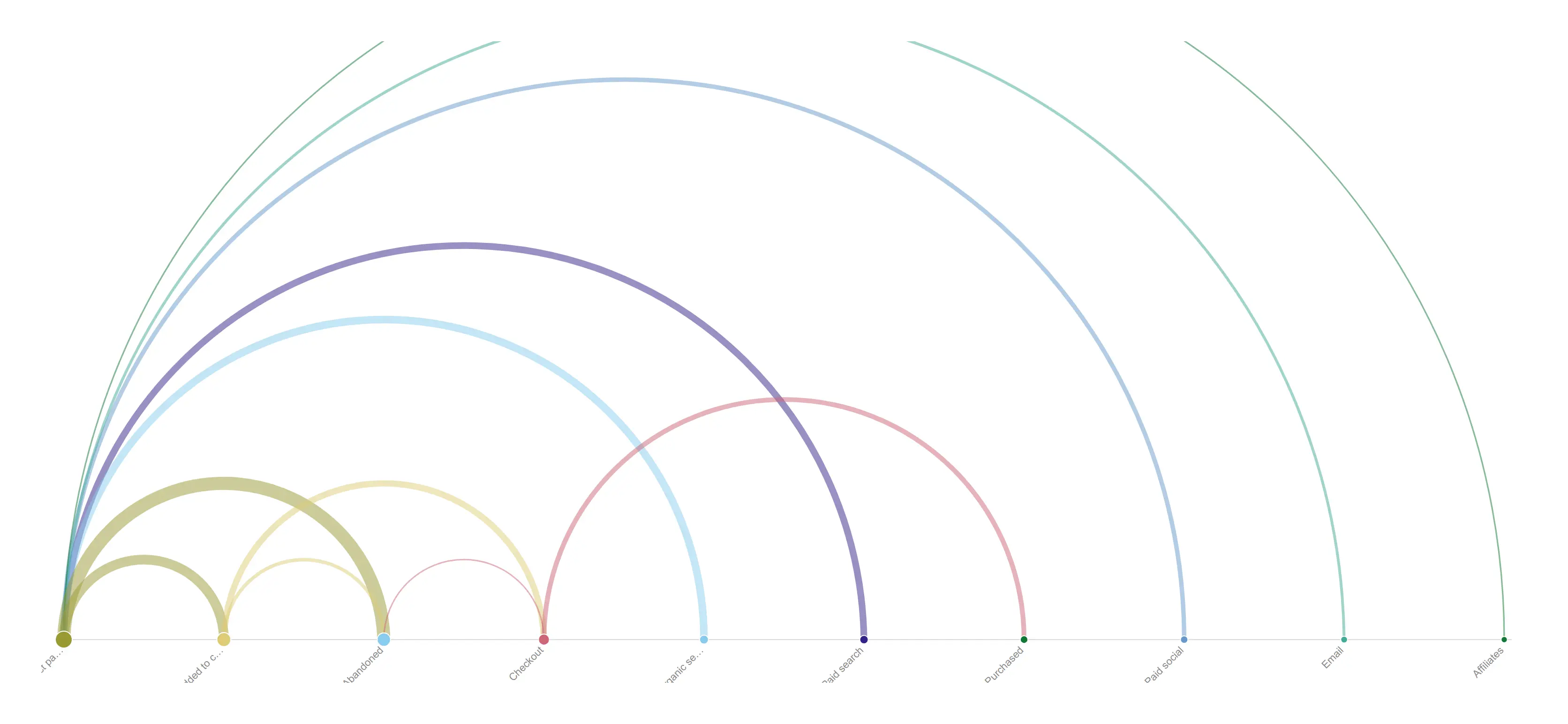
Put the same flows on a line instead of a circle, and node ORDER starts carrying meaning — the right read for a journey or a pipeline.
props.chord.layout = arc with order = flow (biggest hubs first). Nodes select; links dim.
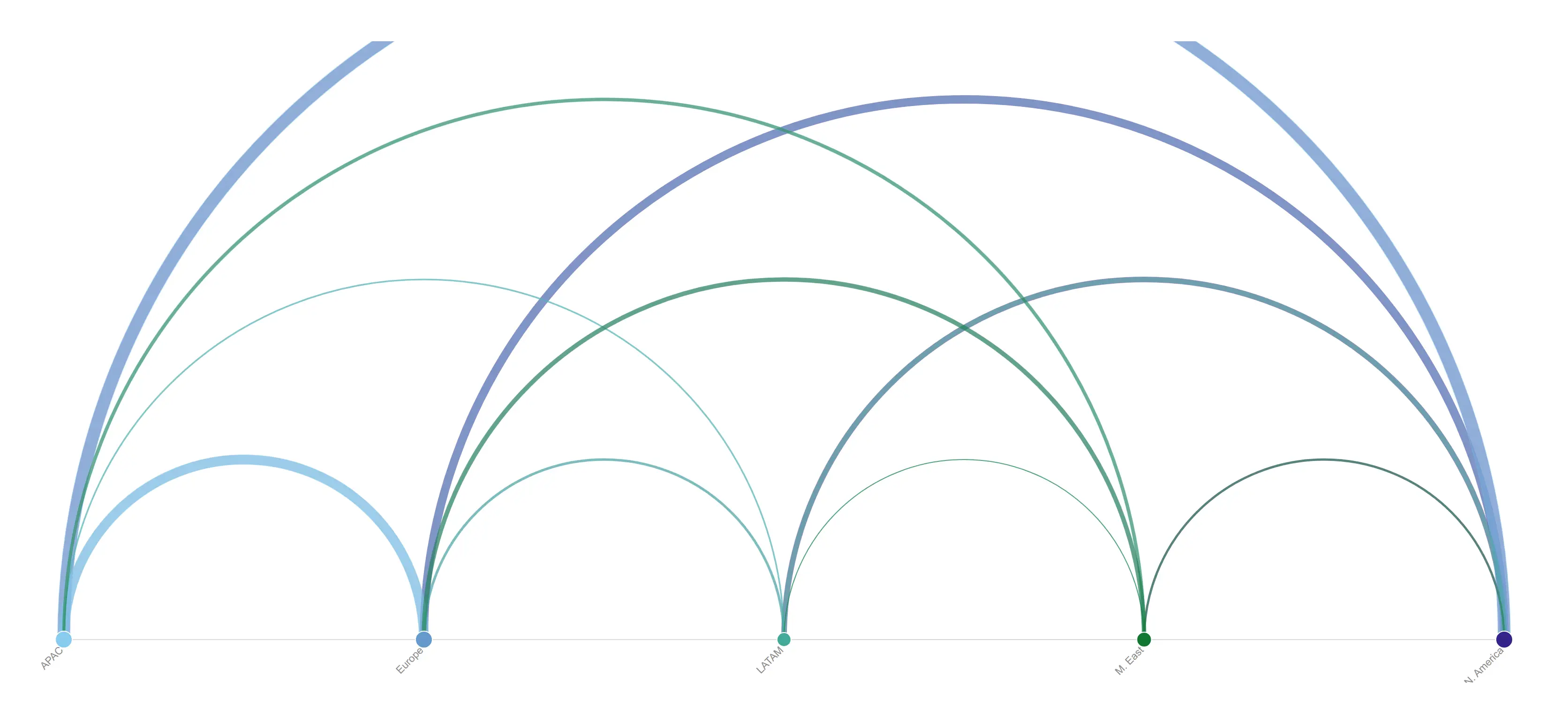
Fix the node order by name and two screenshots taken under different filters stay directly comparable.
props.chord.order = name on the same two-dimension trade cube.
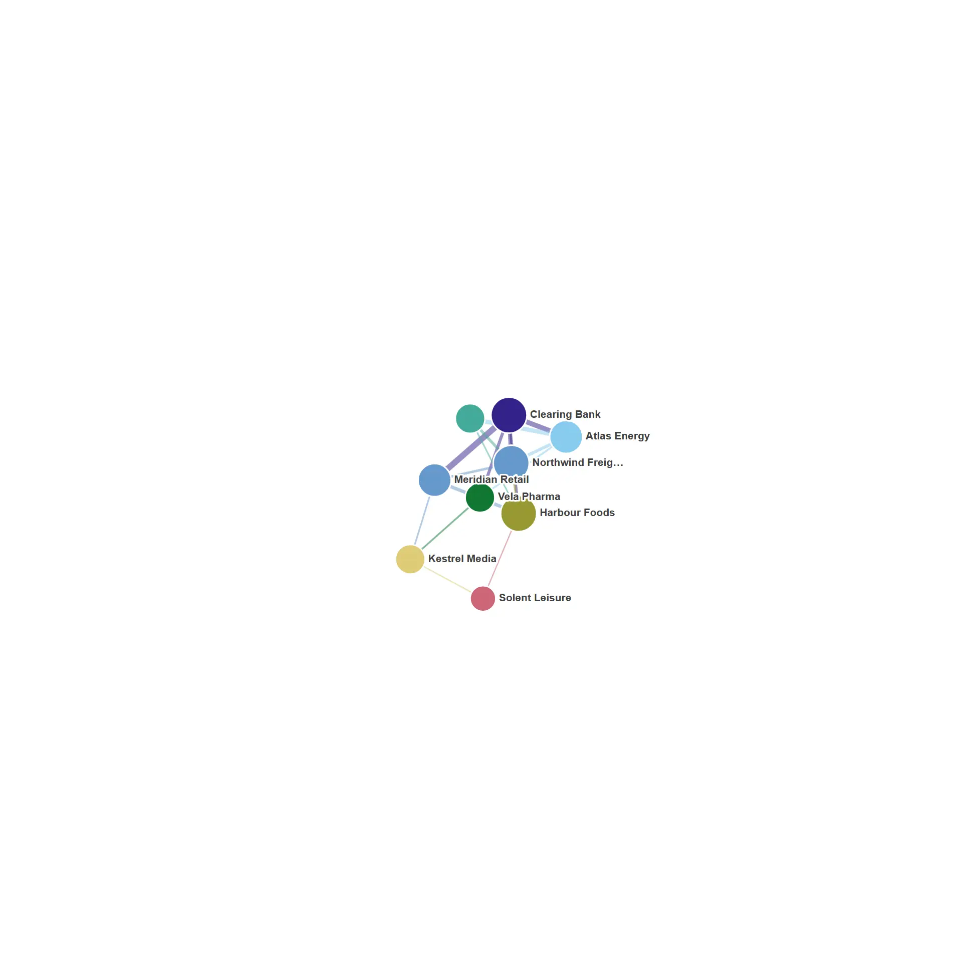
See who transacts with whom at a glance — hubs grow, spokes settle around them, and the picture is identical every single time you open it.
props.network.layout = force. Seeded d3-force run synchronously to a fixed tick count, so the layout is reproducible; node size = degree, link width = weight.
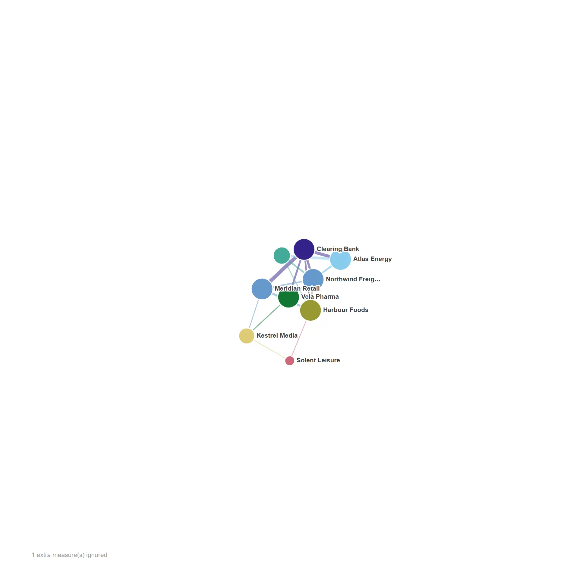
Let a second measure drive the node size, so influence and exposure read as two separate channels instead of one.
props.network.size = measure — measure 2 sizes the nodes (area-true), measure 1 still weights the links.
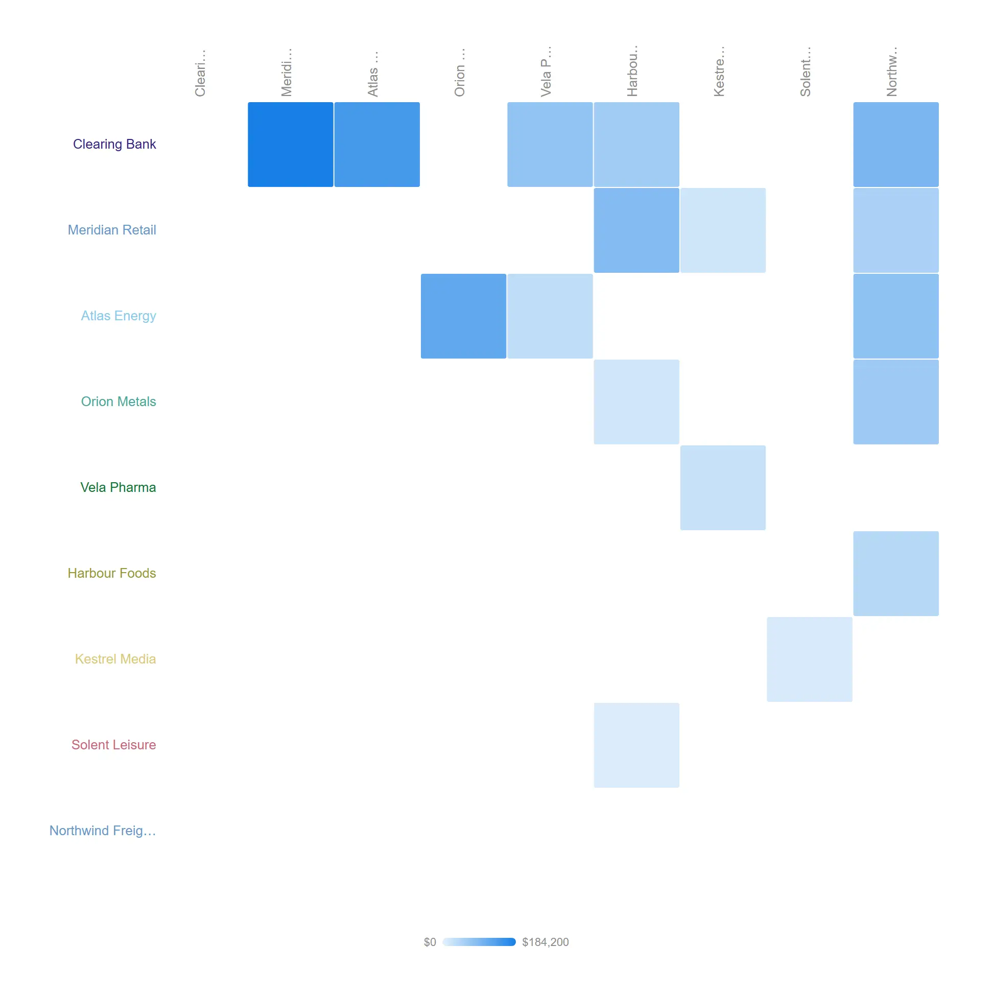
The honest view of a dense graph: one row and column per node, every relationship on the grid, and not a hairball in sight.
props.network.layout = adjacency. Cells take the theme sequential scale with a gradient legend; a cell selects both dimension values.
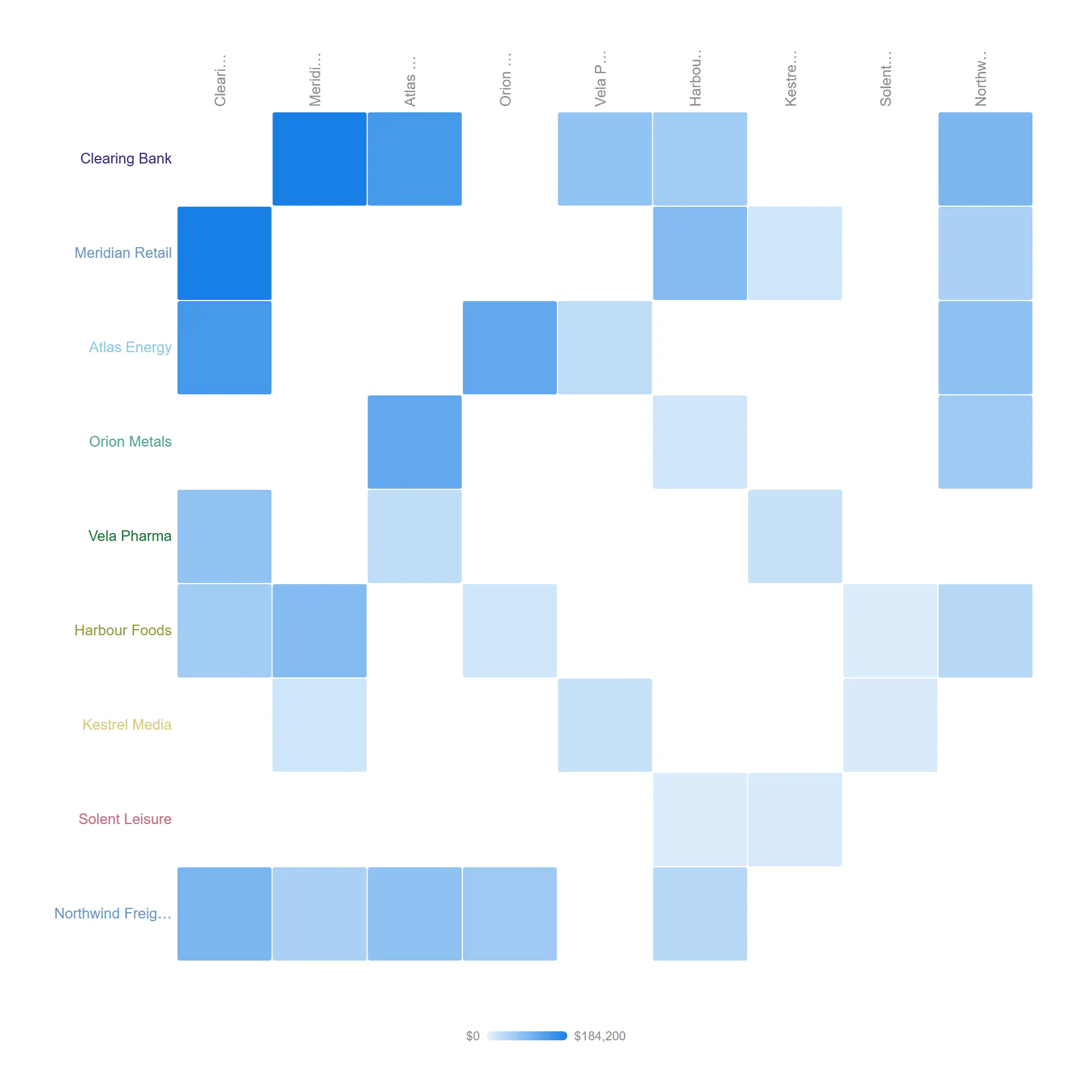
When direction is not the point, fold both ways into one weight and read the relationship strength straight off the symmetry.
props.network.symmetric = true folds source→target and target→source into a single mirrored weight.
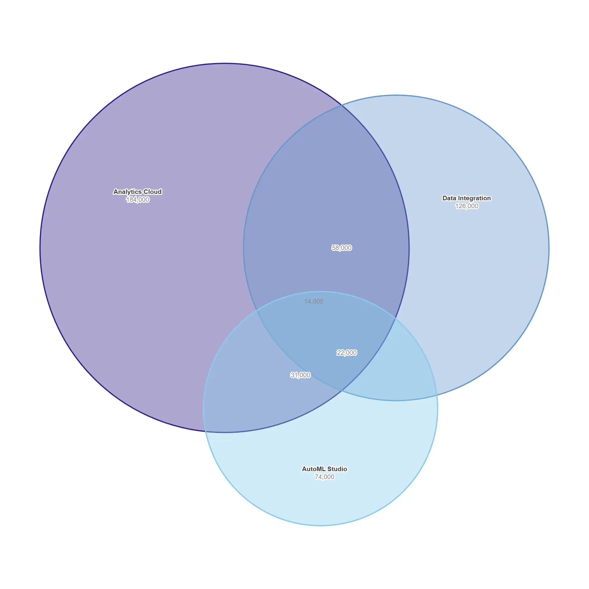
Size the overlap between product lines honestly, with areas that actually match the numbers.
props.venn overlap expressions supply A∩B, A∩C, B∩C and A∩B∩C.
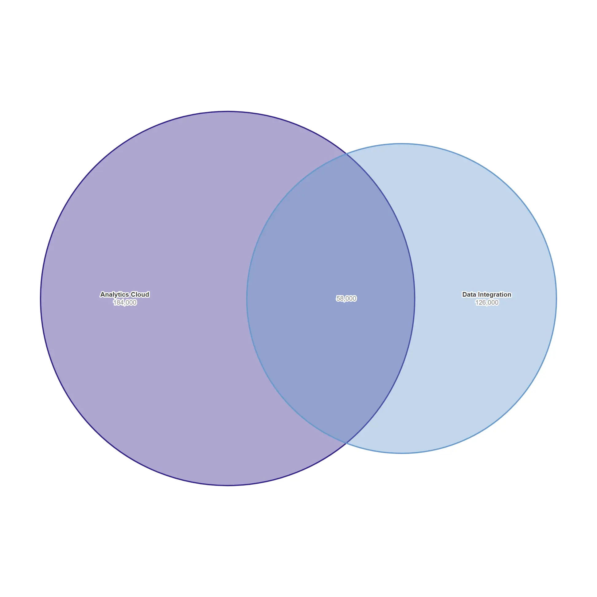
The two-circle case is solved exactly — the lens area is the overlap you supplied.
props.venn.overlapAB only; area-proportional layout.
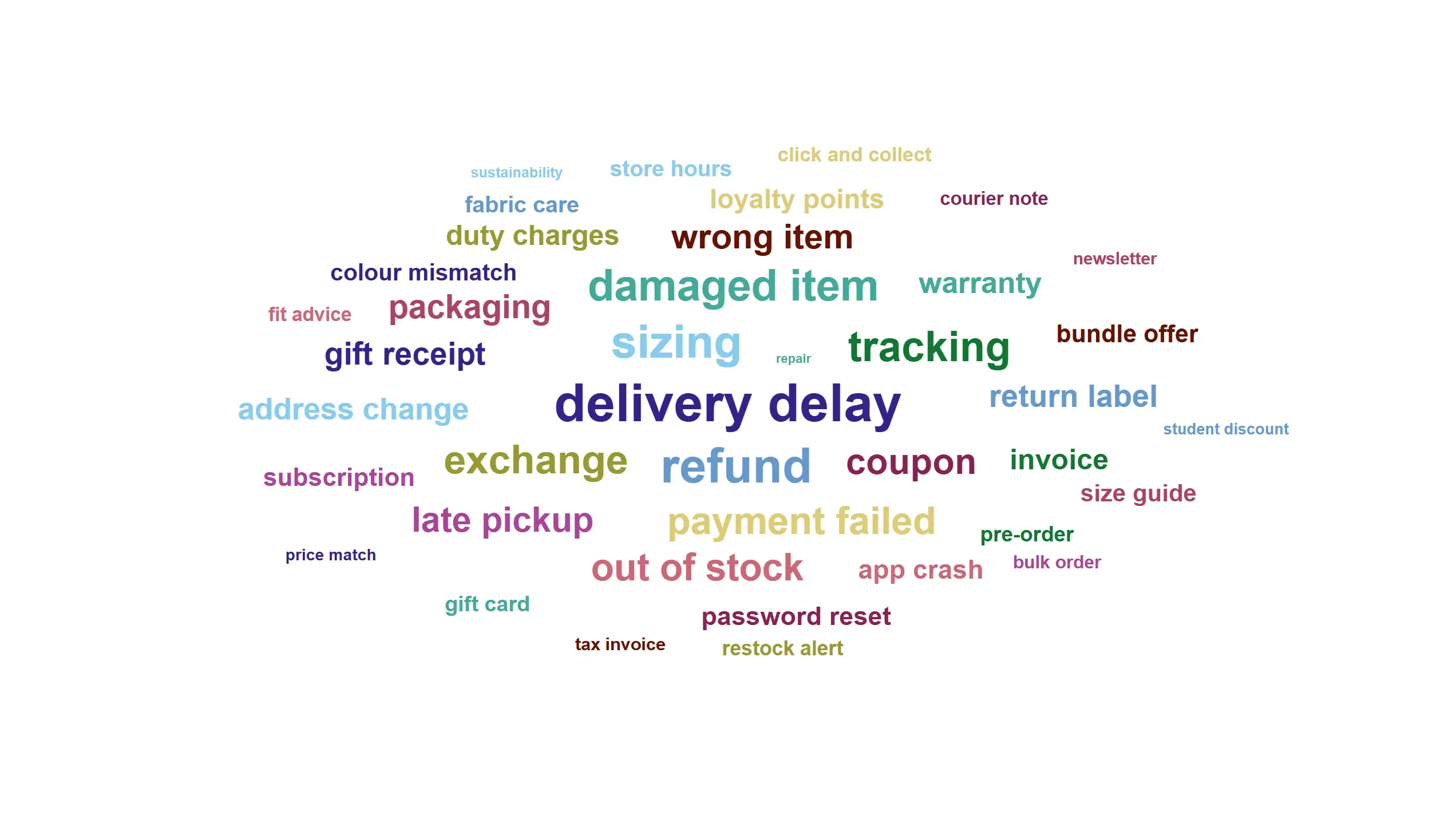
Surface what customers keep writing about, sized by how often they write it.
Deterministic spiral layout, font size scaled by √value.
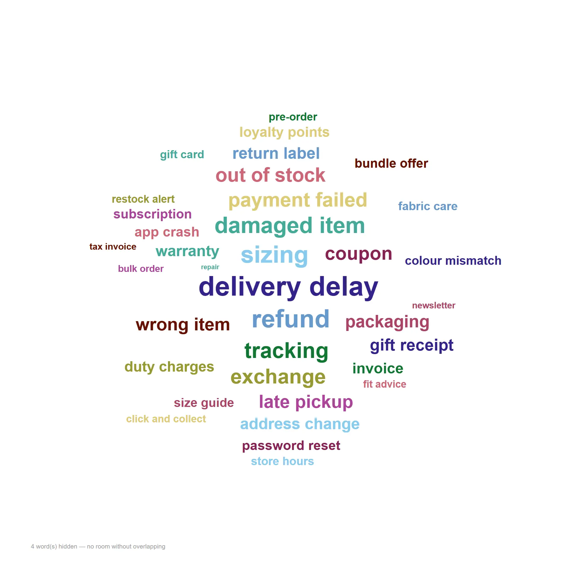
The same cloud re-flows to fit a square dashboard tile without losing the leading terms.
Identical data at a square aspect — layout is deterministic, never random.
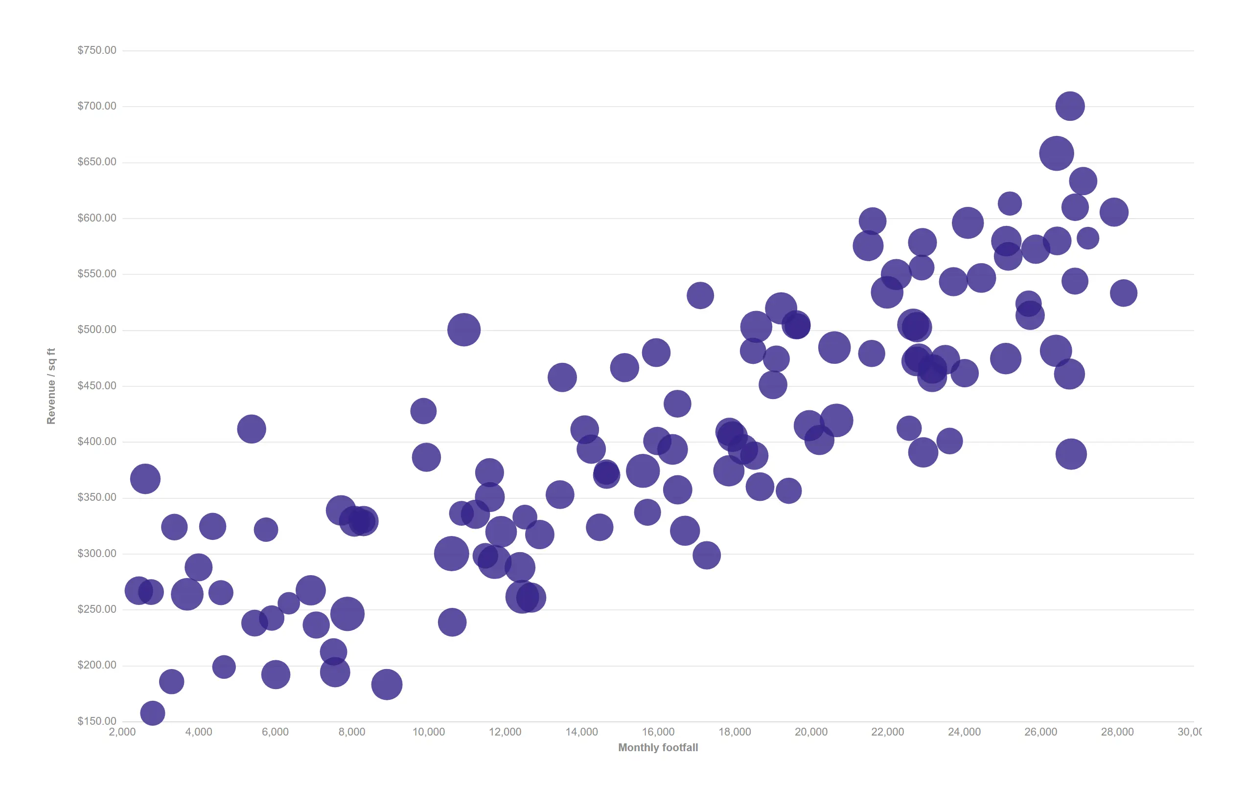
Three measures in one frame: footfall, productivity and basket size across every store.
Measure 1 = X, 2 = Y, 3 = bubble size; props.scatter.display = "points".
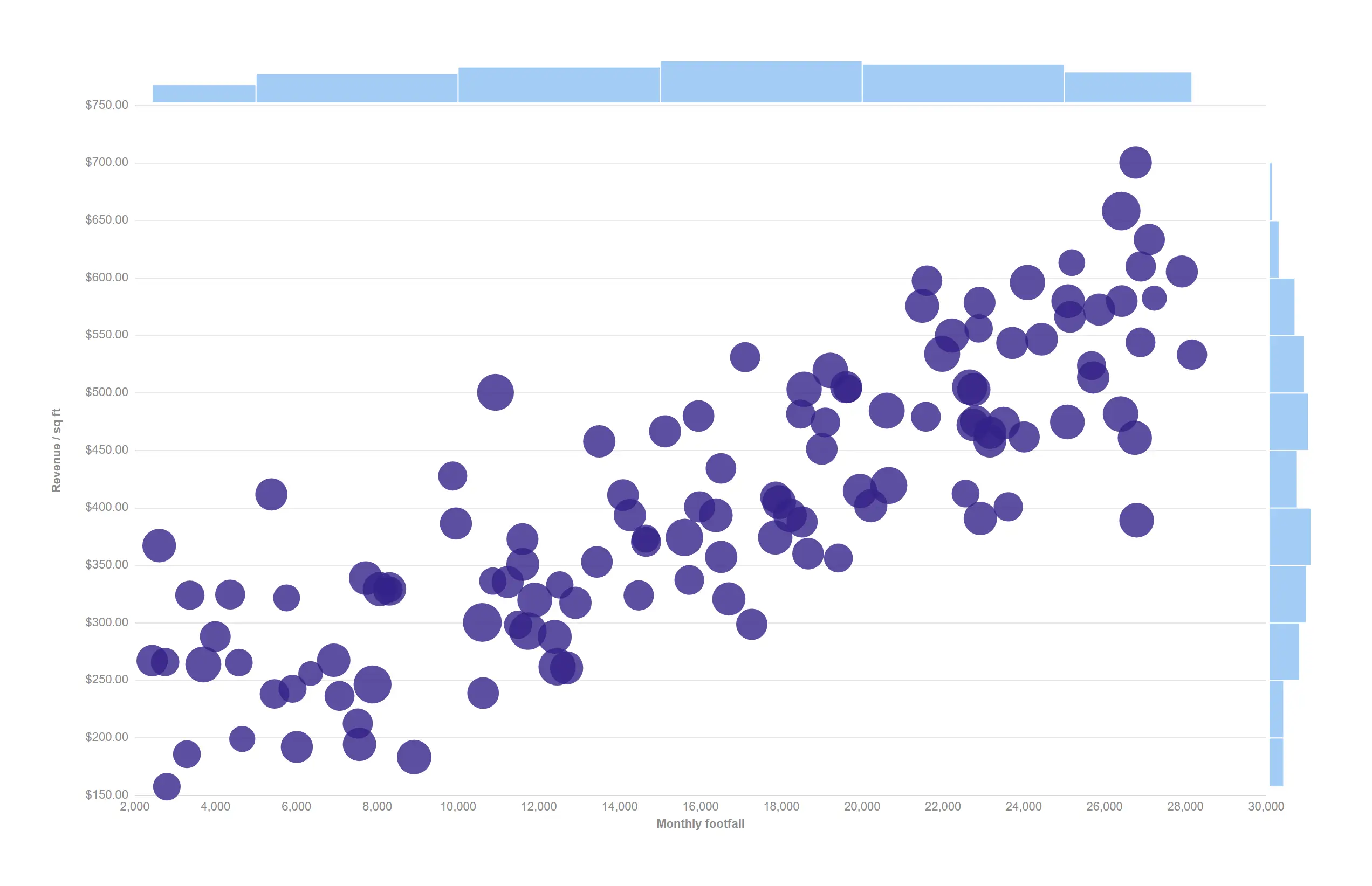
Small distributions on the top and right edges tell a real cluster from an axis skew at a glance.
props.scatter.marginals = "histogram" — the strips share the plot's own scales.
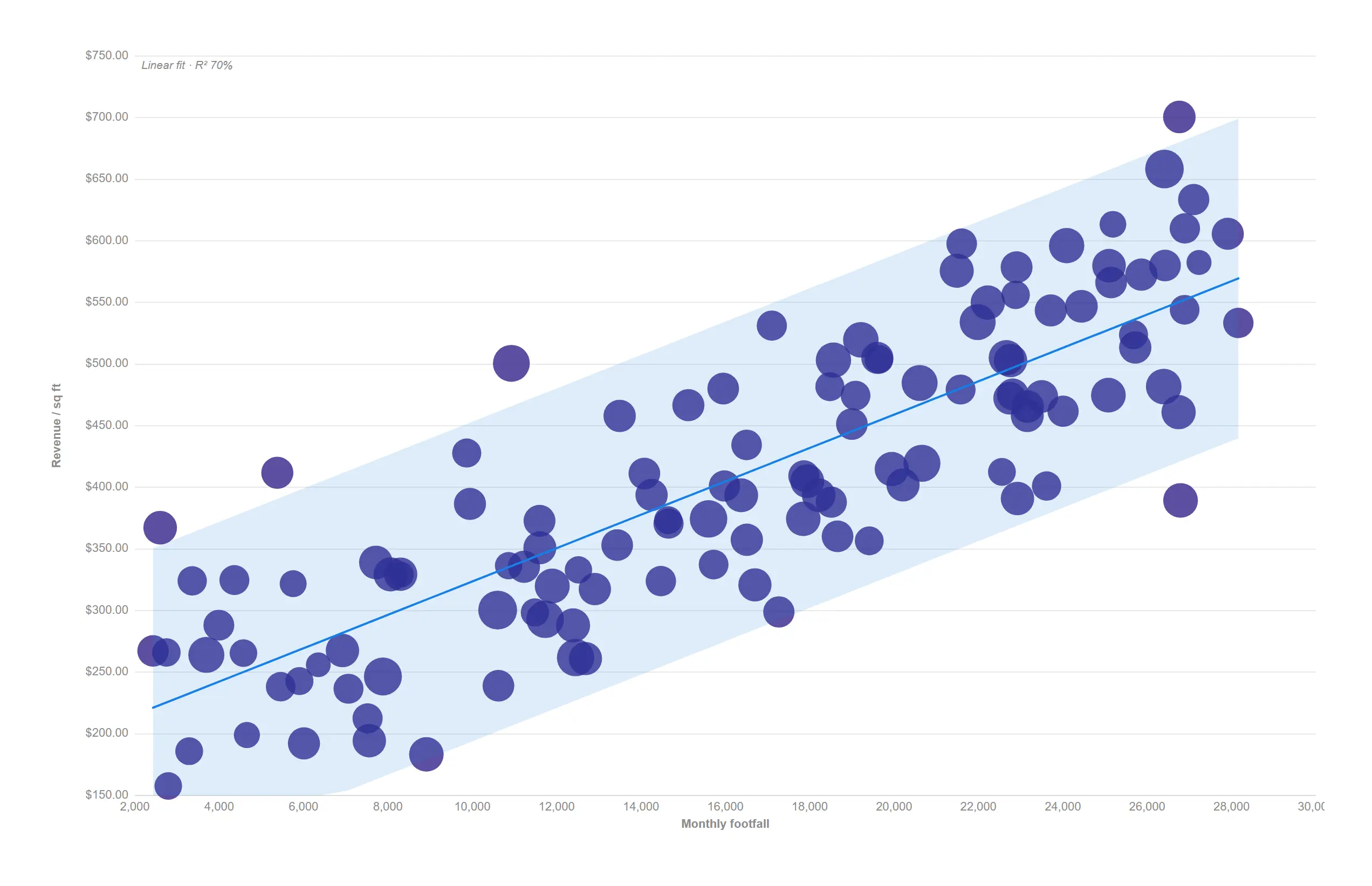
A least-squares fit line and confidence band answer whether the relationship is real, and how tight.
props.trend.fit = "linear" with the ±1.96·SE confidence band; R² printed through the engine mask.
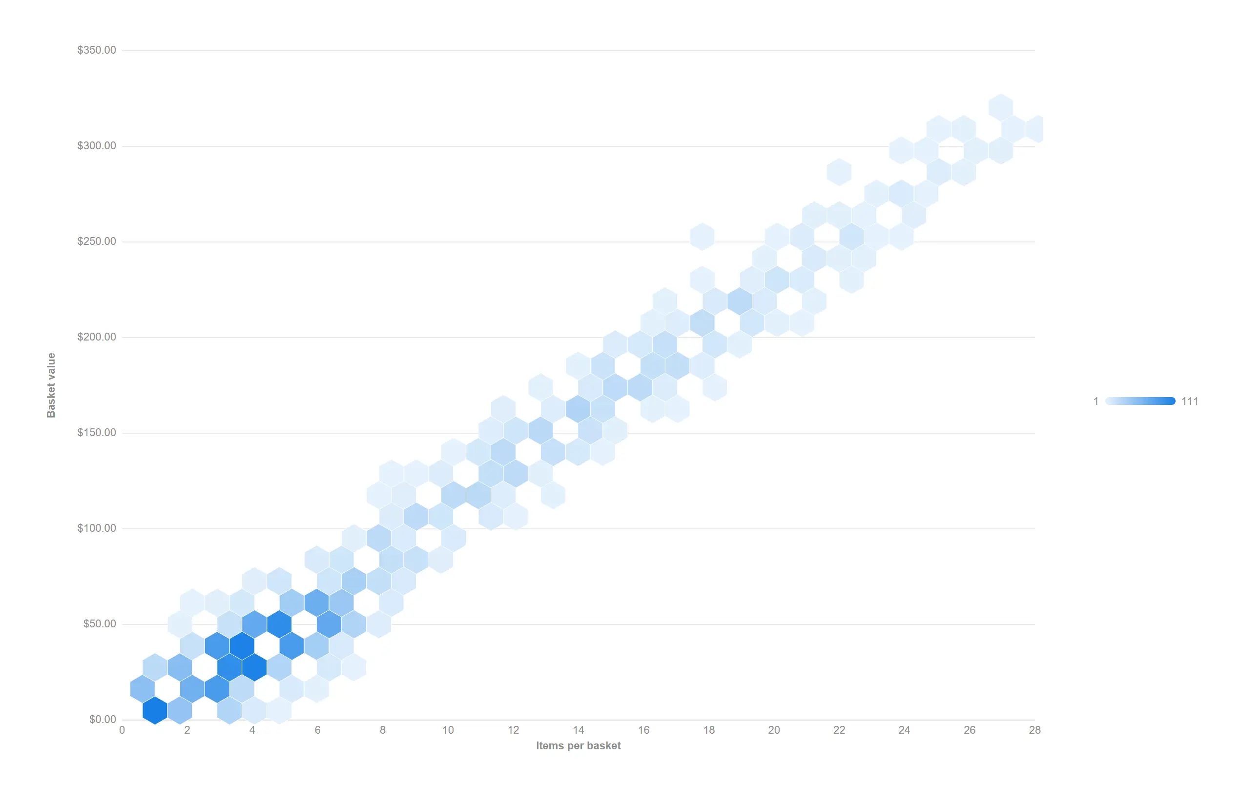
Thousands of transactions stop being a blob and start being a distribution.
props.scatter.display = "hexbin" with the theme sequential ramp.
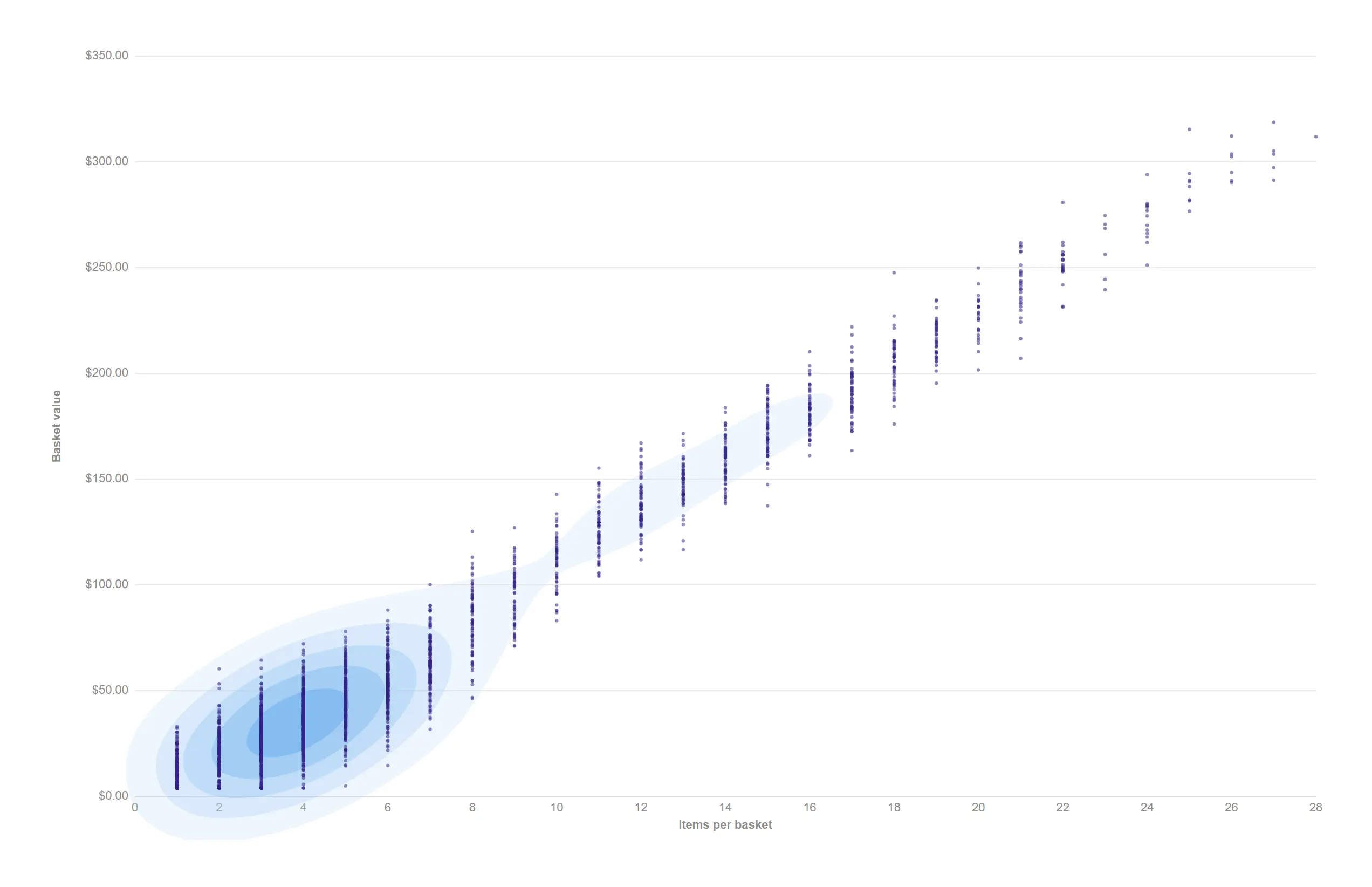
Contour bands reveal the clusters hiding inside an over-plotted cloud.
props.scatter.display = "contour" over selectable points (the density BANDS are the artifact; the small points stay SVG selection anchors).
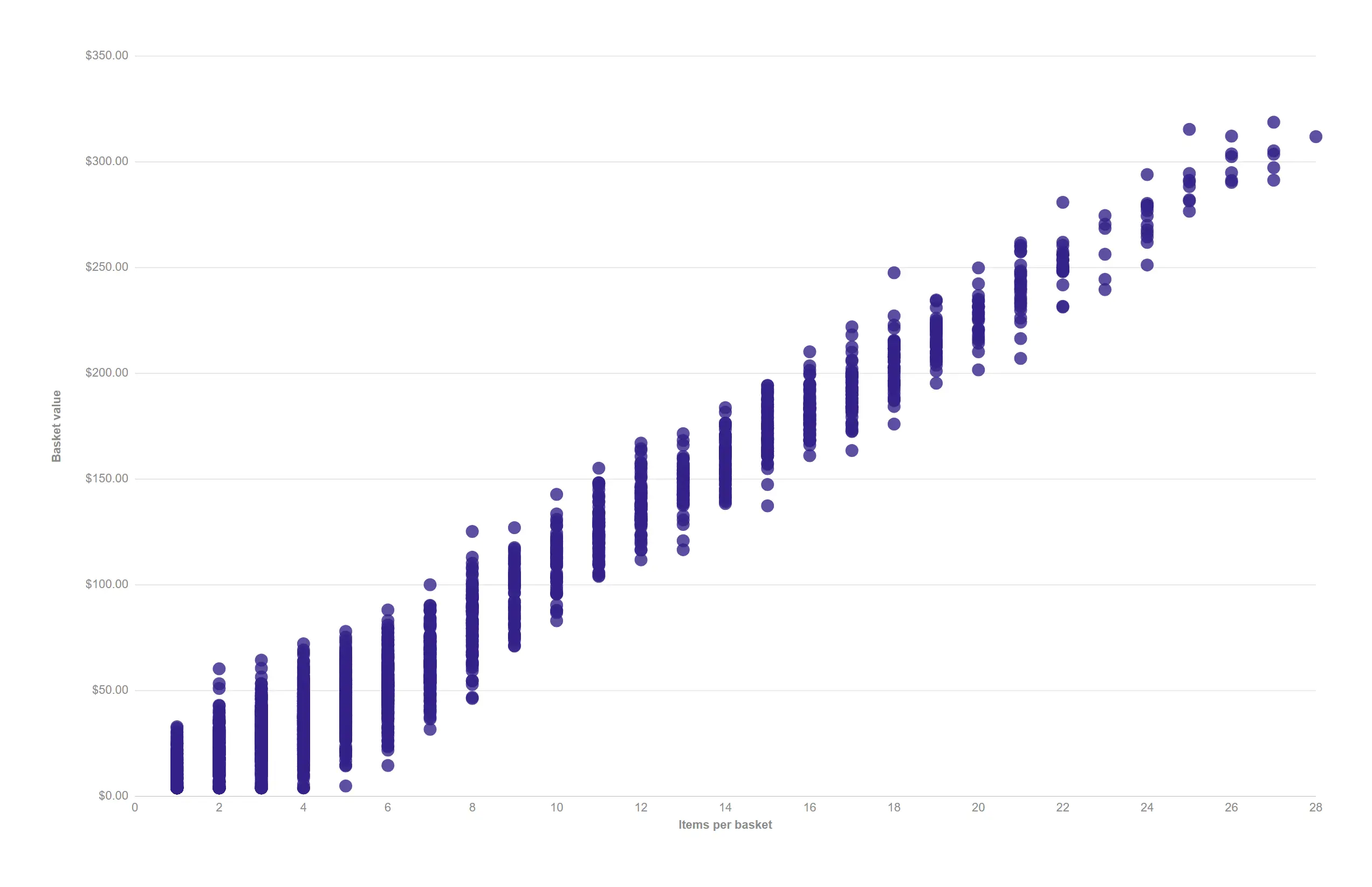
Thousands of individual transactions stay one fast, fully selectable picture.
props.scatter.display = "points" over ~2400 rows — above ~2000 marks the cloud paints to a single canvas; box and lasso still select the exact enclosed rows.
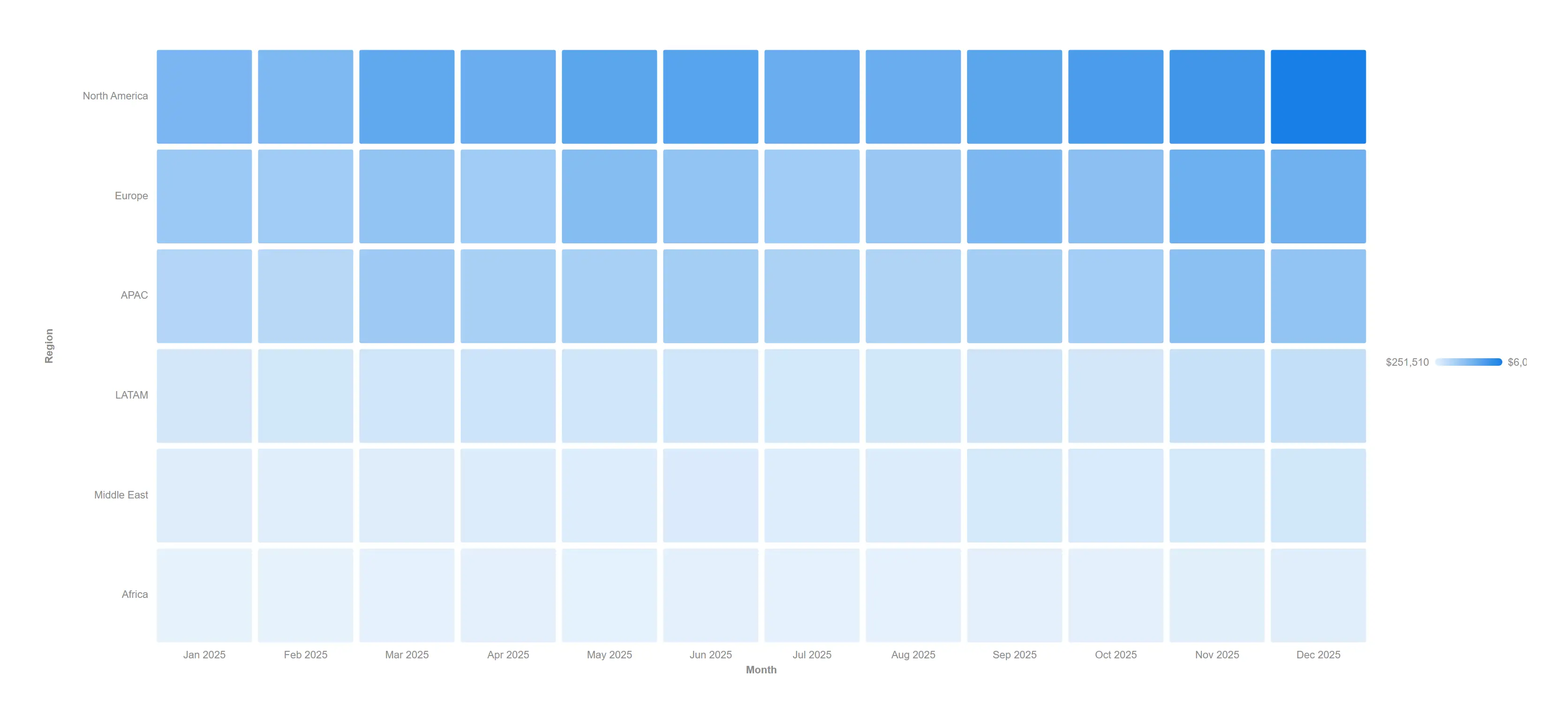
A month-by-region grid where the hot and cold cells announce themselves.
props.heatmap.layout = "grid" on the theme sequential scale.
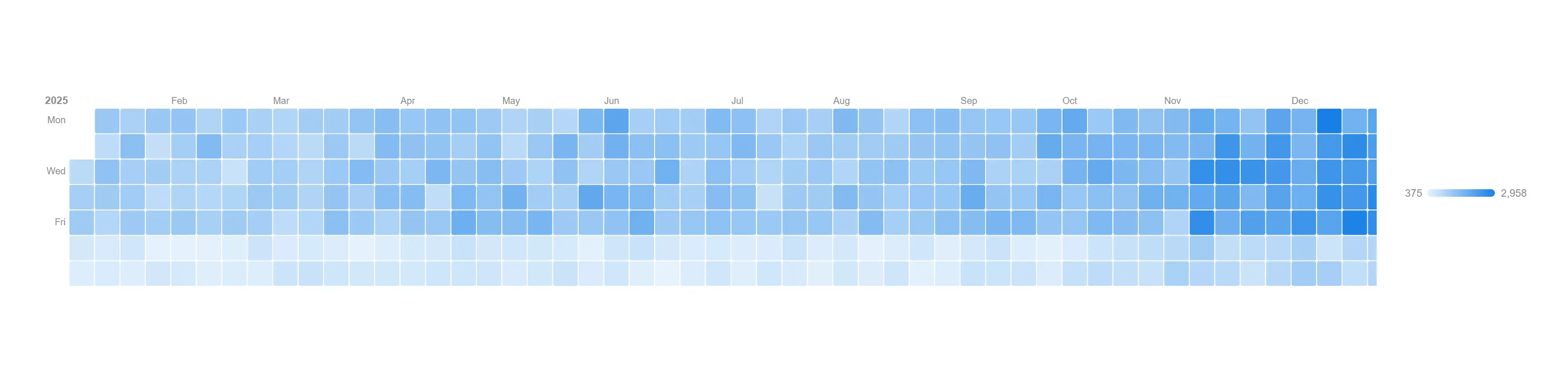
A full year of daily orders in one glance, weekends and peak season included.
props.heatmap.layout = "calendar" over a single date dimension.
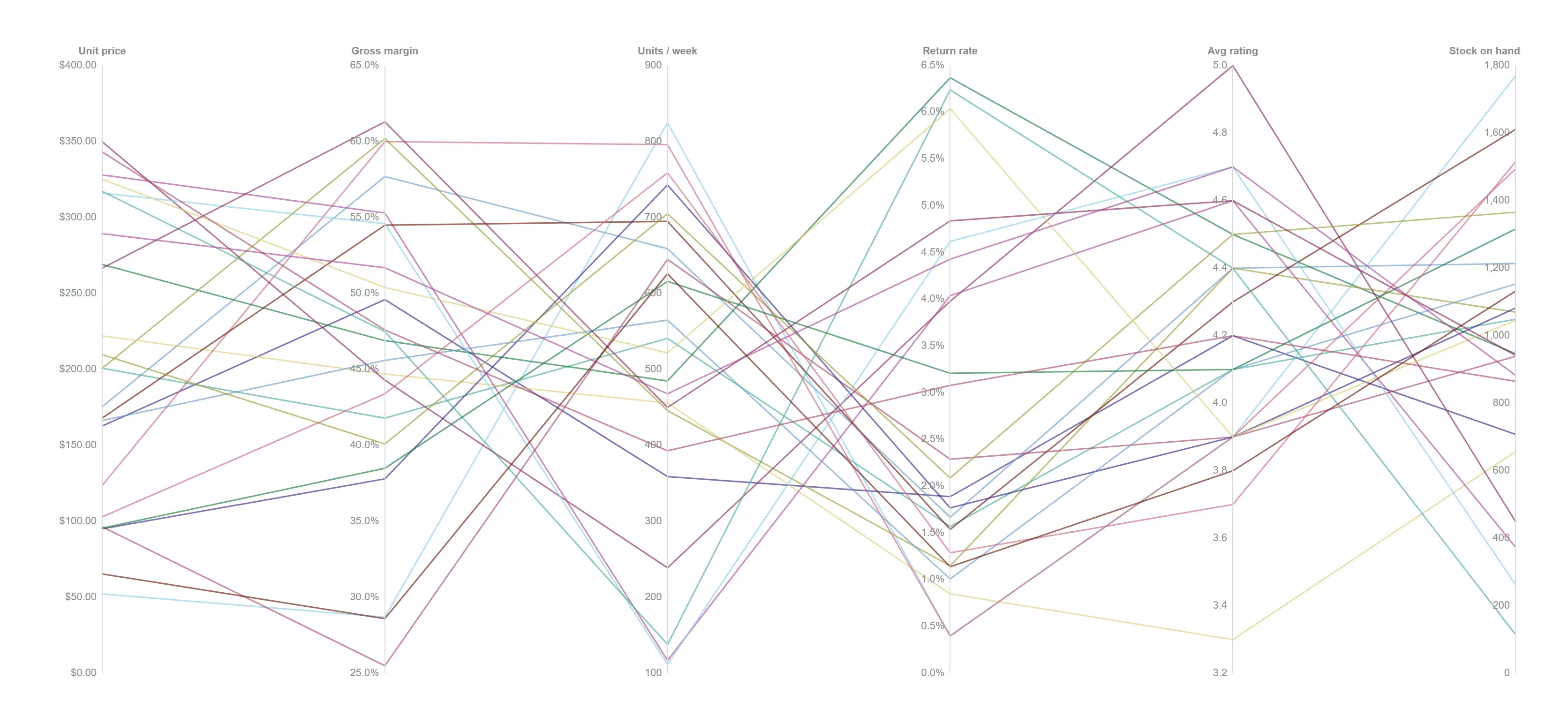
Read six competing metrics for every product at once, then drag on any axis to narrow the field to the ones that pass.
One dimension, six measures — one independently scaled axis each; drag an axis to brush, a chip commits the survivors as a real selection.
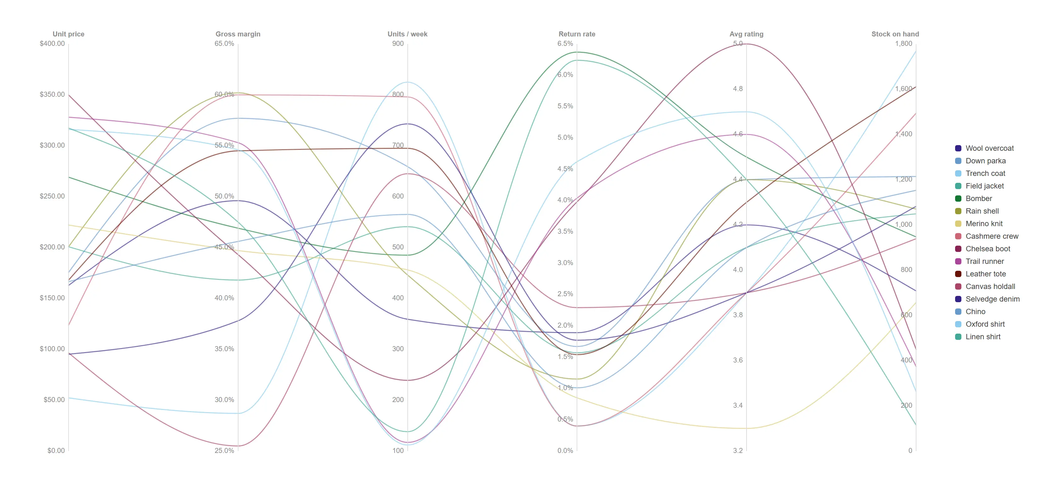
Follow individual products through the plot more easily when the threads curve instead of kinking at every axis.
props.curve.type = monotone with by-dimension colouring across the twenty-four lines.
See the whole spread, not just the average, with statistics computed honestly against your own data.
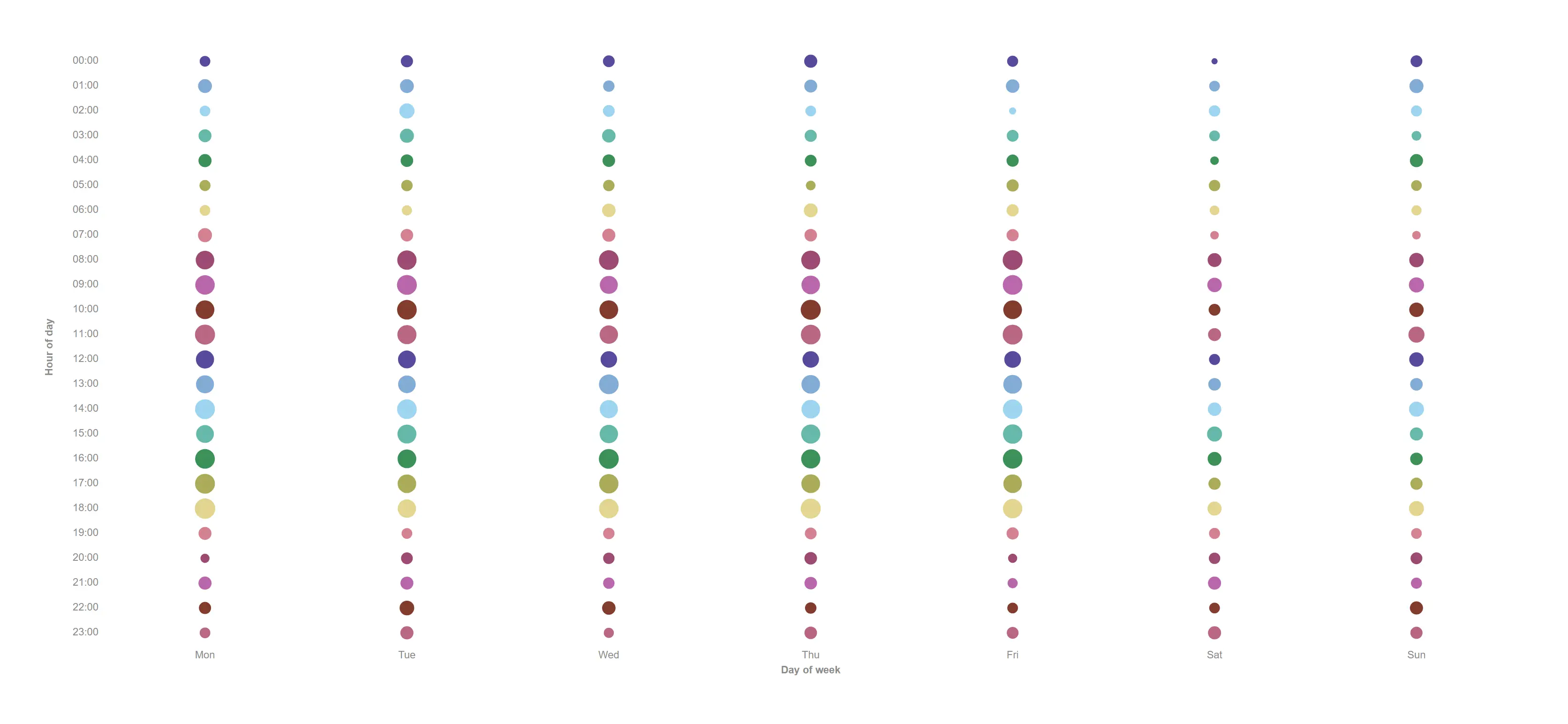
When incidents actually happen, day by hour, sized so the busy cells announce themselves.
Two dimensions (day × hour) + one measure sizing an area-true dot at each cell; empty cells stay visibly empty.
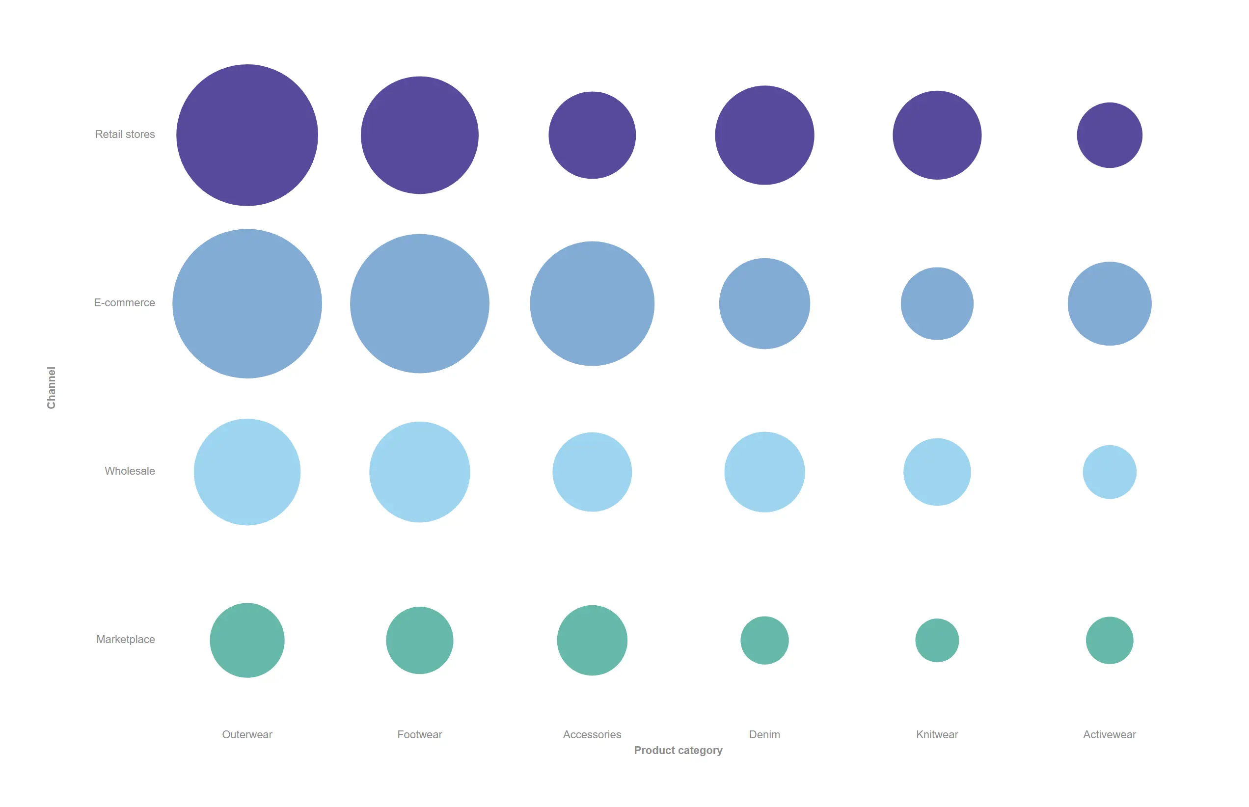
Revenue concentration across two categorical axes, read off dot size without a colour legend.
Product category × channel + revenue; a dot selects both dimension values like a heatmap cell.
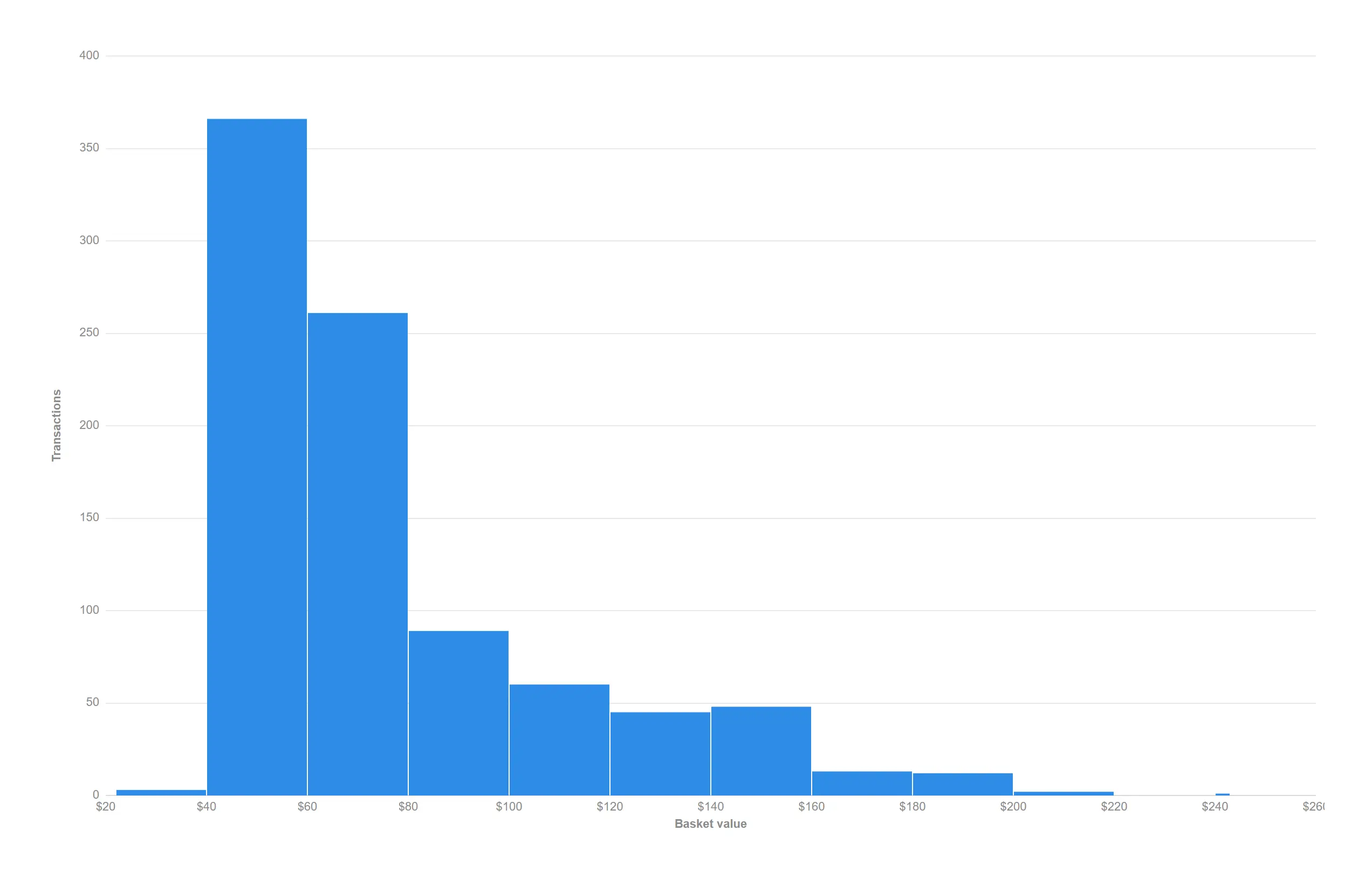
Bin your own data client-side and see the two kinds of basket your customers actually buy.
Auto binning (Freedman–Diaconis) over a numeric dimension.
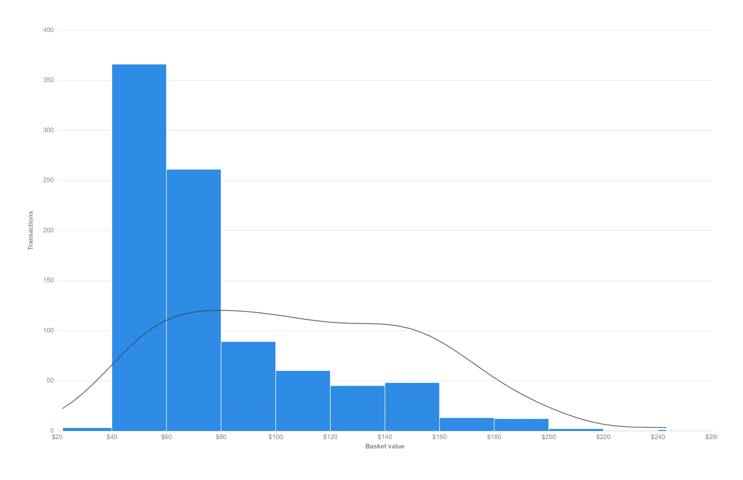
Add a smoothed density curve when the bin edges are getting in the way of the shape.
props.histogram.density = true over the auto bins.
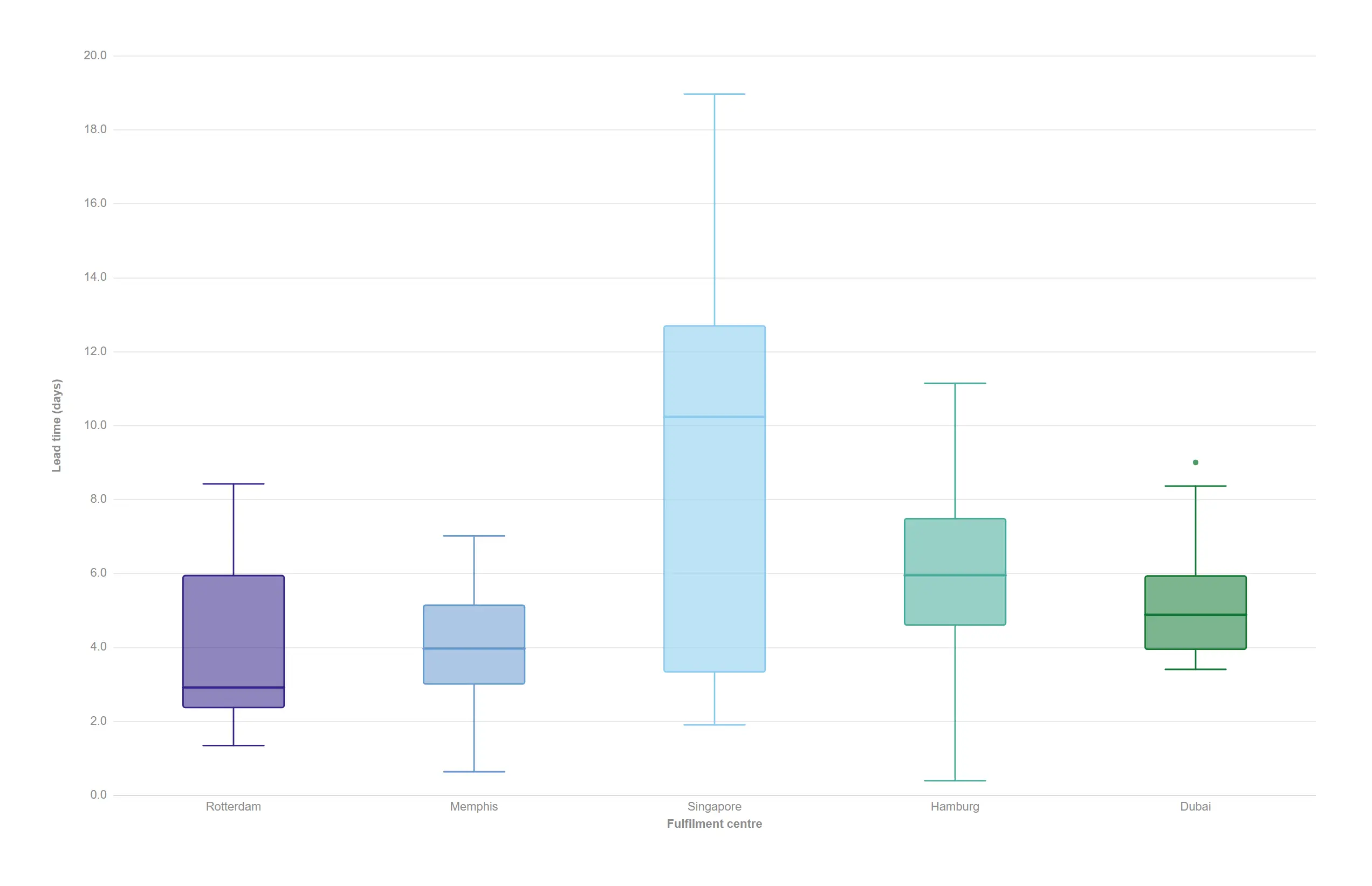
Quartiles, whiskers and outliers computed from the detail rows — no pre-aggregation needed.
props.boxplot.mode = "compute" with Tukey 1.5·IQR whiskers.
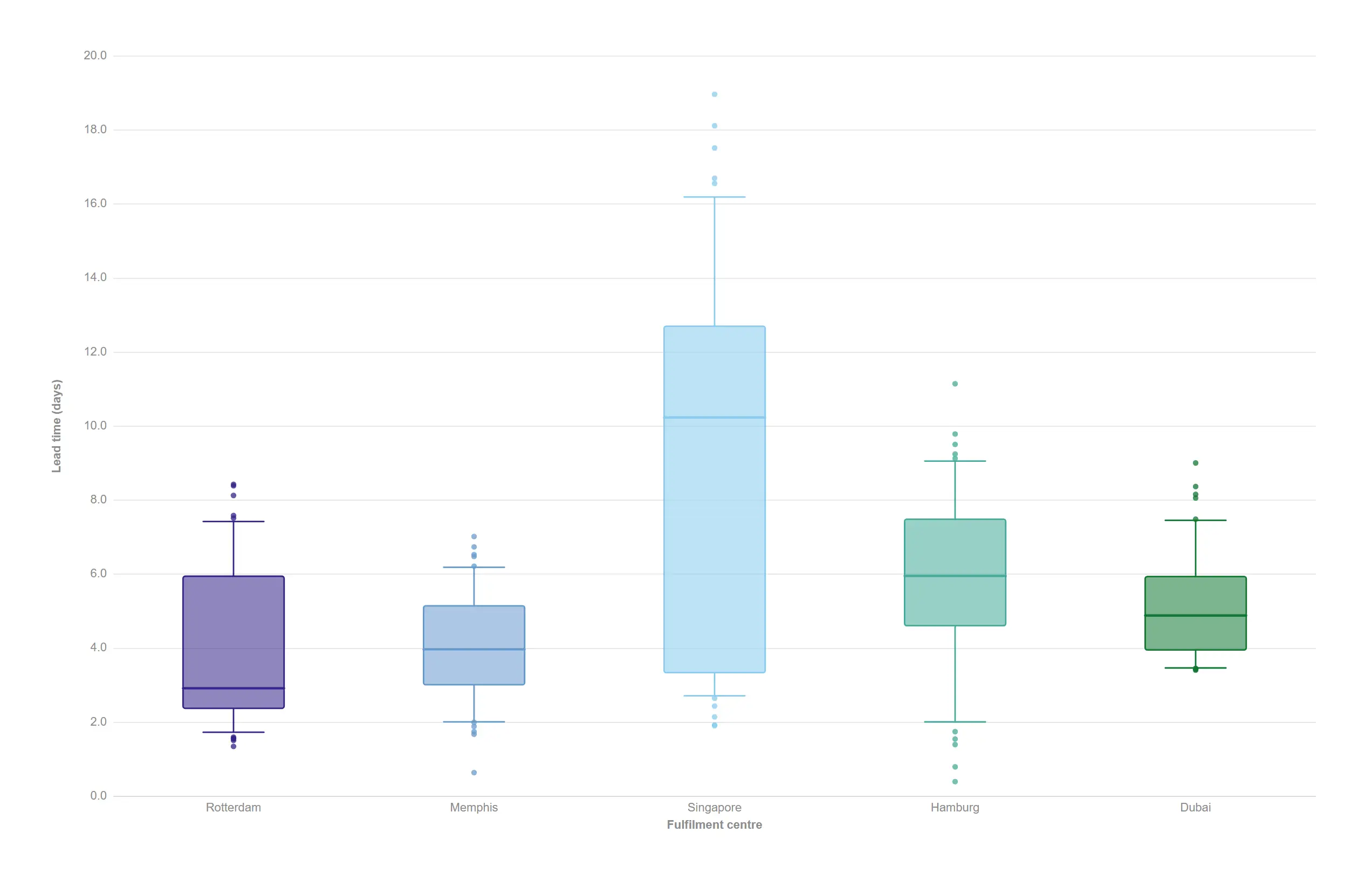
Switch whisker rules in one click when your organisation reports on percentiles.
props.boxplot.whiskers = "percentile".
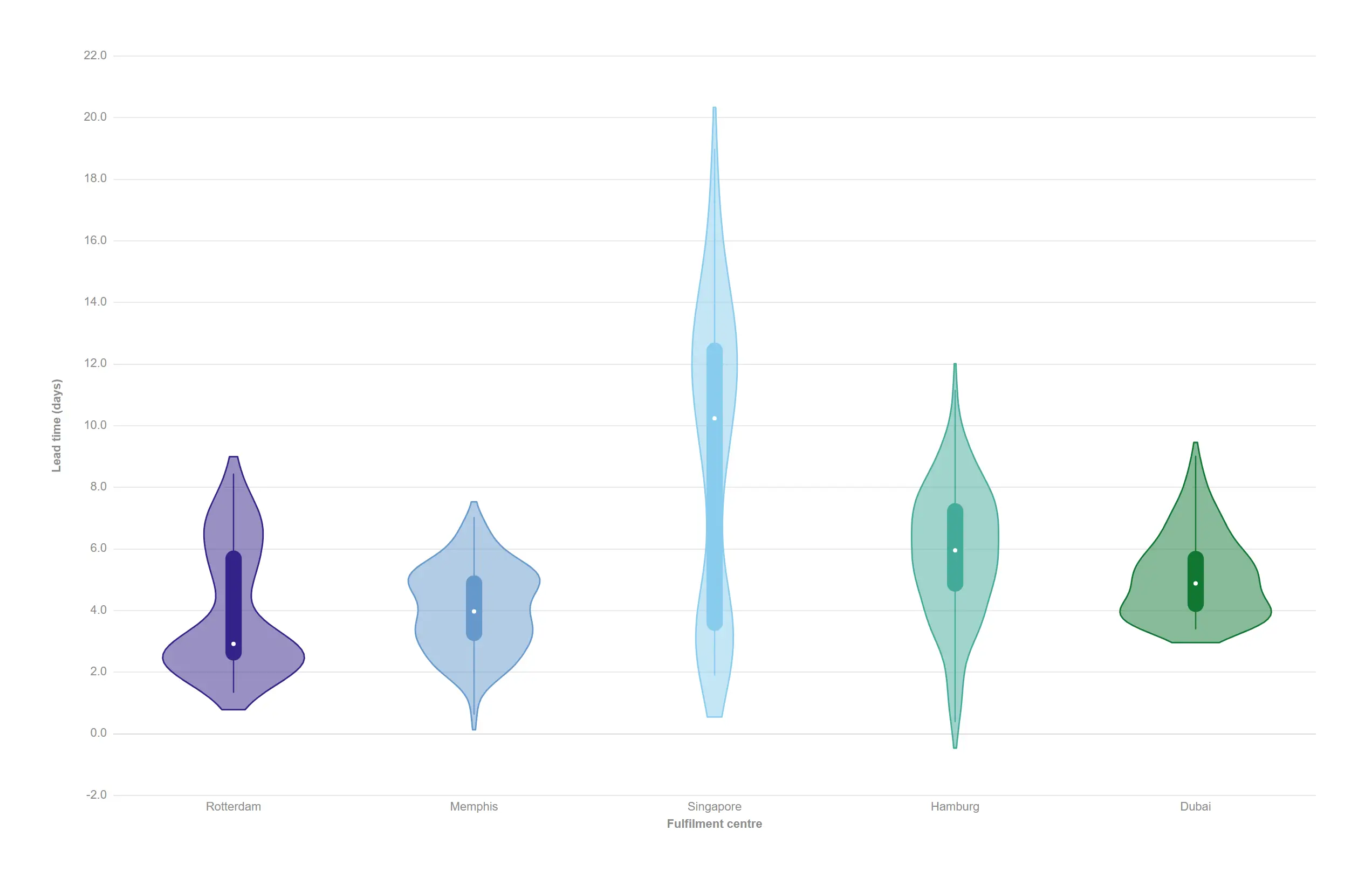
Where a box plot hides a second peak, the violin shows it.
props.violin.box = true adds the inner quartile box and median dot.
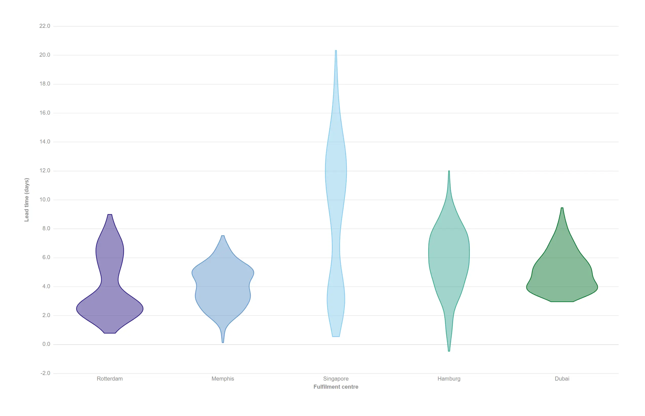
Drop the inner box for a cleaner comparison of pure distribution shape.
props.violin.box = false.
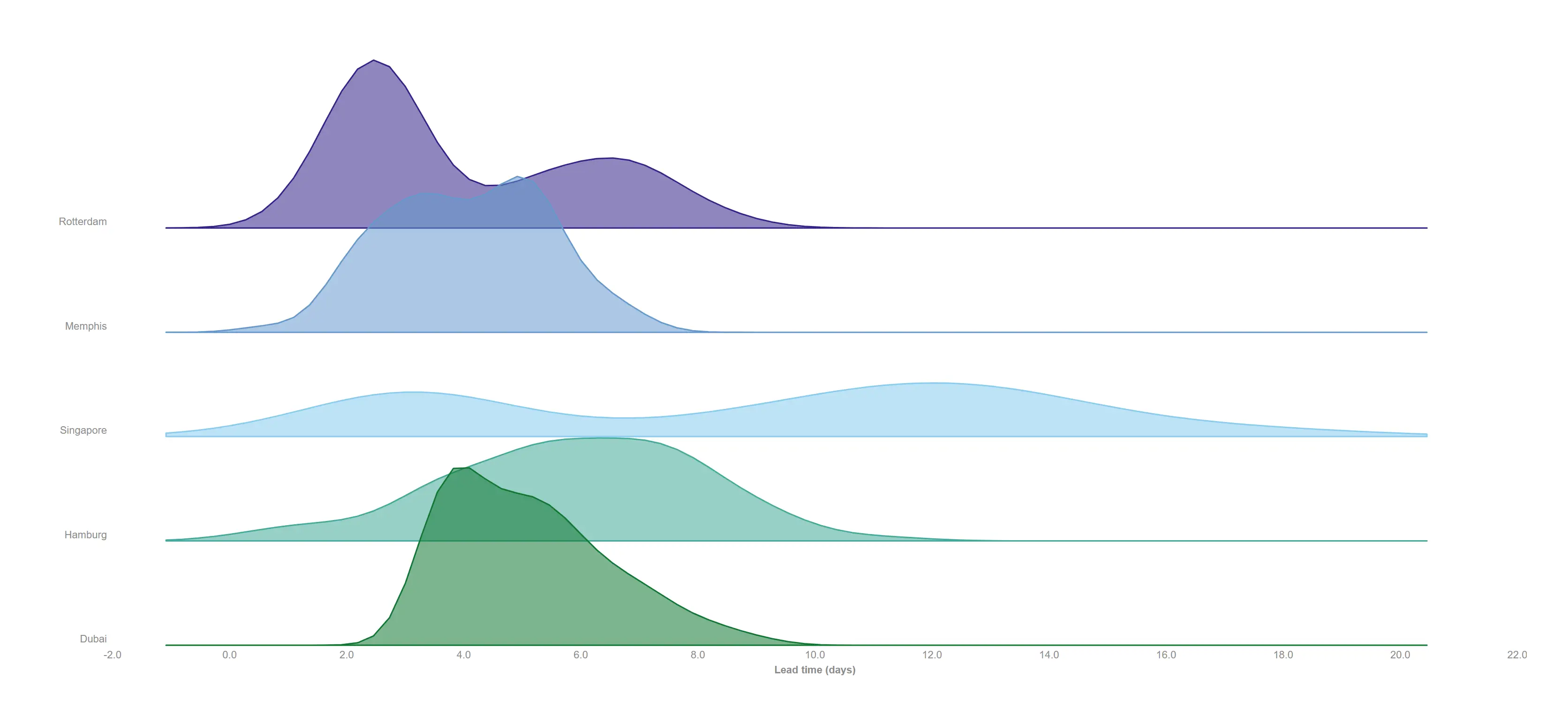
Stack every centre's lead-time distribution on one shared axis and read the whole network at once.
props.ridgeline.mode = "density" (shared KDE extent across ridges).
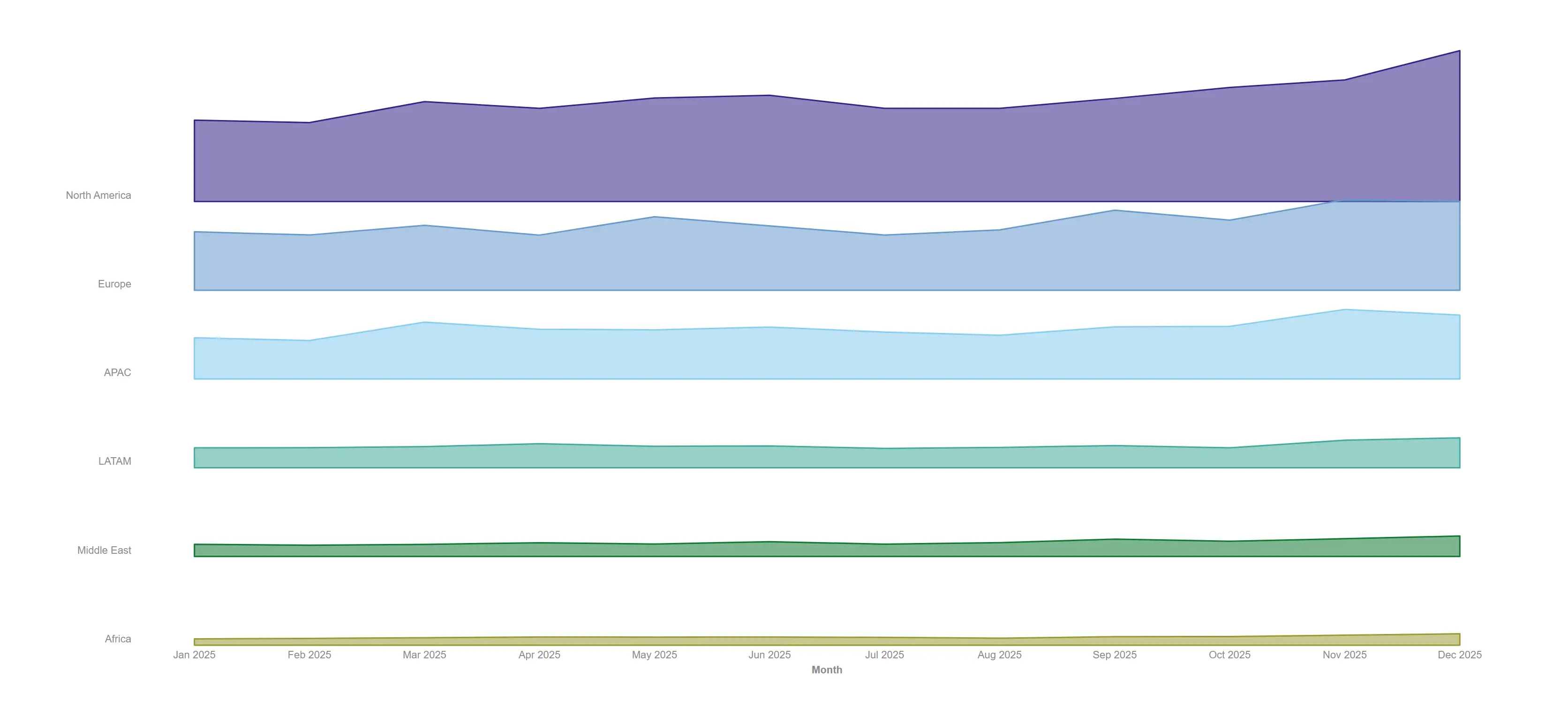
Turn a crowded multi-series line chart into calm, comparable ridges.
props.ridgeline.mode = "curve" plots the measure over dimension 1.
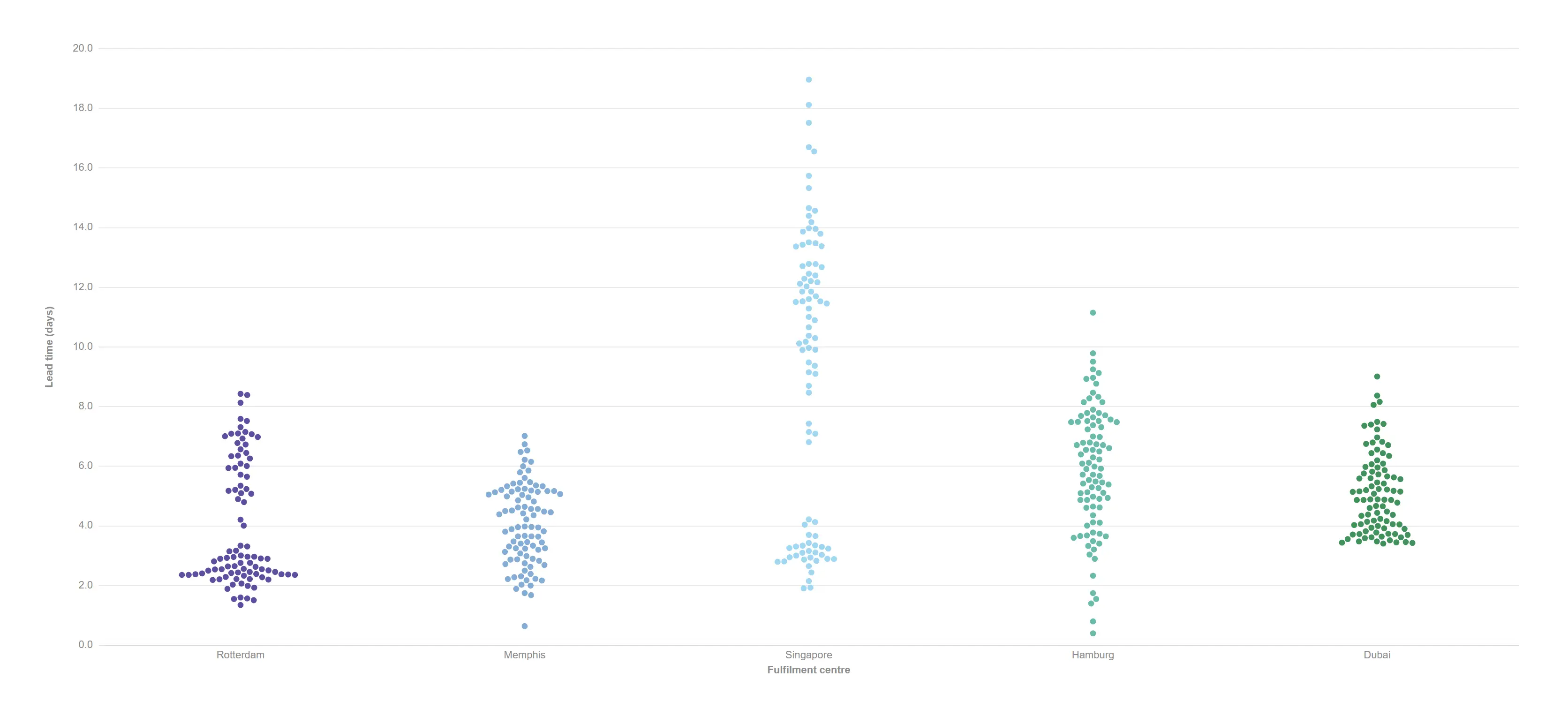
Every shipment as its own dot, dodged deterministically so nothing hides behind anything else.
props.distribution.mode = "beeswarm" (no simulation, fully reproducible).
A lighter-weight point cloud per lane when you have more rows than pixels.
props.distribution.mode = "jitter" (golden-ratio spread).
Track movement over time — positions changing, markets trading and processes drifting out of control.
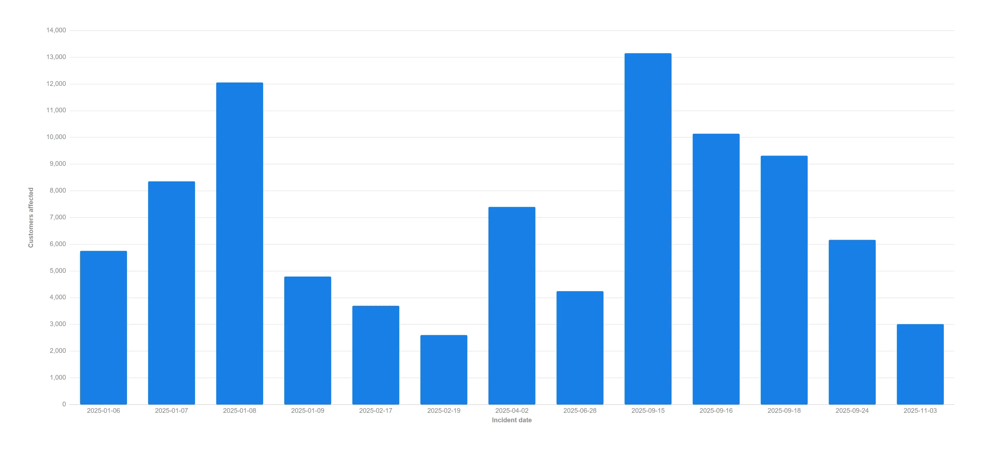
Thirteen incidents across a year, spaced equally. Read it and you would swear they arrived at a steady drumbeat — but four of them landed in the same week.
props.xAxis.scale = categorical. This is what every cartesian chart used to do with a date dimension, whatever the dates said.
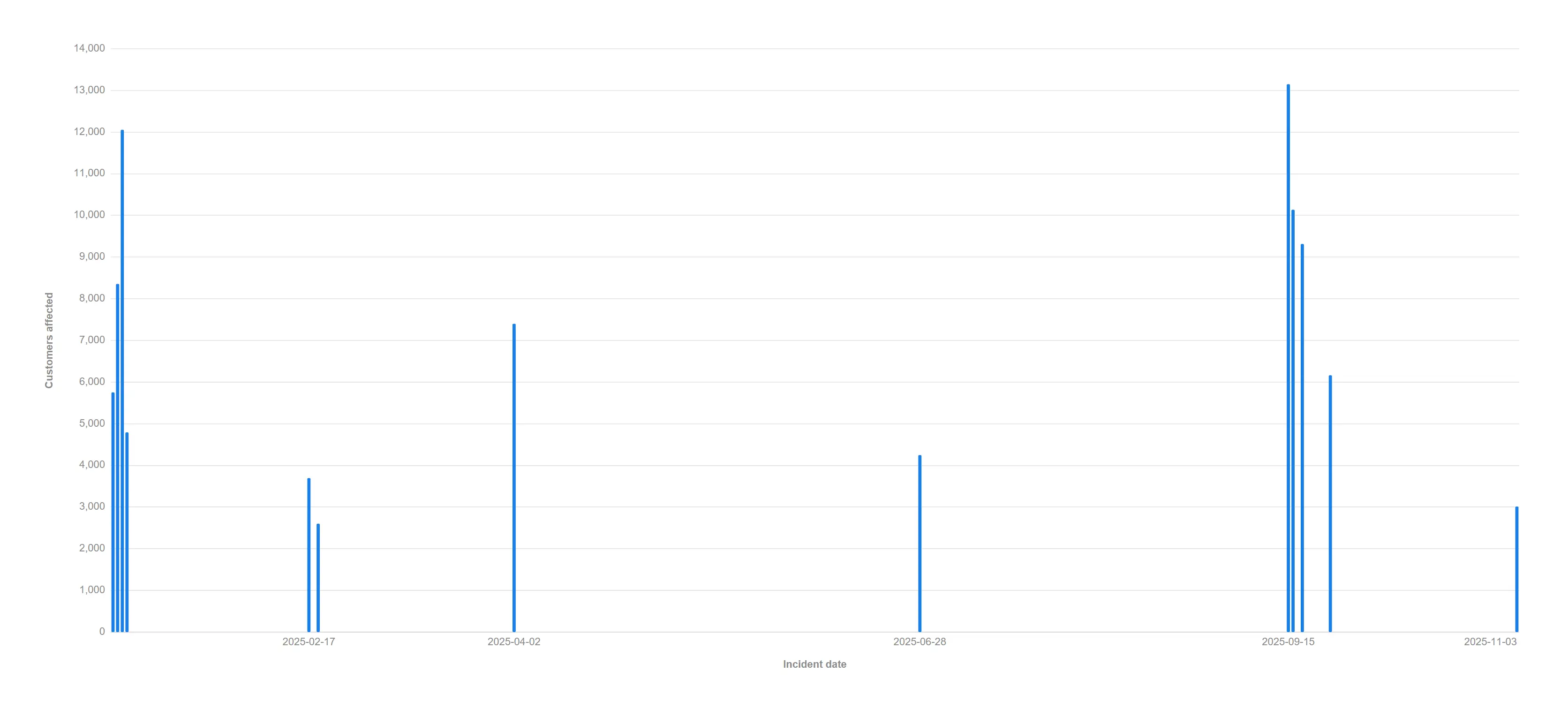
The same thirteen incidents on a real time axis: the January cluster, the five-week quiet spell and the September burst are all suddenly visible. The gaps were always the story.
props.xAxis.scale = time (or just Auto — it detects irregular dates). Positions come from d3 scaleUtc; the tick labels are the dimension’s own Qlik date format.
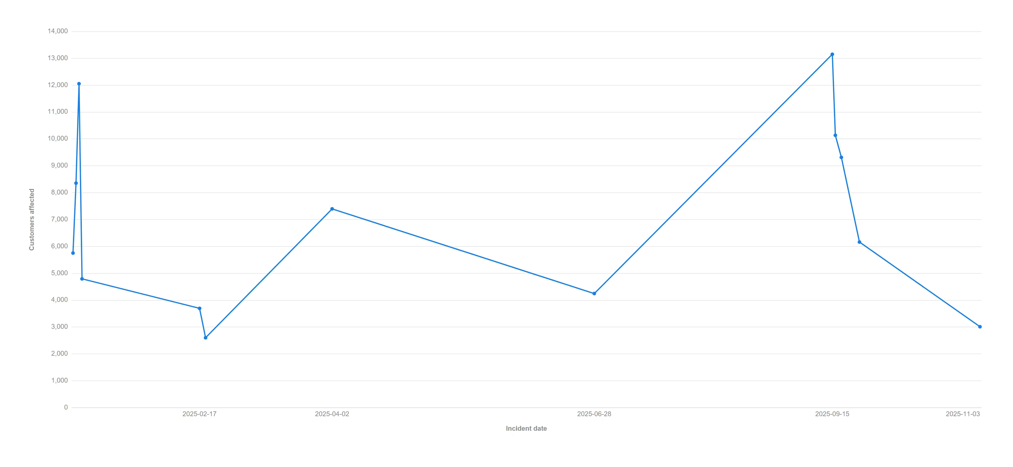
A line over irregular readings slopes at the rate the data actually moved, instead of pretending every step took the same time.
Auto picks the time axis because the dimension is a date and its values are irregular; a regular series is left categorical and unchanged.
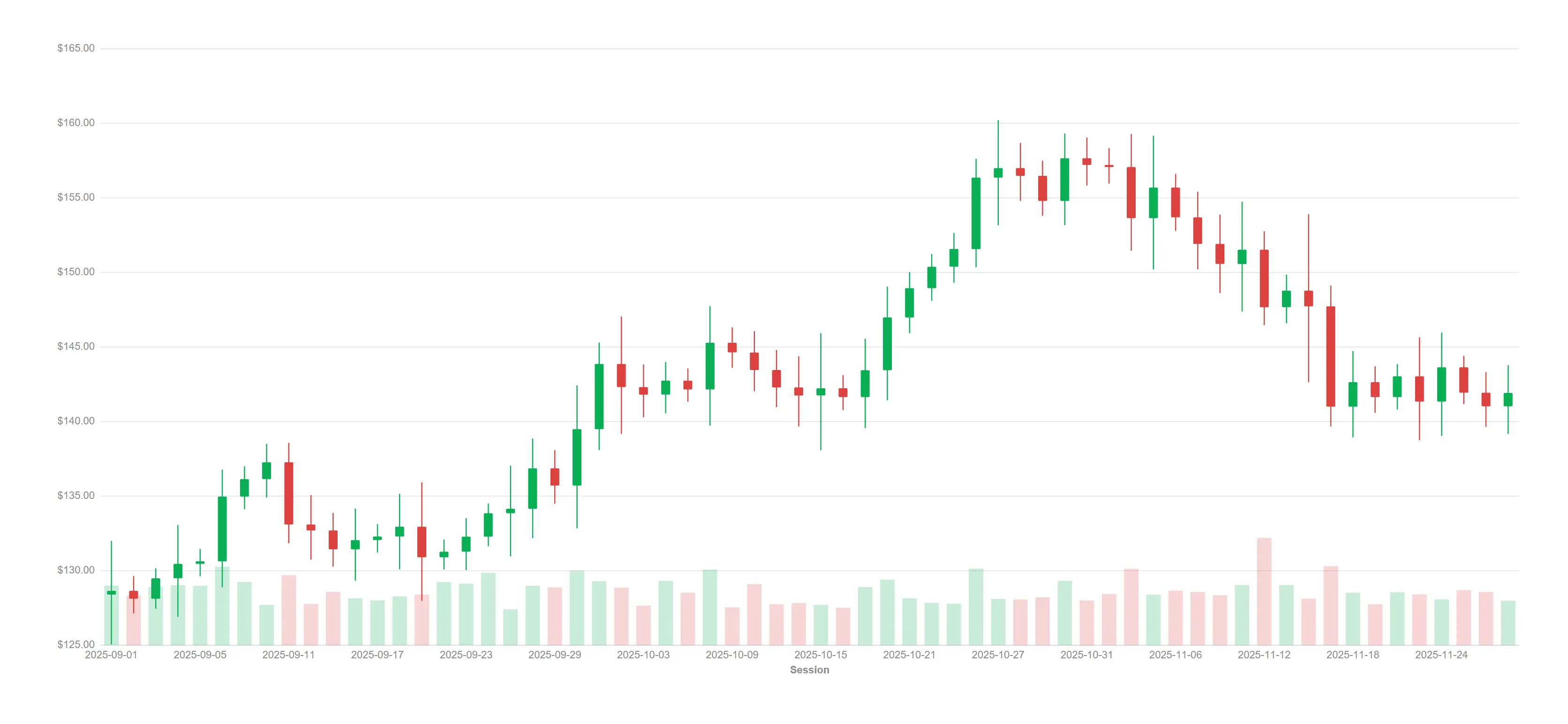
Full OHLC candles with a volume band along the floor — the finance view your traders expect.
Five measures in open / high / low / close / volume role order.
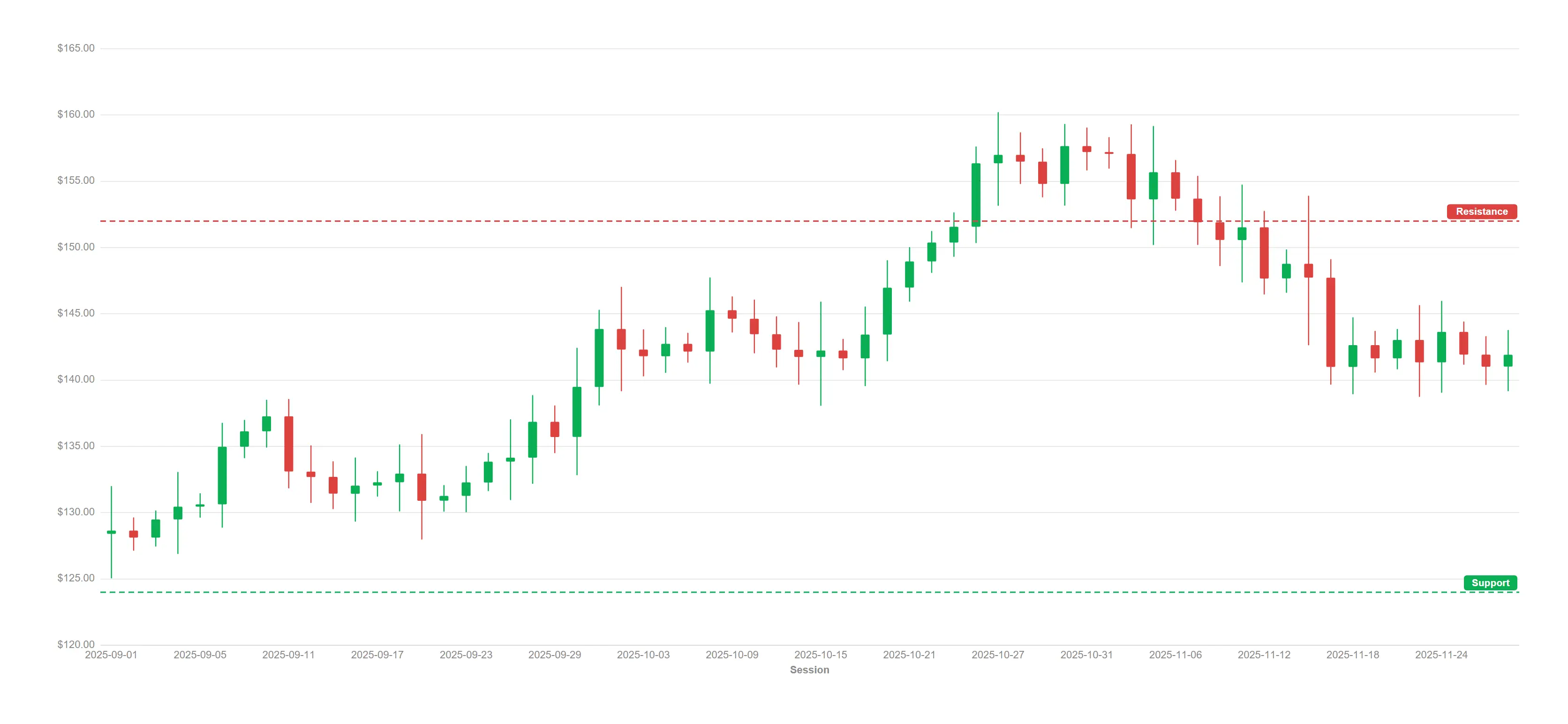
Drop support and resistance lines onto the chart and keep them engine-evaluated.
Four OHLC measures plus two props.refLines price levels.
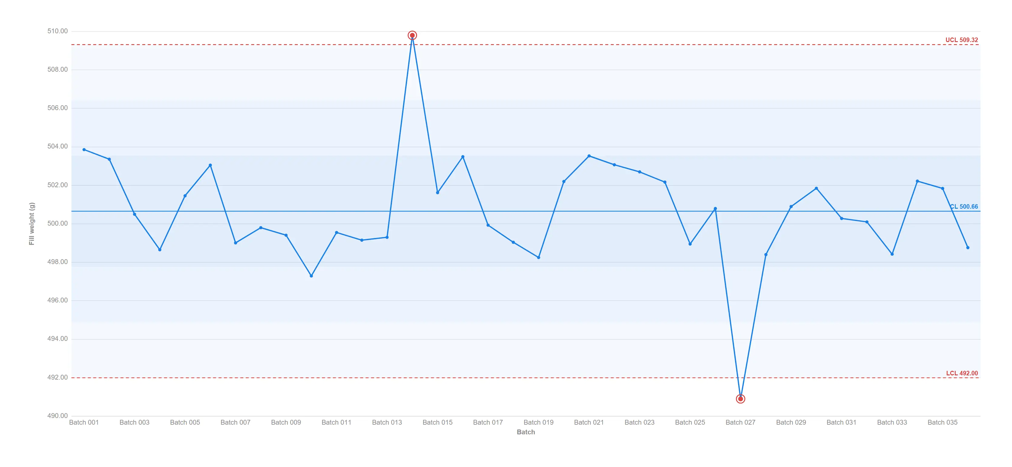
Sigma zones, control limits and out-of-control points flagged the moment the process drifts.
props.control.center = "mean"; rule 1 (beyond 3σ) always on.
Catch the slow drift a limits-only chart misses, with all four run rules evaluated honestly.
props.control.rules = true enables Western Electric rules 2–4.
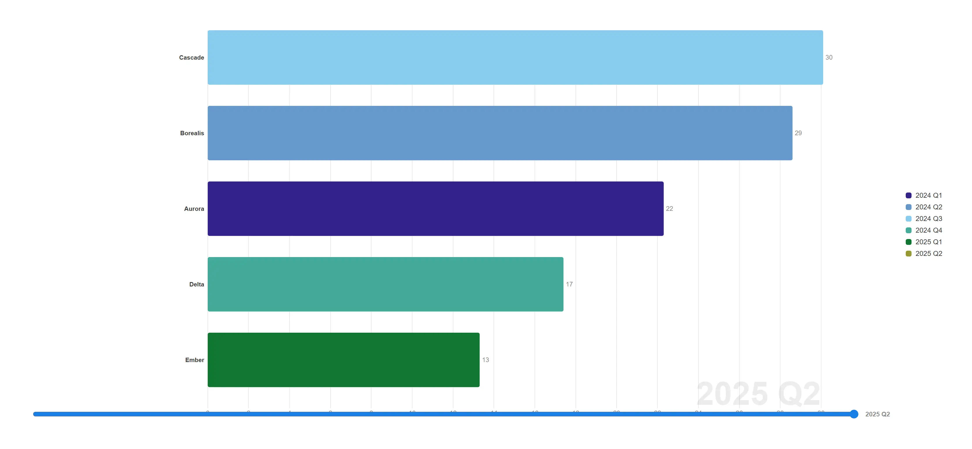
Press play and the ranking runs — value-sorted bars slide, resize and overtake, period by period. The still is the settled final quarter.
props.motion.play = true over a Brand × Quarter cube; the last period is the settled frame (the scrubber is live-only, motion-gated).
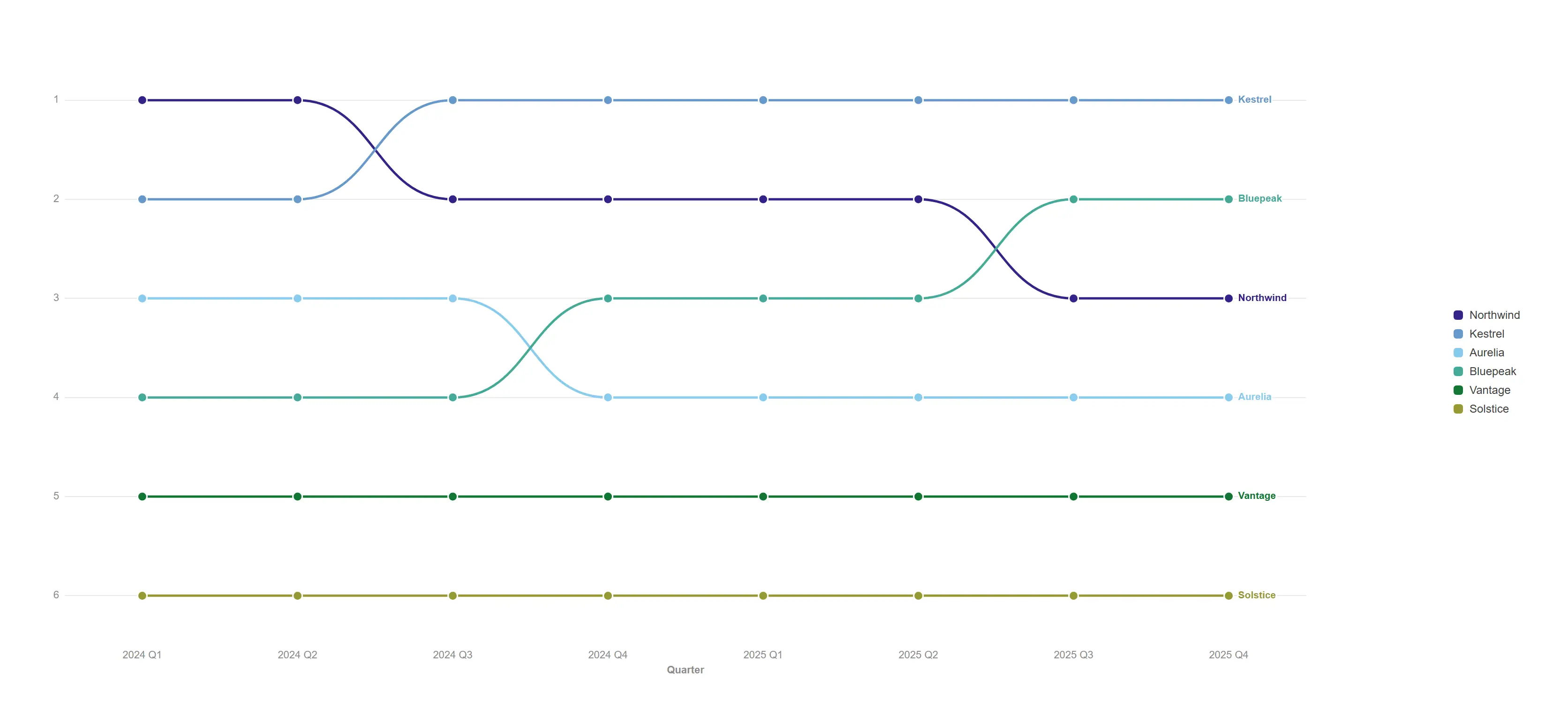
Watch competitive position change quarter by quarter, with every crossover called out.
props.bump.mode = "rank"; ties break deterministically.
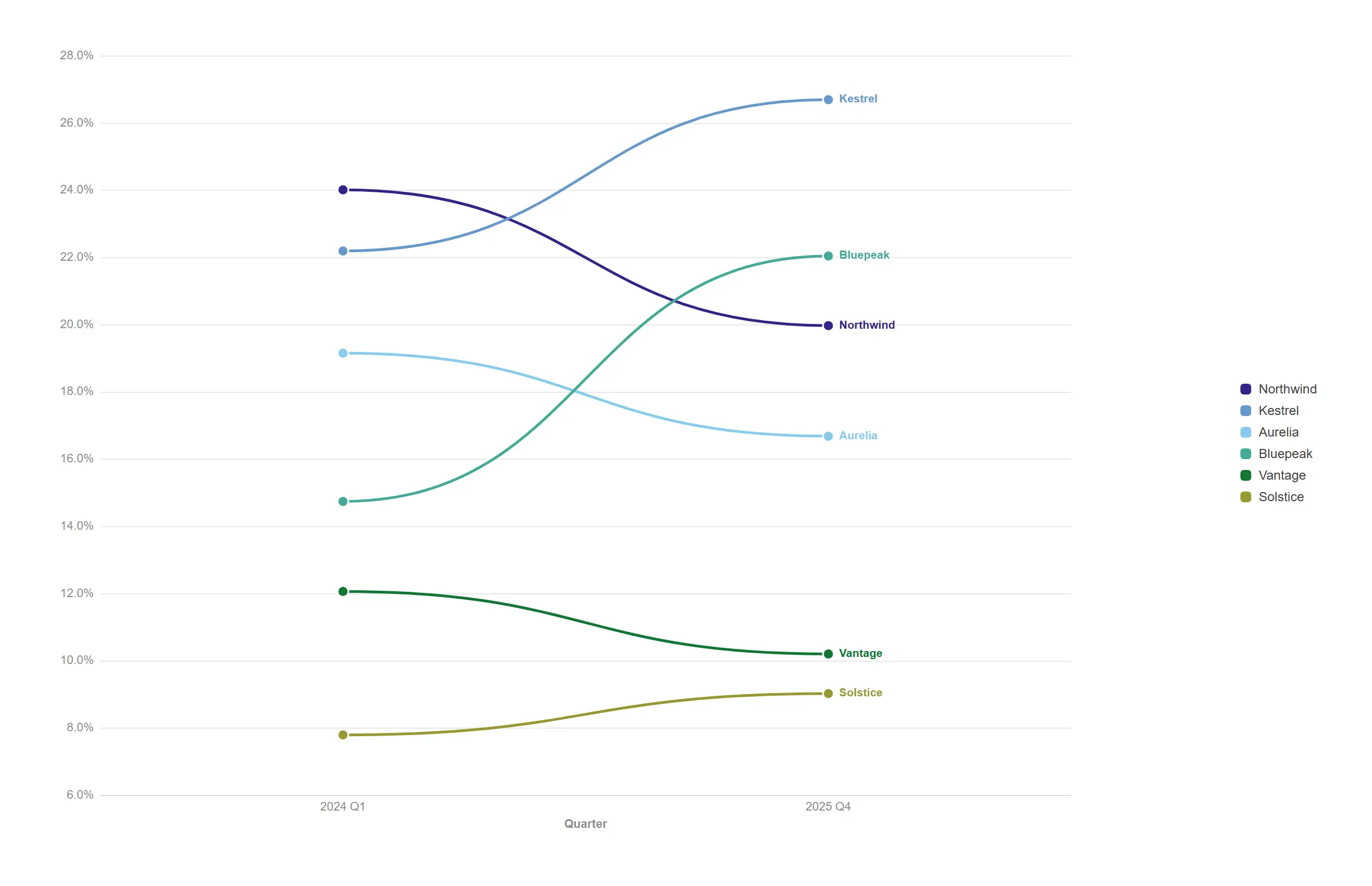
Two periods, real values, one line each — the cleanest before-and-after there is.
props.bump.mode = "slope" plots engine values on a true value axis.
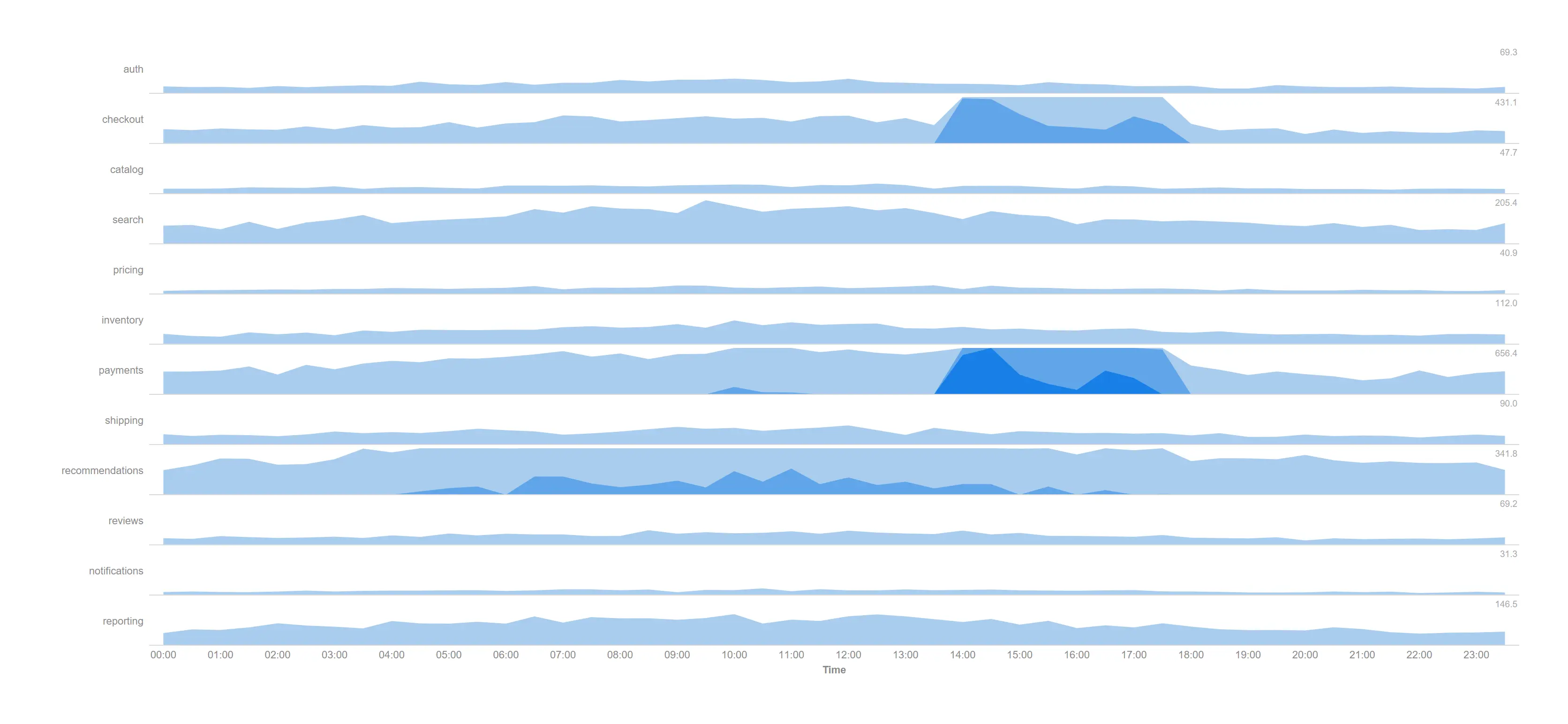
Watch twelve services through a whole trading day in the height a single line chart would need, and see the afternoon incident immediately.
Two dimensions (time × service), three folded bands, shared scale so the rows stay comparable.
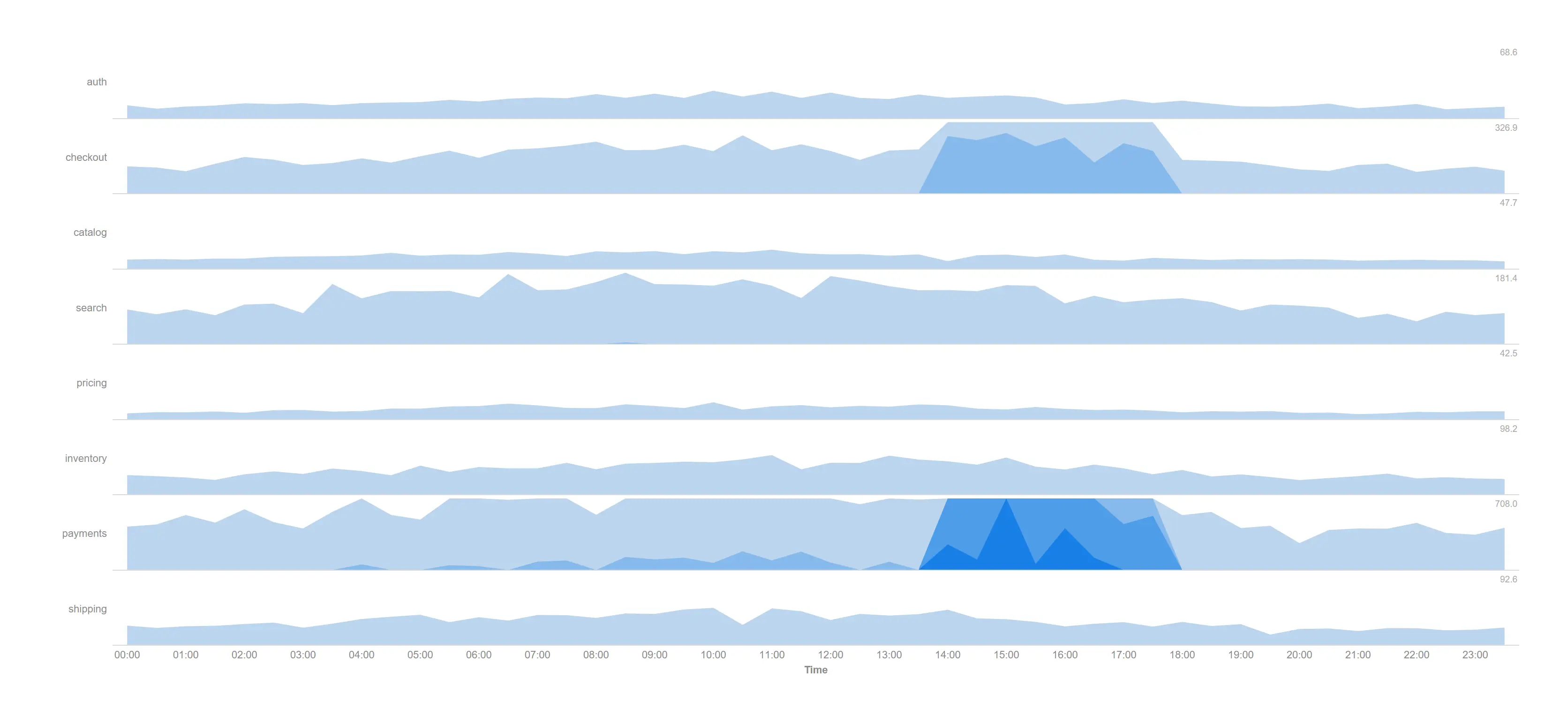
Turn up the resolution when the interesting variation hides inside the top of the range.
props.horizon.bands = 4 over eight services — more bands, finer value discrimination per row.
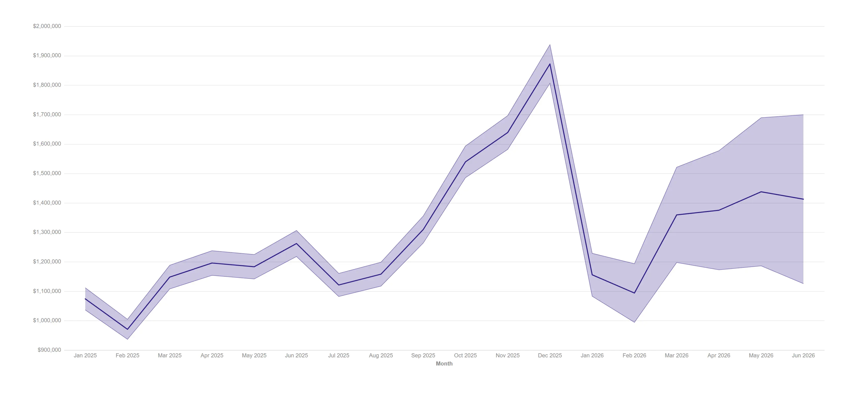
Publish a projection with its uncertainty attached, so the widening interval argues for itself.
Low/high bounds plus an expected-demand line, on a date axis with the interval widening past the actuals.
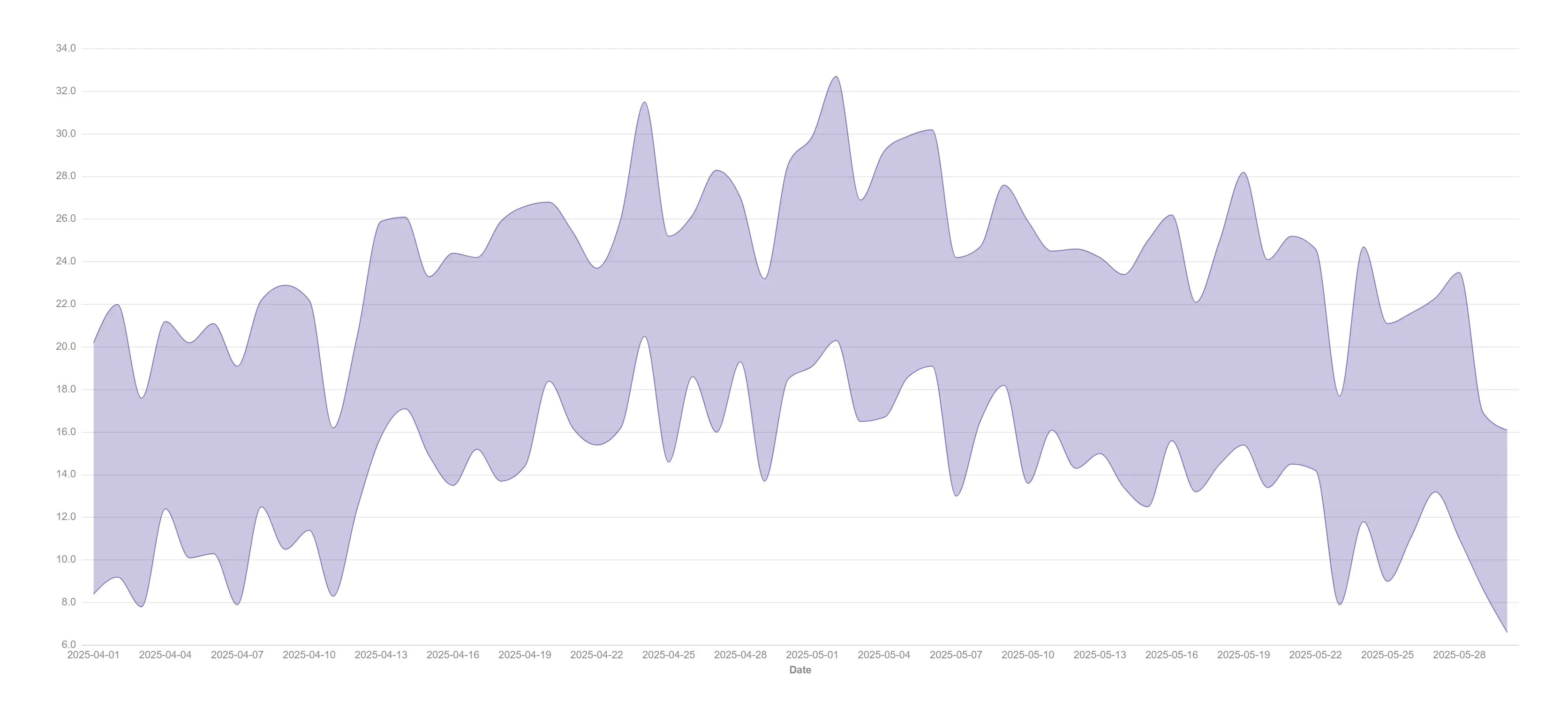
Show the spread of every day at a glance when the daily minimum and maximum matter more than an average.
Two measures (daily low and high), no middle line, monotone curve over sixty days.
Put the number that matters where the eye lands first, with the context that makes it mean something.
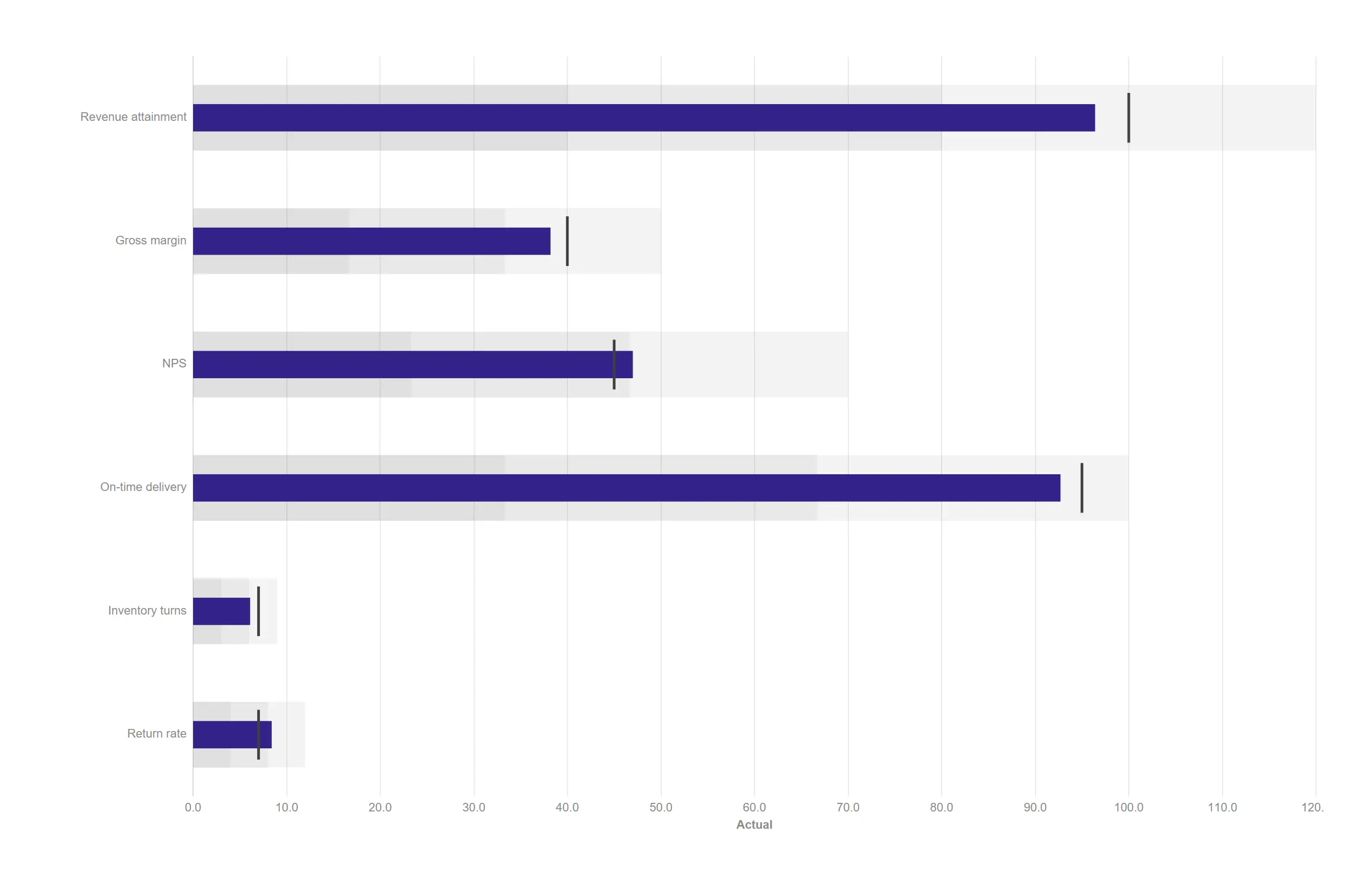
Six KPIs against target with qualitative bands, in less space than a single gauge.
Measure roles: value / target / range, automatic thirds for the bands.
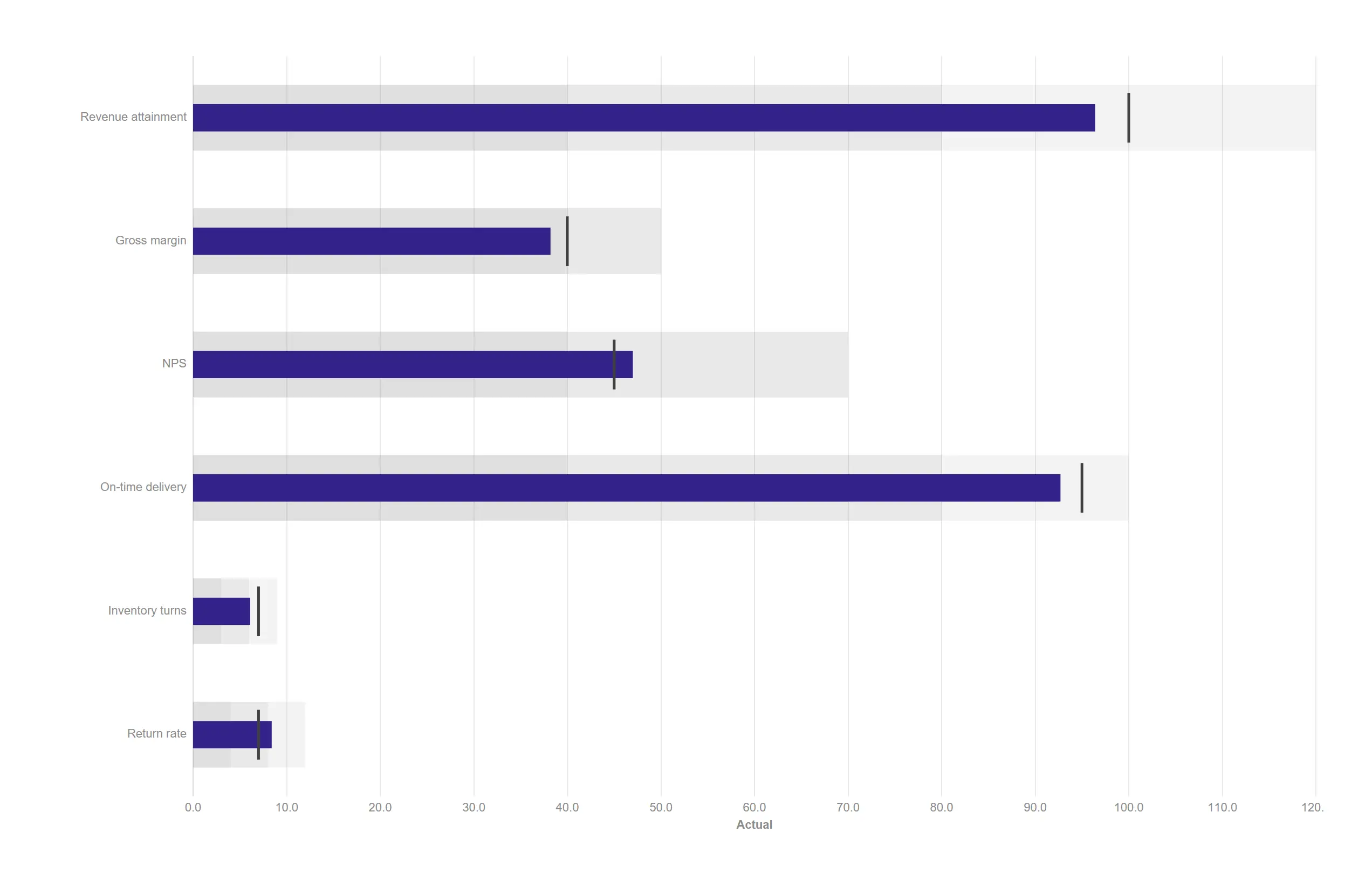
Set your own red, amber and green boundaries instead of accepting automatic thirds.
props.bullet.bands = "expressions" with limit1 / limit2.
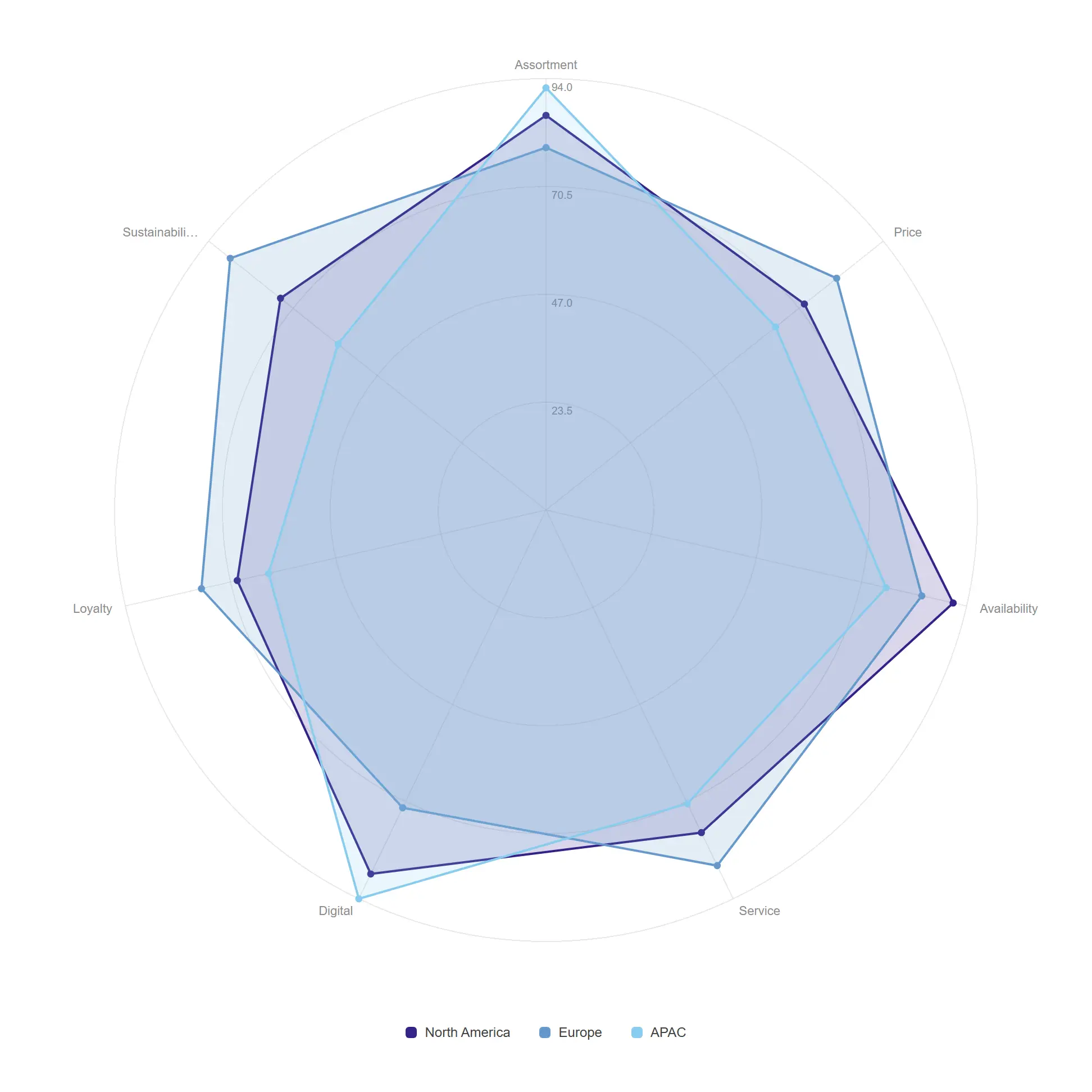
Compare three regions across seven capabilities and spot the shape of each strategy.
props.radar.mode = "radar" with three measure polygons.
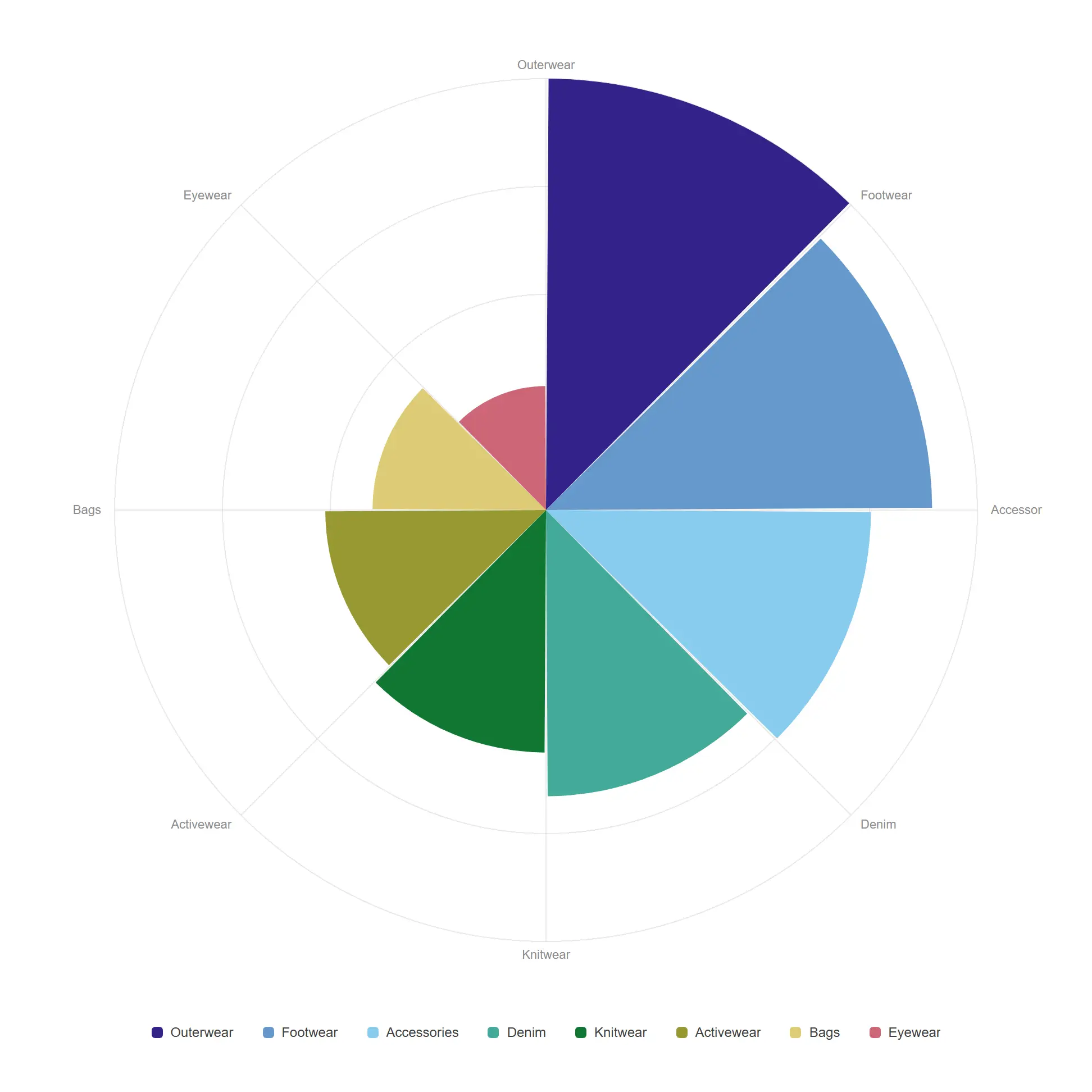
A polar bar chart where area, not radius, carries the value — so the comparison stays honest.
props.radar.mode = "rose" (radius ∝ √value).
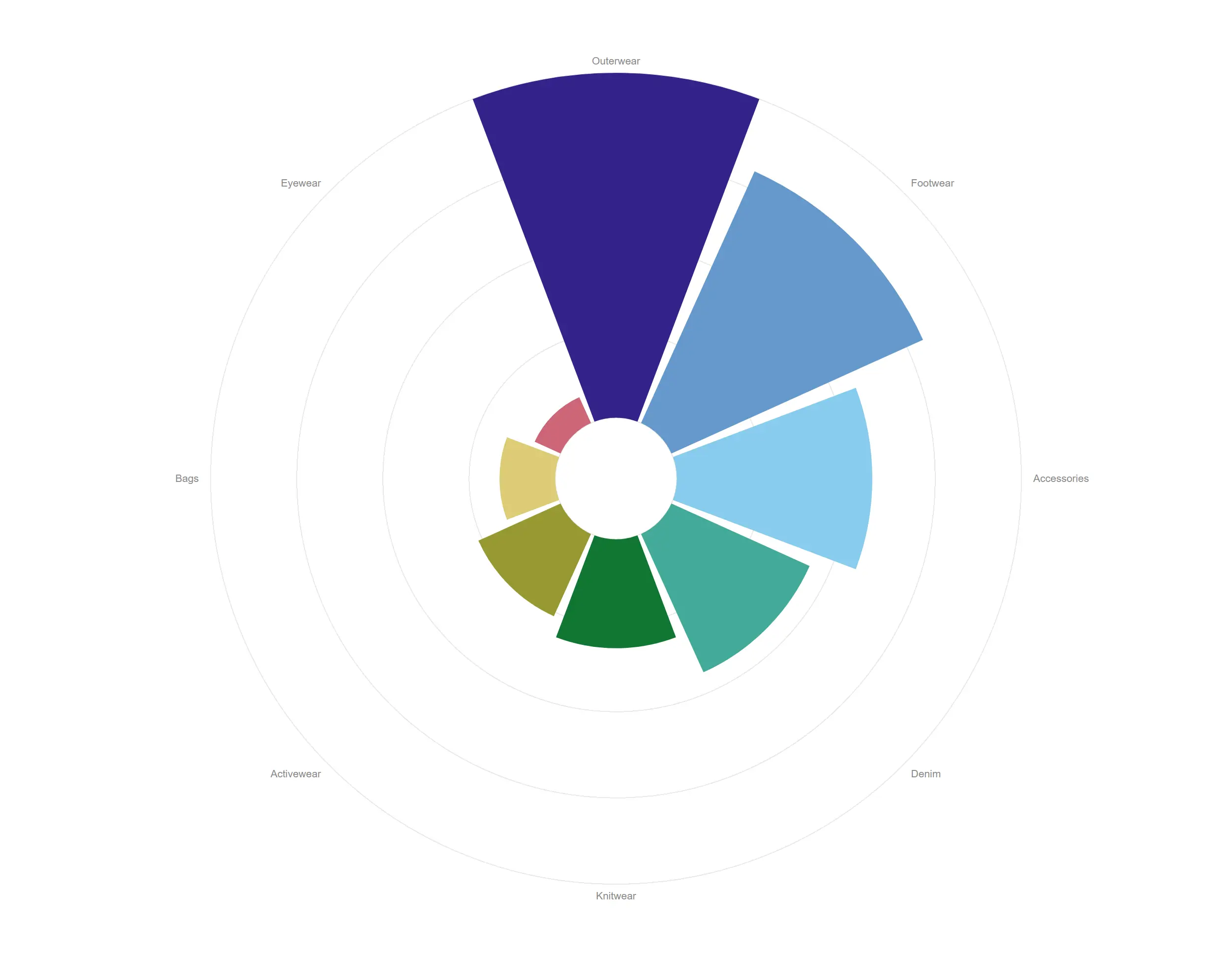
A bar chart wrapped into a ring, so a repeating cycle reads at a glance instead of scrolling off the edge.
One dimension around the ring, its value as the radius from the inner hole.
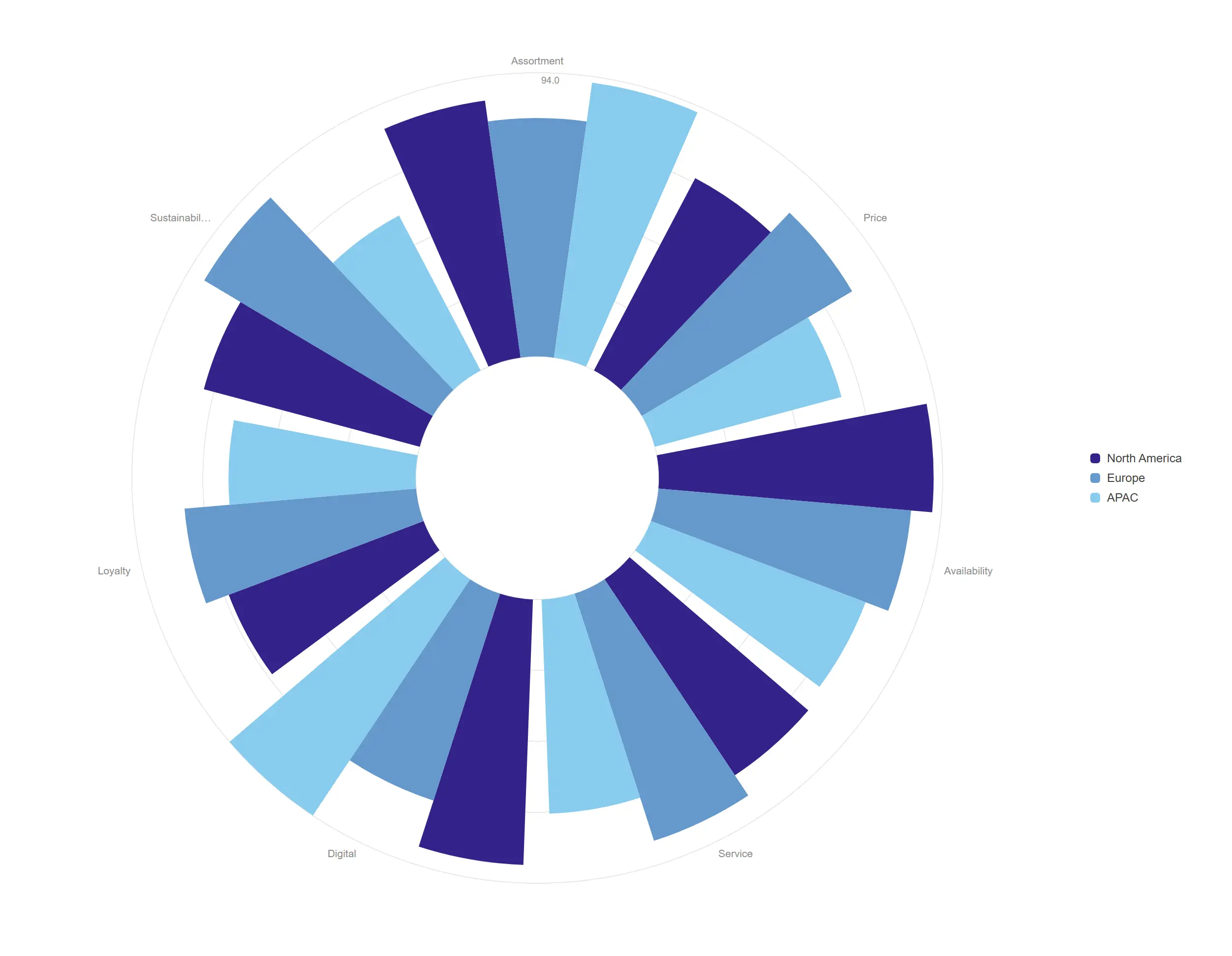
Several measures group as sub-wedges around each category, comparing three scores per capability at once.
props.radial.innerRadius widens the hole; three measures group angularly.
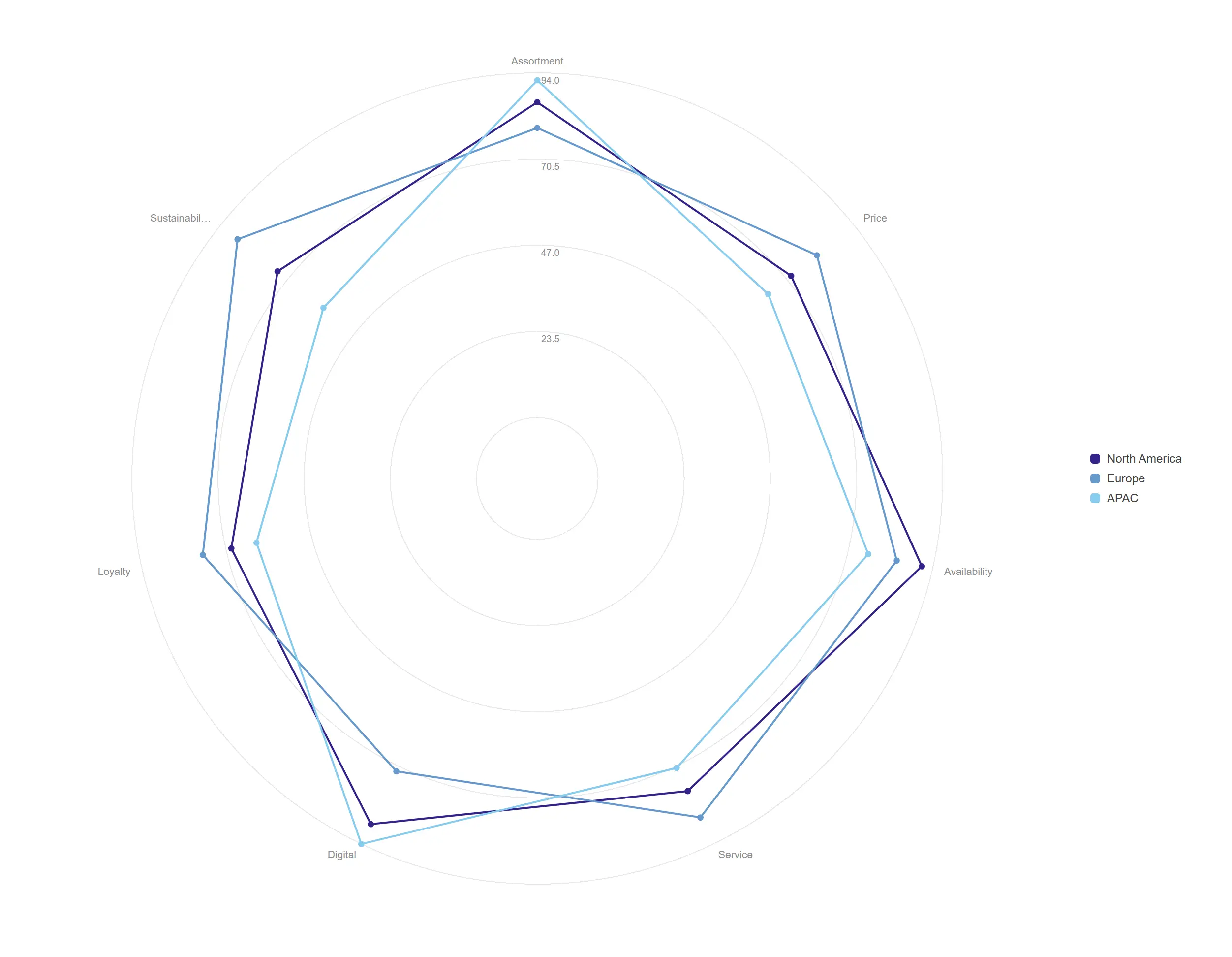
Each measure loops around the cycle, so the shape of a strategy shows up as a silhouette.
One closed loop per measure over the dimension angles.
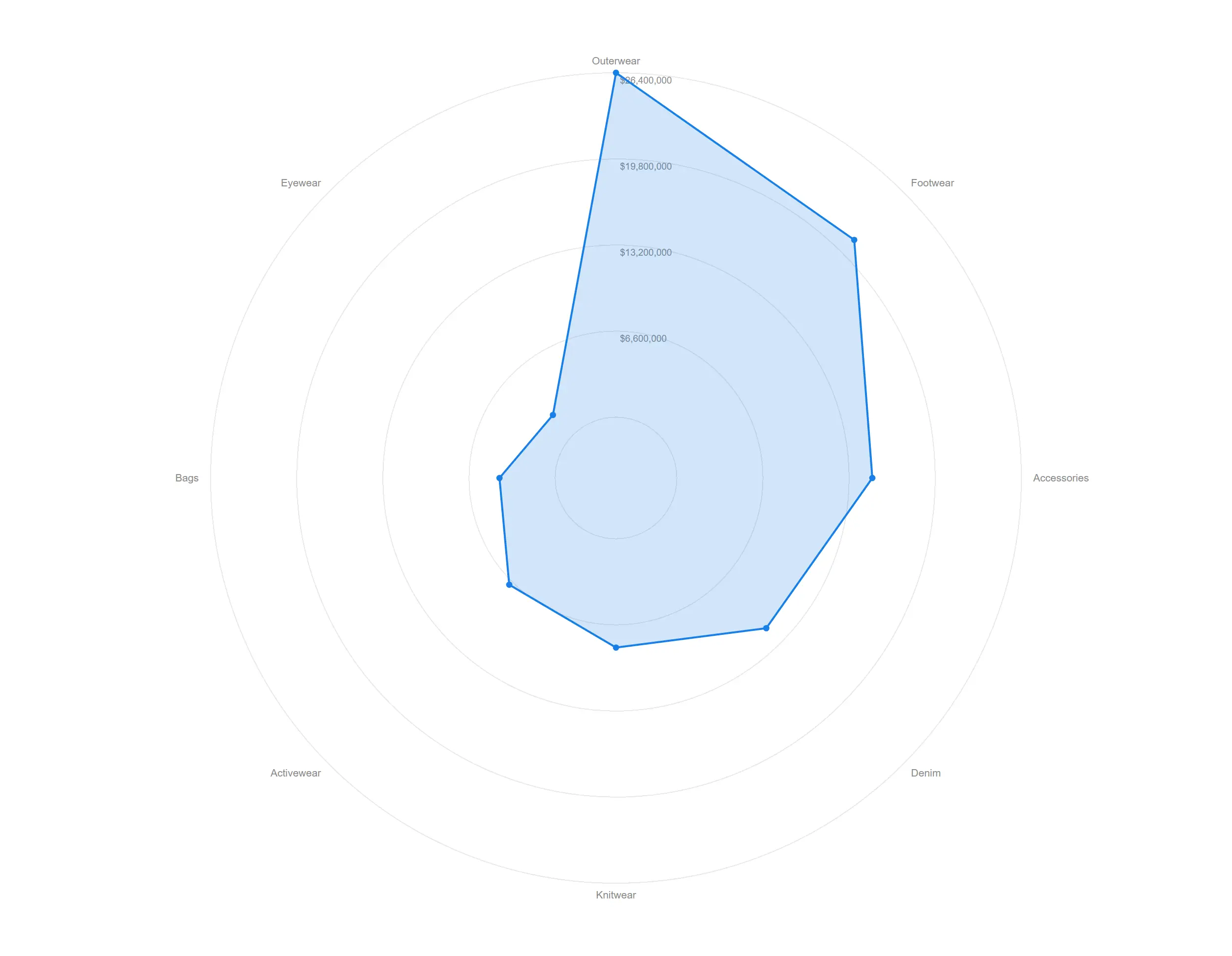
The filled silhouette of a single measure around a repeating cycle, honest about the whole shape.
props.radial.area fills the loop.
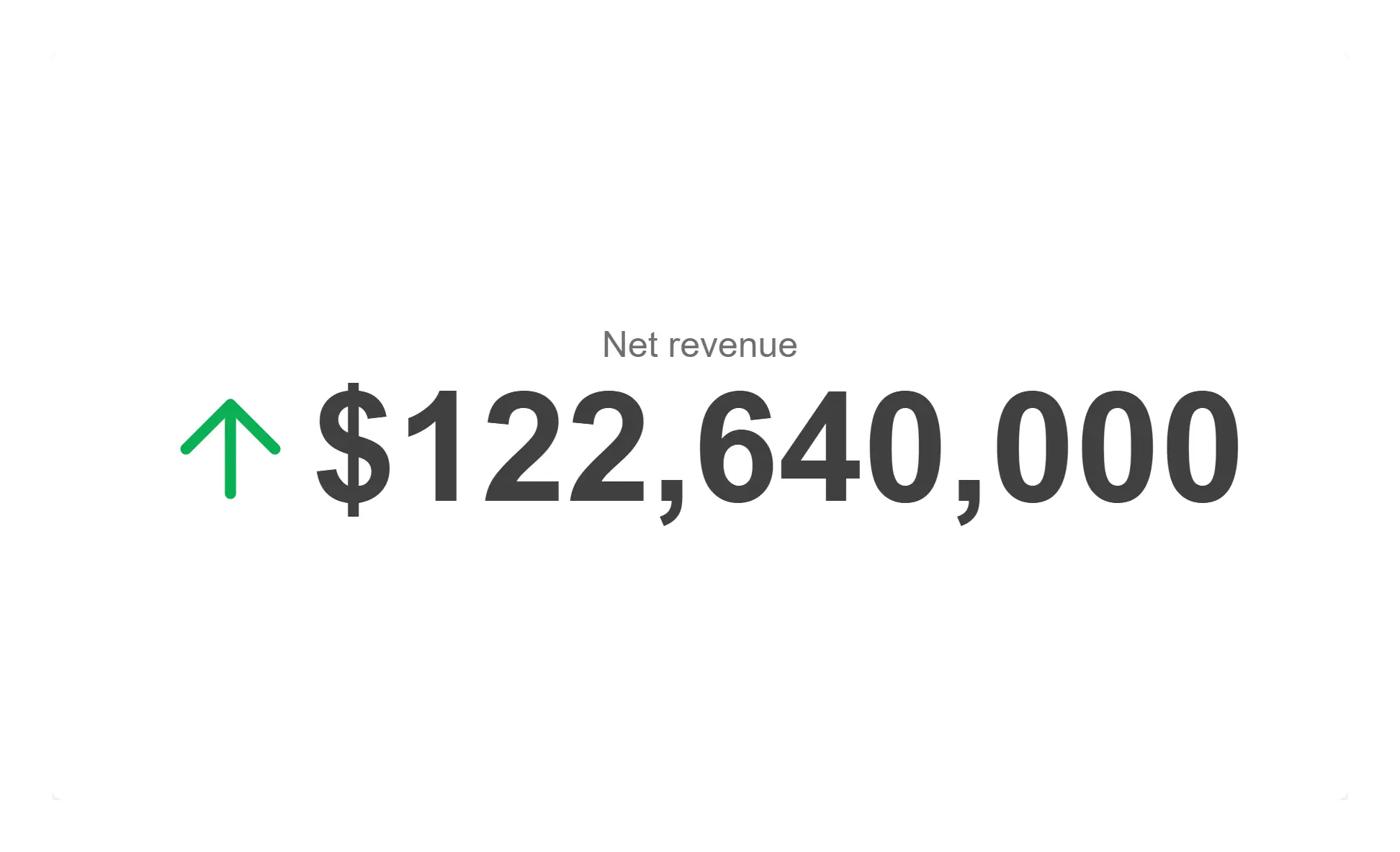
The headline number, formatted by the engine and legible from across the room.
Standard layout, comparison off, no progress element.
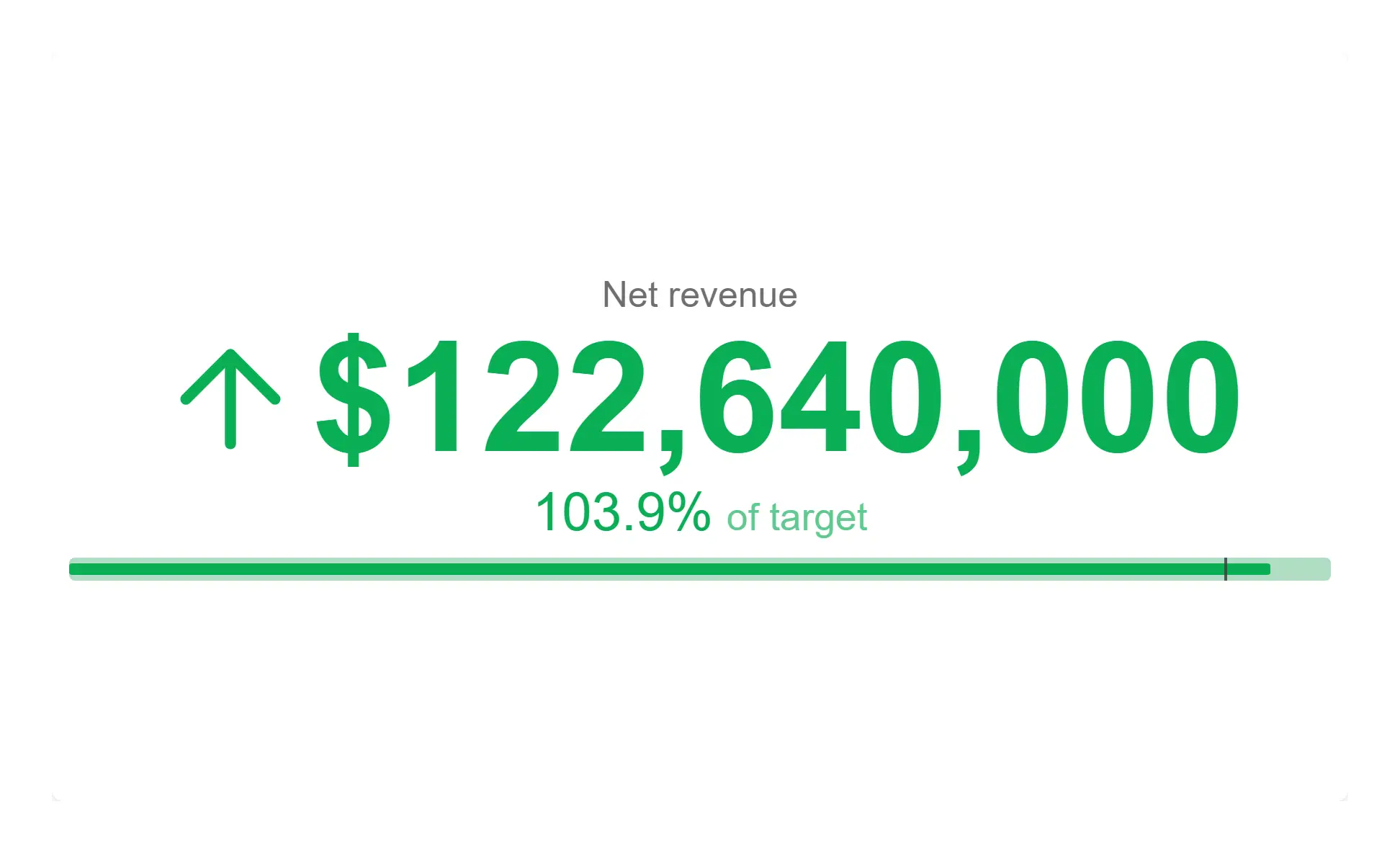
Attainment against plan, colour-banded, so the card answers "is this good?" not just "what is it?".
props.progress.mode = "bullet" with threshold banding and an arrow indicator.
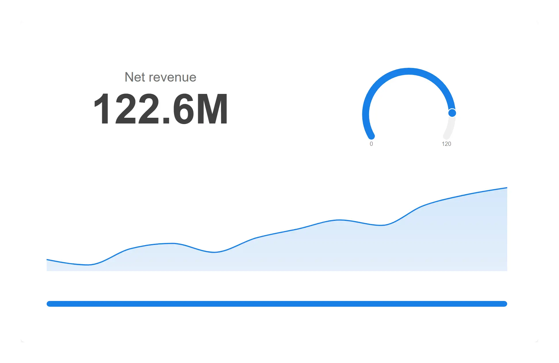
Compose a card from stacked visual layers when one number is never quite the whole story.
props.layers with viz-number, viz-gauge, viz-sparkline and viz-progress elements.
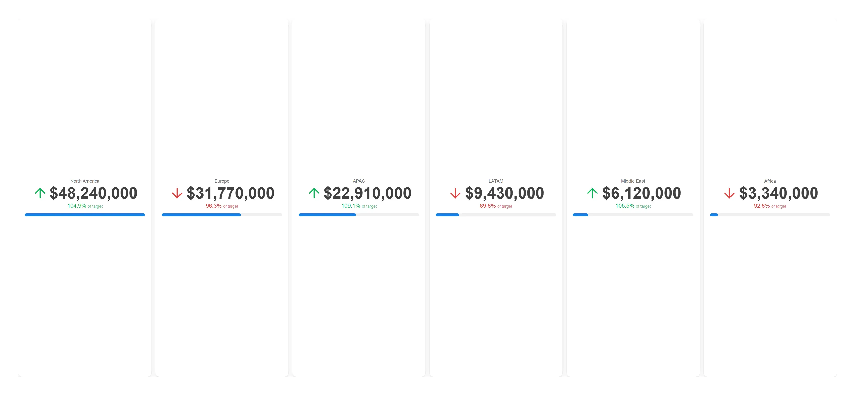
One card per region from a single object — add a region and the grid grows itself.
props.trellis.enabled = true with attainment comparison on every cell.
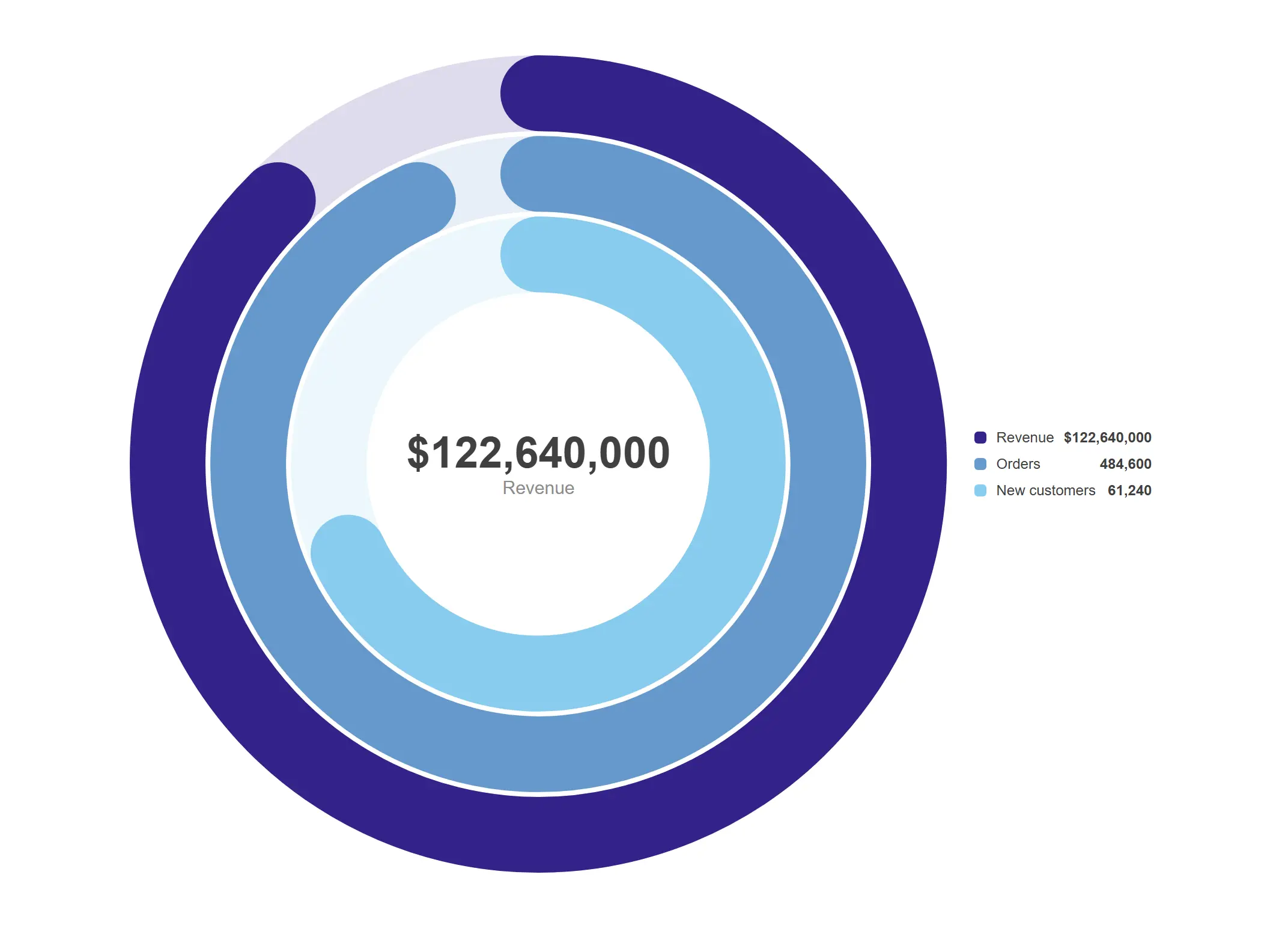
Three targets, three rings, one glance — the fitness-ring pattern applied to your business plan.
Measure mode with props.arcs targets per ring and the legend showing values.
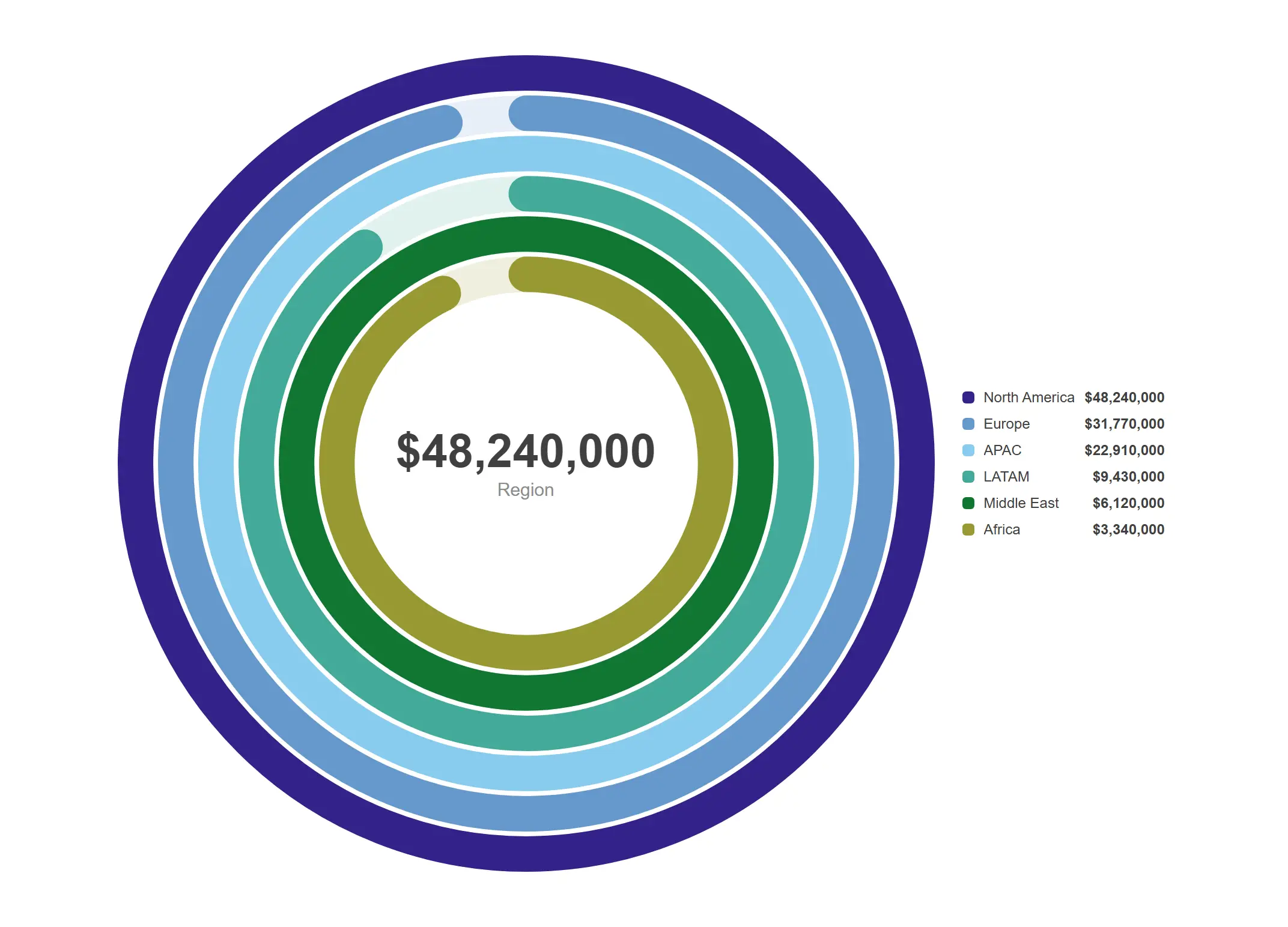
One ring per region, each measured against its own plan, all selectable.
Dimension mode: 1 dimension + value and target measures.
Dense, readable, export-ready tables and narrative text that stay in the analyst's hands.
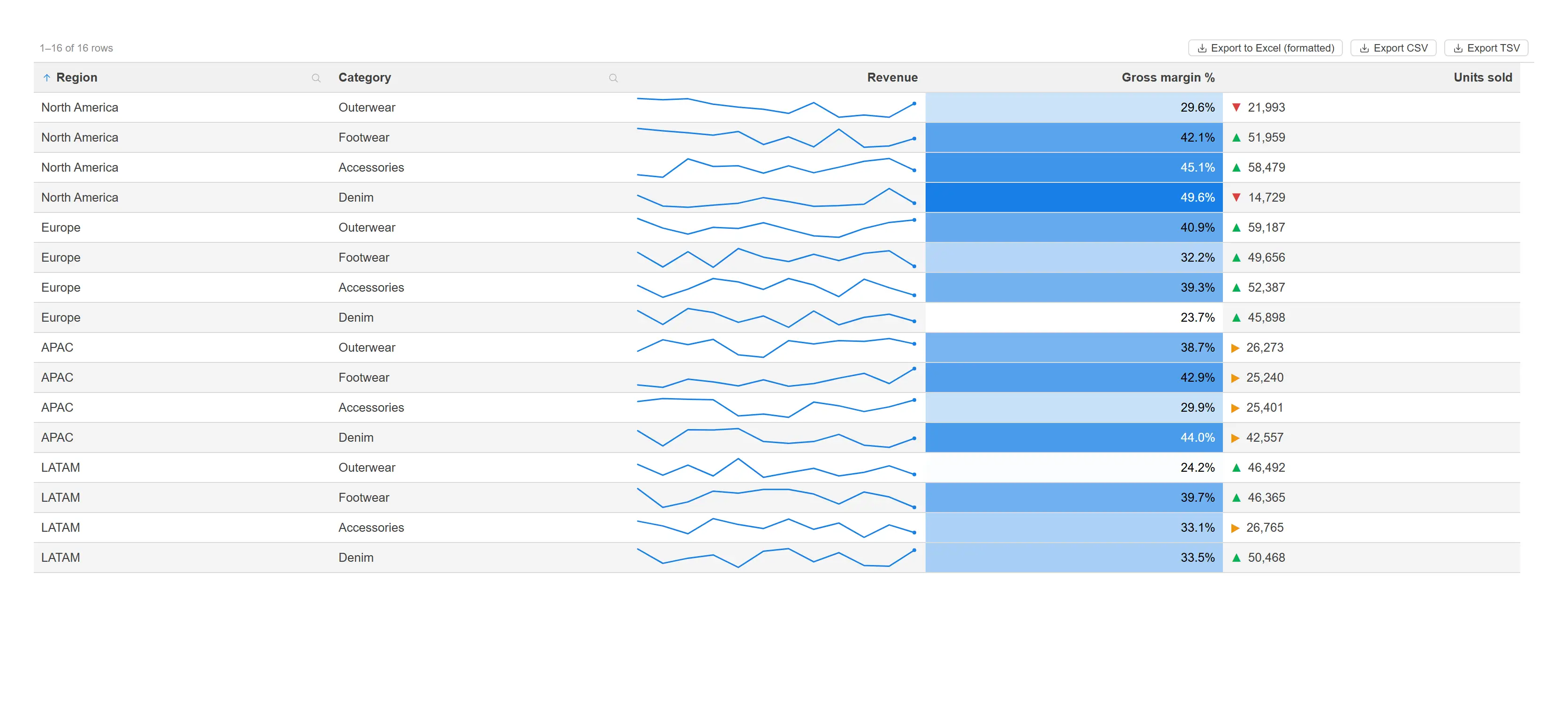
A straight table that earns its space: in-cell sparklines, heat gradients and threshold indicators.
Column rep modes: minichart (line), measure gradient, and indicator thresholds.
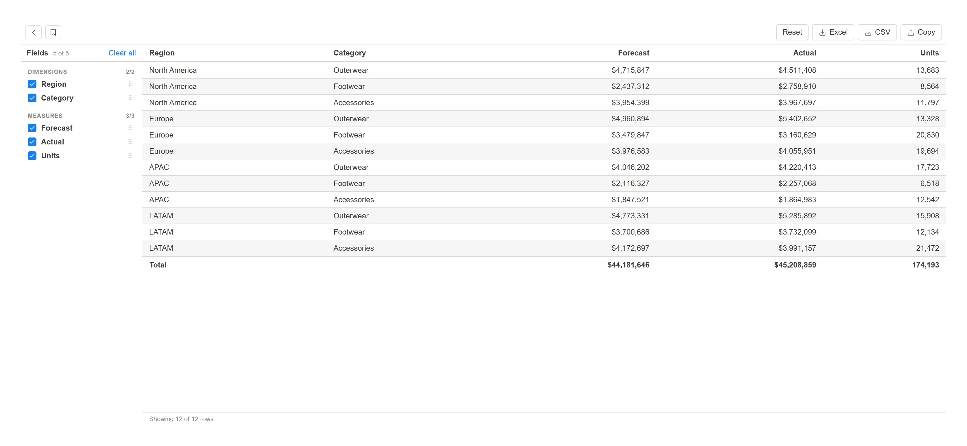
Let analysts assemble, reorder and export their own report without ever leaving the sheet.
All fields pre-selected, totals row on, comfortable density, Excel/CSV export enabled.
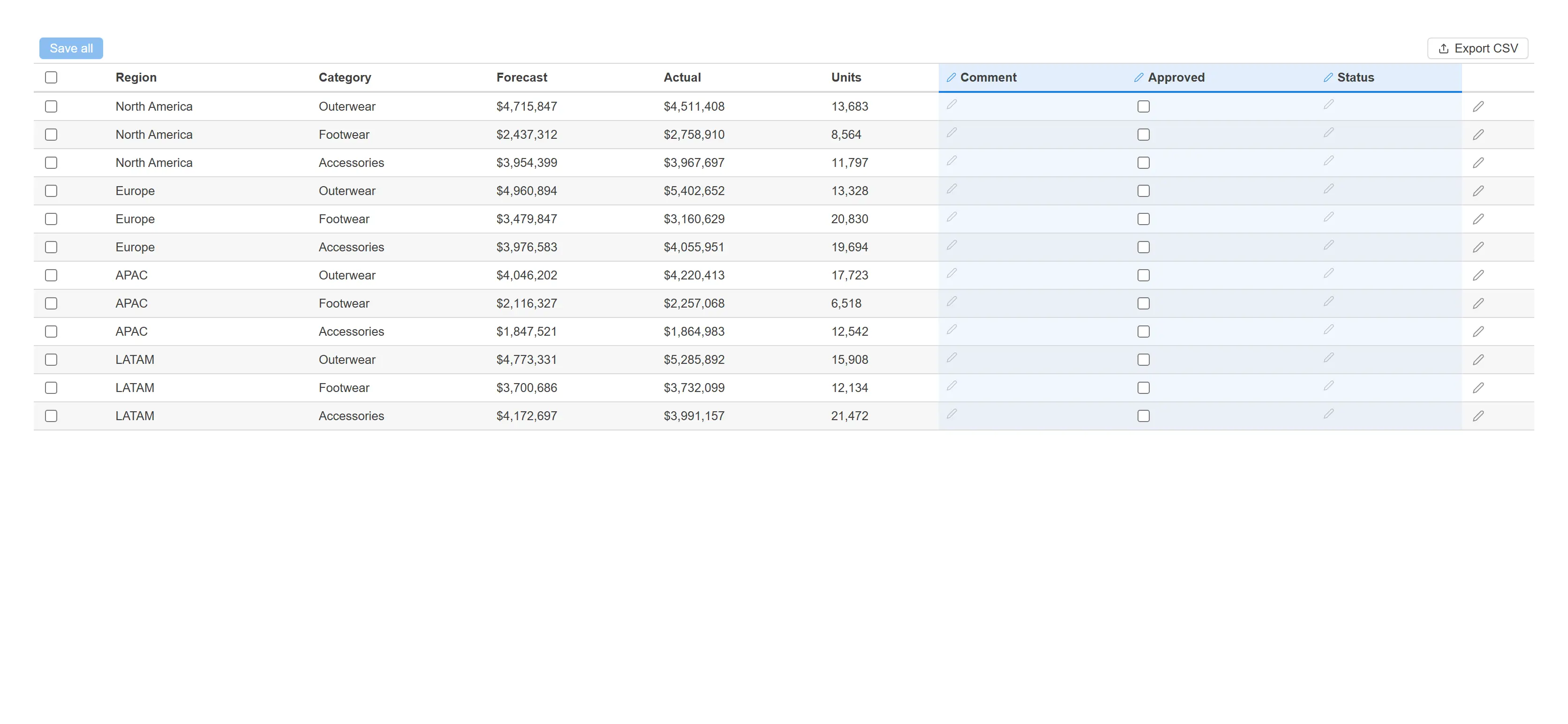
Capture comments, approvals and status against live rows and push them straight back to your system.
props.inputColumns with text, checkbox and select editors; bulk edit and export on.
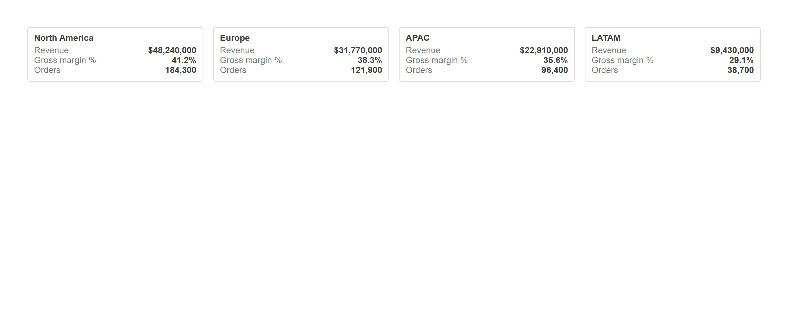
Turn a dimension into a row of branded cards that read like a story instead of a table.
props.content.mode = "cards" with a templated title and automatic measure rows.
Answer "where" and "when" with geography, project plans and interactive breakdowns.
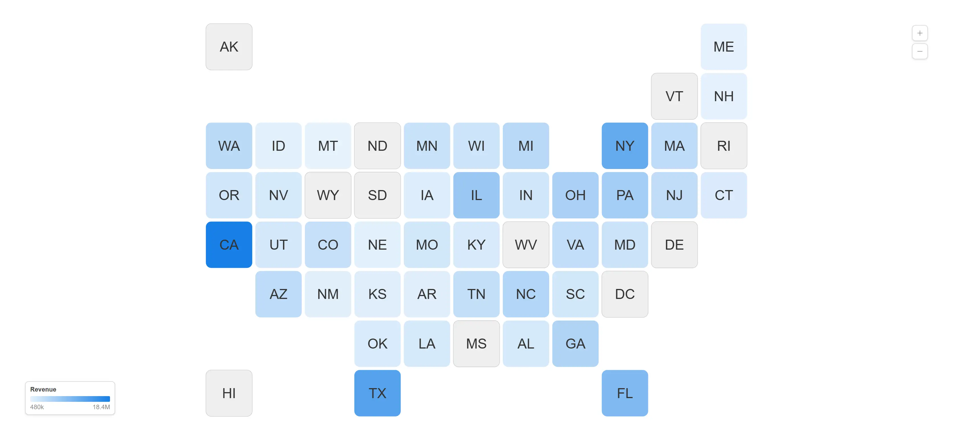
A branded choropleth with no tile server, no API key and no external call — the map ships with the object.
Library map "us-states", sequential measure colouring with the legend on.
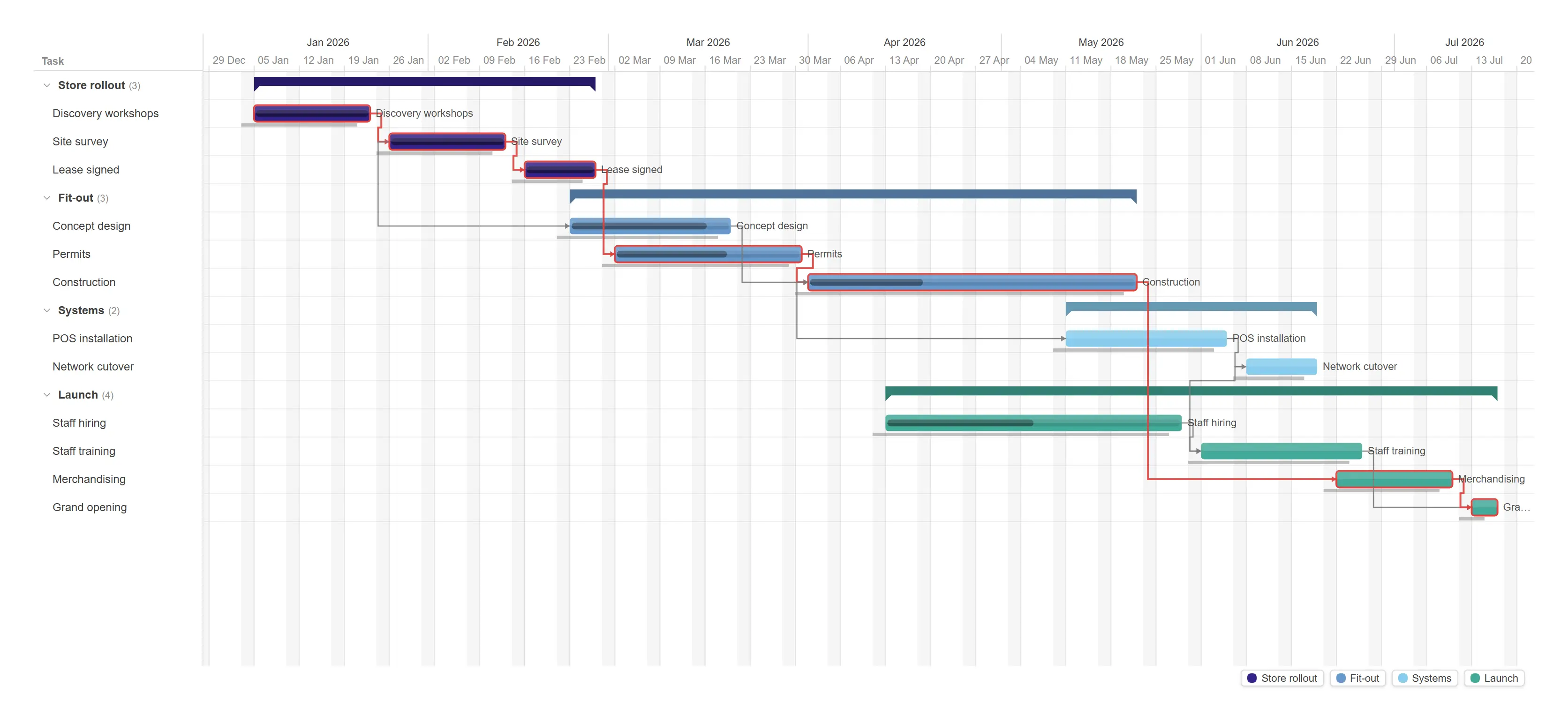
A real project plan with dependency arrows, baselines and the critical path highlighted for you.
props.deps.criticalPath = true, baselines on, elbow arrows, weekend banding.
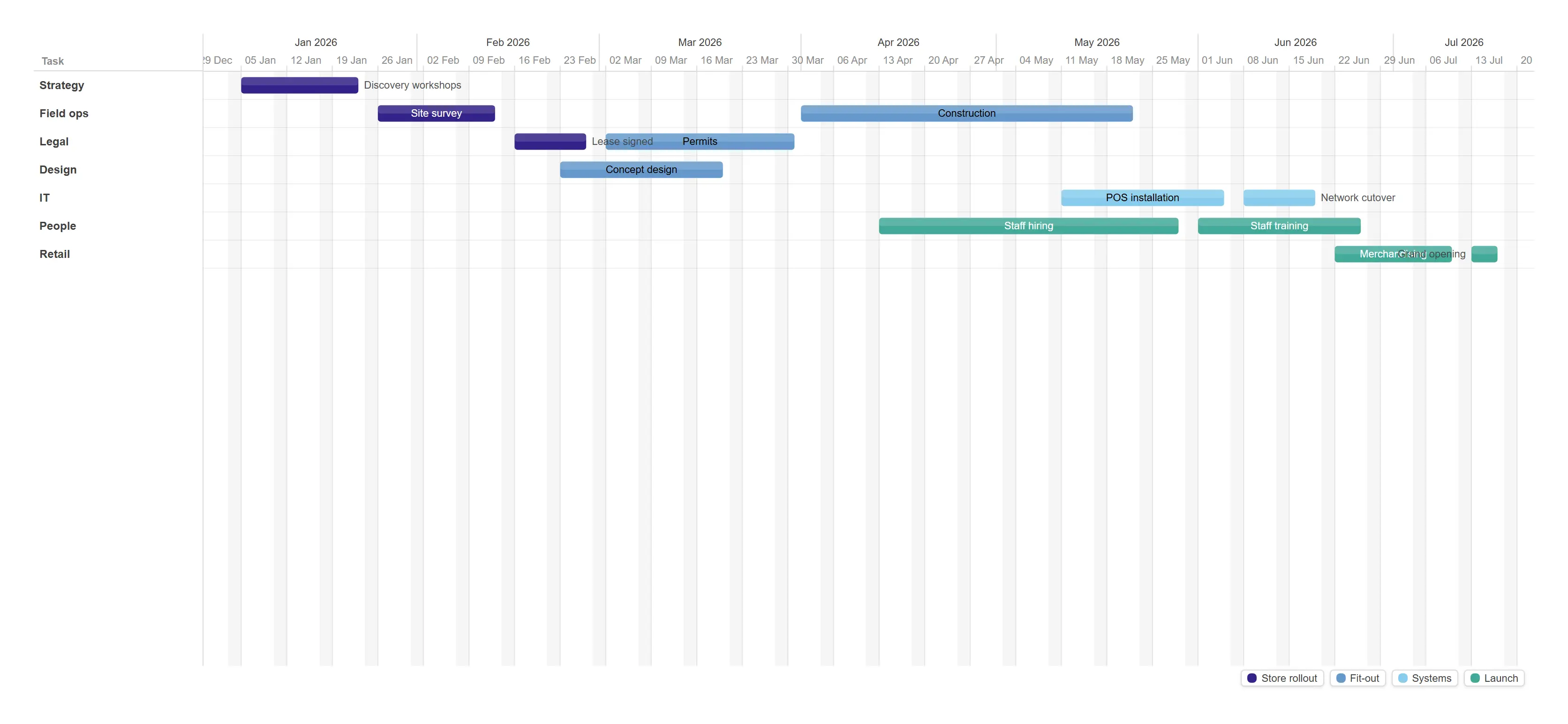
Re-lane the same plan by team to see who is over-committed before the schedule slips.
props.view.mode = "resource" with a third dimension supplying the lanes.
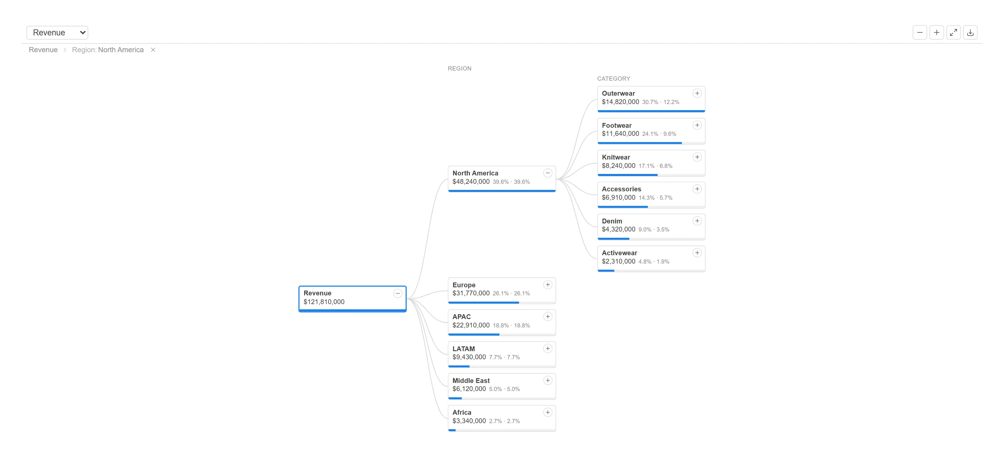
Let anyone break a total apart, one question at a time, and keep the path they took visible.
Three split fields with props.tree.defaultExpansion pre-opening two levels.
The controls that make a sheet feel like an application rather than a report.
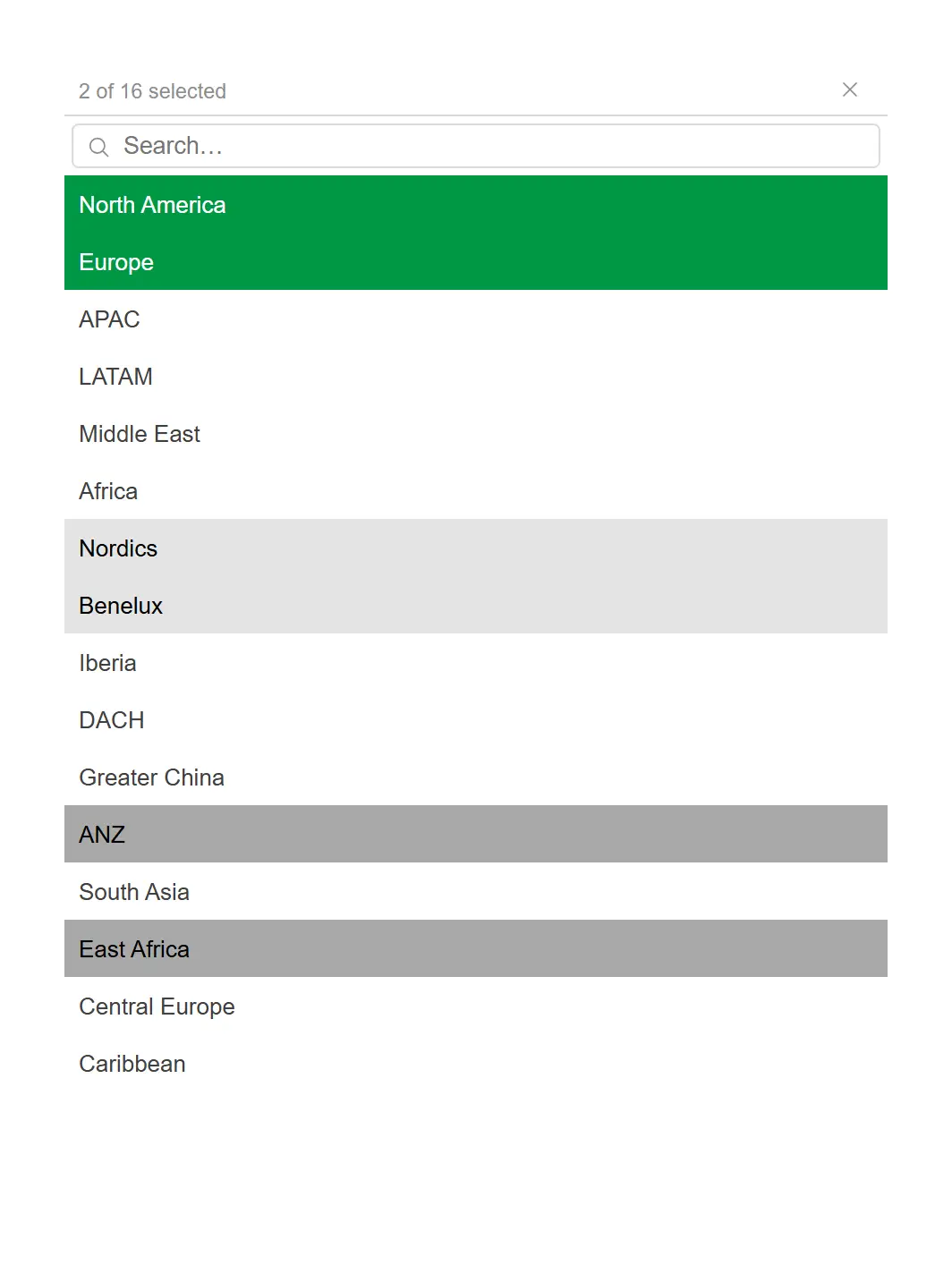
Every Qlik selection state — selected, alternative, excluded — rendered exactly as users expect.
Listbox mode with search, header summary and a clear control.
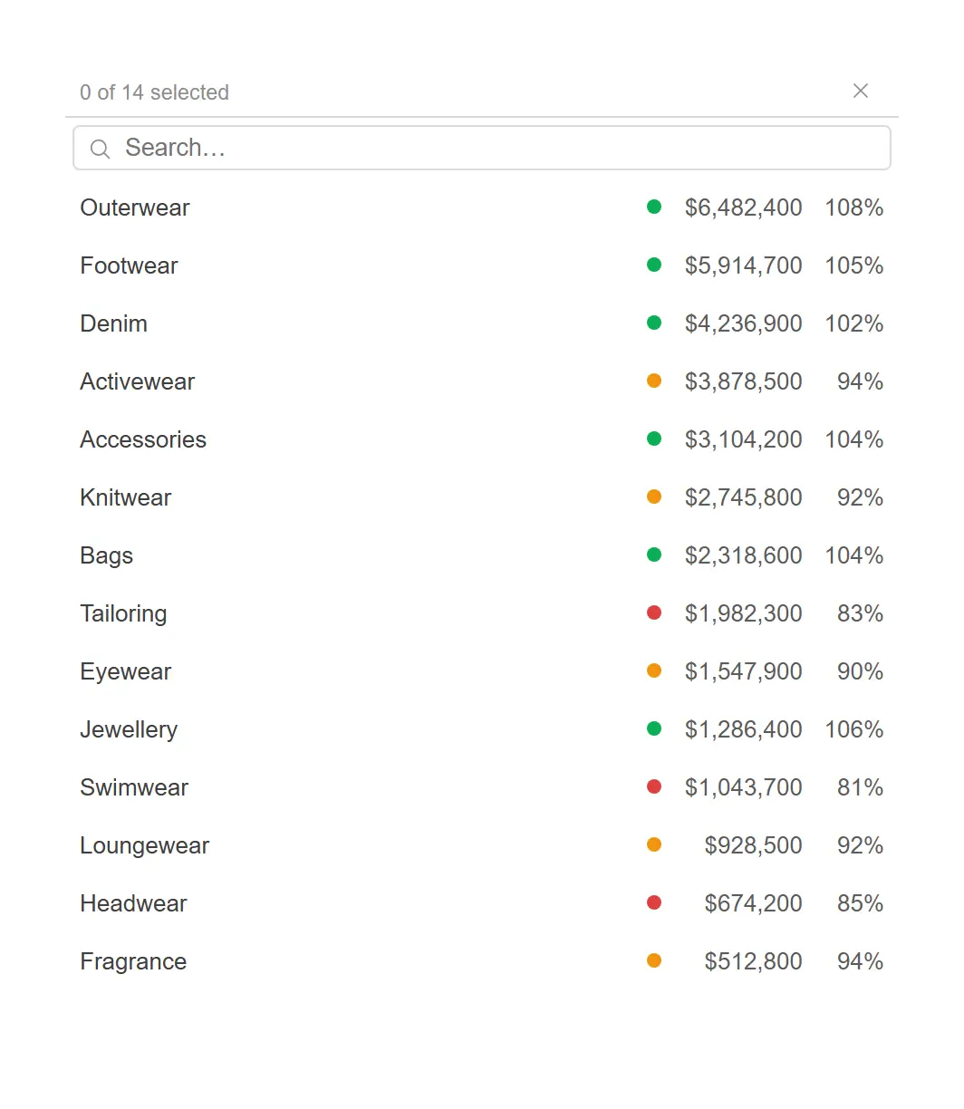
Let people see what they are choosing between — the number beside every value, and a status dot that says which lines are behind plan.
Listbox mode with two per-value measures (Sum(Sales) masked $#,##0, and its share of plan) and an indicator-colour expression, all evaluated by the engine on the object’s companion hypercube.
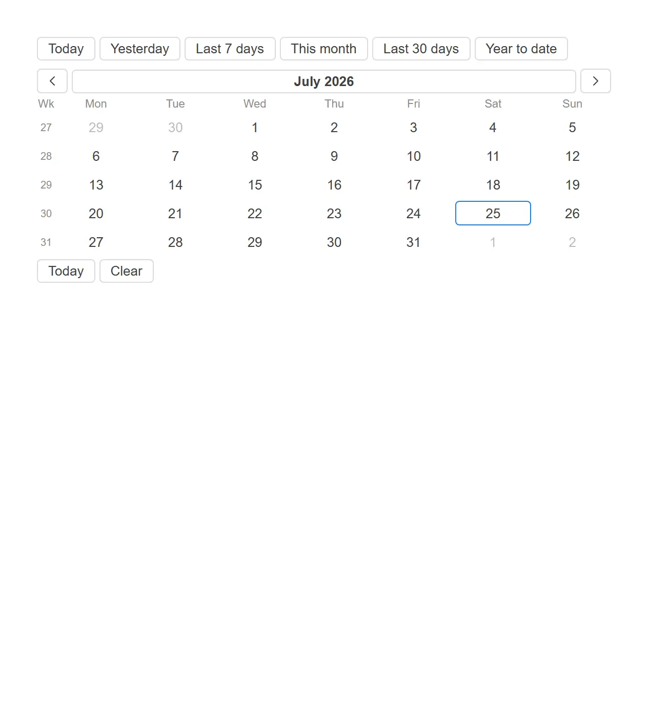
Pick a range the way people actually think about dates, with the presets they reach for most.
Inline range mode, preset buttons on top, Monday-first calendar with week numbers.

Put the current selection state on the sheet itself, complete with locks and one-click clearing.
Soft chips, field names shown, lock and clear-all controls enabled.

Give users a scenario switch that drives every expression on the sheet from one control.
Buttons mode over a fixed value list, bound to a live variable.

Turn a pile of sheets into an application menu your users can navigate without a map.
Horizontal bar with grouped items, actions and icons from props.nav / props.items.
Pick the example closest to the question you are trying to answer. We will build it against a Qlik app you already have.